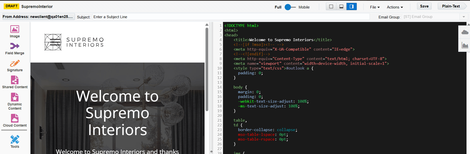
Classic Source Editor Components
The source editor is available in both the classic UI and the Redwood experience. Learn more about the Redwood experience editor.
Important: To access the content editors in the Redwood experience, please log in to My Oracle Support and create a service request. After you have been granted access, turn on the Redwood experience.
The classic Source Editor provide components to build your email. To learn more about the Design Editor, see Email authoring.
The following table describes the components of this editor.
| Component | Description |
|---|---|
|
|
Image: Add images to your email. Click the icon to open the Image Browser, then drag-and-drop an image from the browser onto the email canvas. Important: As of version 85, Google's Chrome is now blocking embedding mixed content in secure web pages and web applications served with the |

|
Field Merge: Add a field merge to your email. Field merges personalize emails by drawing information from specified fields in contact profiles. Click the icon to open the Field Merge Browser, then drag-and-drop your field merge to the desired location. |

|
Hyperlink: Add a link to your email. You can enable text or images as hyperlinks, you can then configure the link in a number of different ways. A hyperlink can route your clients to a landing page, a file, a web page, a system action, or a pre-addressed email that they can fill out and send. Select text or an image and click the Hyperlink icon, select the check box next to Enable as Hyperlink then configure the link as needed. |

|
Signature: Add a signature to your email, this can be a standard signature layout that populates with specific sender information. Click the icon to open the Signature Browser, then drag-and-drop a signature from the browser onto the email canvas. Learn more about |
|
|
Shared Content: This component allows you to add shared content to your email, this is content that can be reused in multiple Oracle Eloqua assets. Click the icon to open the Shared Content Browser, then drag-and-drop shared content from the browser onto the email canvas. Learn more about |
|
|
Dynamic Content: This component allows you to configure your email to substitute different content depending on specific rules and conditions. Example: You could create a rule to decide which salesperson will appear as the sender of an email based on the city, state, country, or region specified in the contact's profile. Click the icon to open the Dynamic Content Browser, then drag-and-drop the content from the browser onto the email canvas. The Responsive Vertical Resizing option dynamically resizes emails built in the Email Editor based on the content populated in the email (e.g. cloud content, dynamic content, shared content). This prevents content from being cut off when a recipient's content is larger than the container originally configured in the email editor and renders a more mobile-friendly version. Learn more about |
|
|
Cloud Content: Cloud content is content that is provided by an external service. (Cloud content can be added to the browser from Apps in the Setting area of Oracle Eloqua.) Click the icon to open the Cloud Content browser, then drag-and-drop the service that you want to add from the browser onto the email canvas. If the service needs to be configured, double-click the icon on the canvas, the Cloud Content Configuration window opens. Enter the required details then click Save. Note: If you attempt to save the email with AppCloud services which are not fully configured, you will be prompted to complete the configurations before you can proceed. The Responsive Vertical Resizing option dynamically resizes emails built in the Email Editor based on the content populated in the email (e.g. cloud content, dynamic content, shared content). This prevents content from being cut off when a recipient's content is larger than the container originally configured in the email editor and renders a more mobile-friendly version. |

|
Tools: Click this icon to open the Tools window. This component allows you to access settings related to component you are working with, or to change the overall email settings (like page size, alignment, etc.). |
|
|
Mobile View: Click to view the email canvas in a mobile view. This applies to the HTML editor only. To preview your finished email on various devices, see Previewing emails |


Creating emails using the Source Editor
Email authoring