Fatigue Analysis dashboard for Push
Important: This feature is available as part of the Advanced Intelligence Package add-on that must be ordered for your account. Please contact your account manager or Oracle sales.
In this topic, learn about the different sections of the Fatigue Analysis dashboard for Push (see also Additional topics for understanding Fatigue Analysis):
To navigate to the Fatigue Analysis page:
- Click Insight
 on the side navigation bar.
 - Select Fatigue Analysis.
- Click the Push tab.
-
Select the mobile app for which you want to view push fatigue analysis results.
Burnout alert
Your dashboard displays a Burnout alert when your Saturated and Over saturated personas combined contain 60% or more of your mobile app list's recipients analyzed. This means that most of your recipients analyzed are showing decreased engagement and are at risk of burnout.
Dormant alert
Your dashboard displays a Dormant alert when your Inactive personas contain more than 50% of your mobile app list's recipients analyzed. This means that most of your recipients analyzed are showing no engagement.
Fatigue distribution chart

Use this distribution chart to evaluate how your profile list is distributed across the five personas. For example, are most of your profiles in the Saturated and Over saturated personas, or is your dashboard displaying a Burnout alert? In this case, consider sending either highly personalized or fewer messages.
Member count for each persona
Access the member count by hovering or clicking the percent display for the persona.
Send and open rate correlation chart
This chart displays the relationship between the sends and open rate for each persona, allowing you to evaluate engagement rates. Each persona has a line graph (representing the persona members' average open rate for the past three months) and a bar graph (representing the persona members' total sends for the past three months). For example, if you are viewing this chart in the month of January, then it displays data for the months of October, November and December.
You can see the values that correspond to a graph on the sides of the graph. The open rate corresponds to the percentages on the right side, and the sends correspond to the values on the left side.
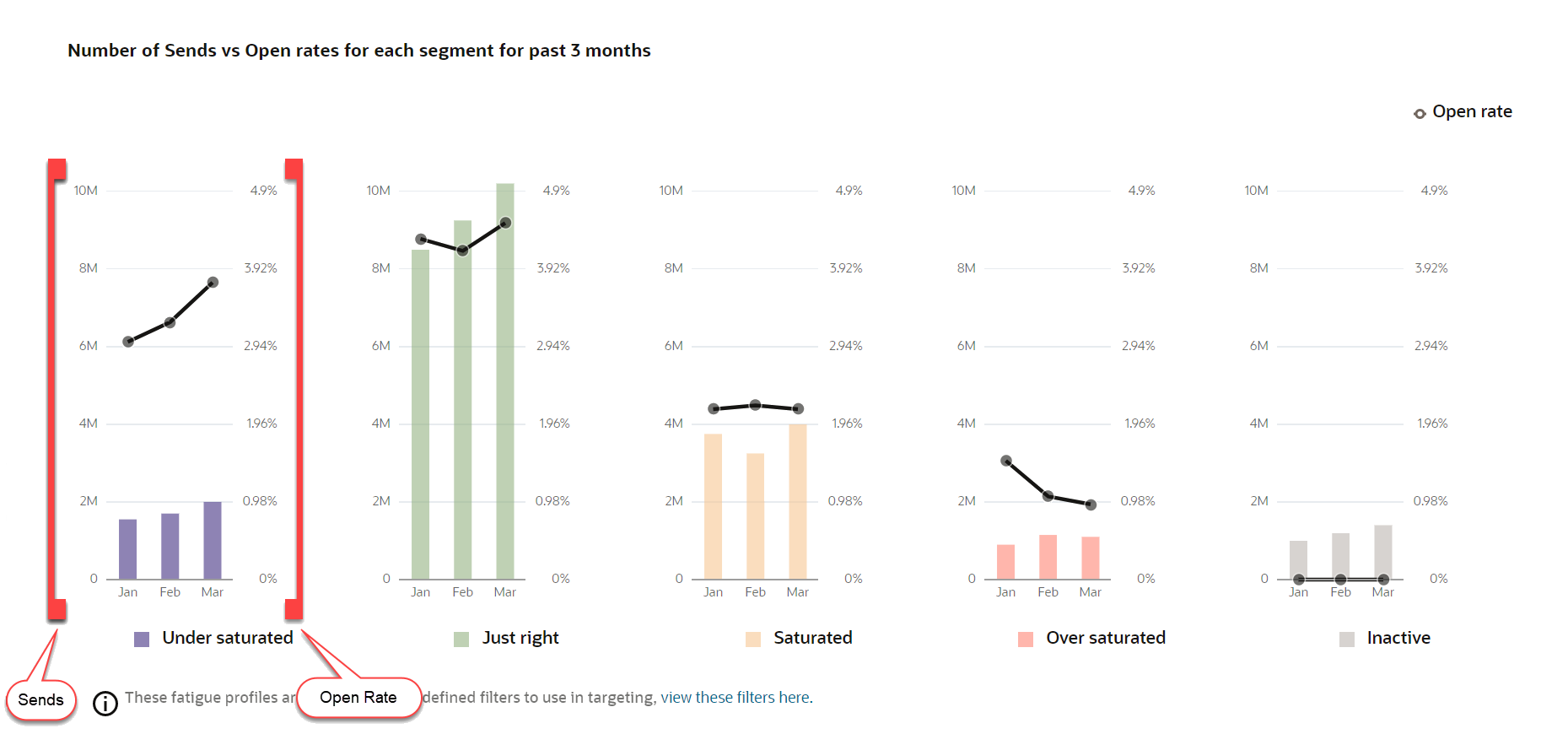
Use this chart to compare each persona's average open rate to its total number of sends, and to compare both metrics across personas. For instance, you can see the rate at which Saturated persona members open your push messages and compare it to the amount of push messages they receive. And how do those numbers compare to the Just right persona?
Additionally, click on the View these filters here link at the bottom of this chart to be taken to the prebuilt filters for this mobile app.

Warning: Do not use the auto-generated New-Fatigue-Push-<App Name> filter (for example, New-Fatigue-Push-NewsApp). This filter will not generate any results and may be deleted in the future.
Additional topics for understanding Fatigue Analysis
Fatigue Analysis dashboard for Email
Fatigue Analysis dashboard for SMS
Fatigue Analysis dashboard for Push (You are here)
Fatigue Analysis filters and PET
Understanding Conversion Tracking