Setting Up a Report Snapshot Portlet
When you've added a Report Snapshot portlet to your dashboard, you can configure the portlet to display data in the most useful manner.
To learn how to add a Report Snapshot portlet, see Adding a Report Snapshot Portlet.
To set up a Report Snapshot portlet:
-
In the report snapshot portlet, click
 and select Set Up from the menu.
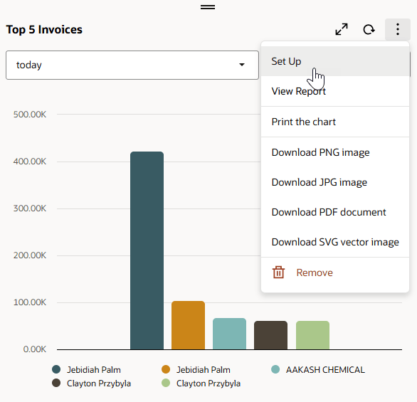
-
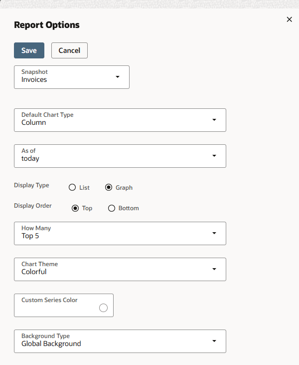
The portlet setup window appears.
-
In the portlet setup window, you can:
-
Use the Snapshot menu to select the report snapshot to display.
-
For custom report snapshots, change the portlet title, or the name of the snapshot.
-
Use the As of or Date Range dropdown menu to change the time period for which data is displayed.
-
Choose a Display Type to indicate whether data should be displayed as a list or a graph.
Note the following about report snapshots that display lists:
-
Report snapshot list text truncates at 25 characters when the report snapshot portlet is in the left or right dashboard column. To avoid this truncation, place the portlet in the middle column.
-
Report snapshot list amounts are rounded to the nearest whole number and don't display decimal places.
-
Graph-specific settings, including Default Chart Type, Chart Theme, Custom Series Color, and Background Type, are not available for lists.
-
-
Choose a Display Order.
-
If you select Top, your data will be shown in order starting with the greatest value.
-
If you select Bottom, your data will show in order starting with the lowest value.
-
-
From the How Many list, select the number of results to display. Choices include:
-
Top 5
-
Top 10
-
Top 15
-
Top 25
-
Top 50
For custom report snapshots, set a number 1 - 300.
-
-
For graphs, use the Default Chart Type dropdown menu to set the default chart used for snapshot data. You can later change the chart type by clicking a thumbnail in the portlet itself.
-
For comparative sales report snapshots, chart type options are Area, Line, Bar, and Column.
-
For other report snapshots, chart type options are Line, Bar, Column, and Pie.
-
-
For graphs, use the Chart Theme dropdown menu to set a look and feel for chart data:
-
Global Theme - uses the chart theme set in the Chart Themes section on the Home > Set Preferences page (the default). See Personal Preferences for Appearance.
-
Basic - offers limited color contrast.
-
Colorful - offers more color contrast.
-
Match Color Theme - Bold - harmonizes with your choices in the Colors section on the Home > Set Preferences page, using bolder shades. See Personal Preferences for Appearance.
-
Match Color Theme - Light - harmonizes with your choices in the Colors section on the Home > Set Preferences page, using lighter shades. See Personal Preferences for Appearance.
-
-
For graphs, use the Custom Series Color field to enter a hexadecimal value for the color you want to use for the graph. This option is meant for backward compatibility with custom chart colors defined prior to the introduction of chart themes in Version 2012 Release 2.
-
For graphs, use the Background Type dropdown menu to set the background display behind chart data:
-
Global Background - uses the background type set on the Set Preferences page (the default)
-
Lines
-
Bands
-
Grid
-
-
-
When you've finished configuring the portlet, click Save to save your configuration.
Some report snapshot portlets don't include a Set Up link because these snapshots don't offer choices for data display. For custom snapshots, you may see an Edit link that includes some of the same settings available from the Set Up link.