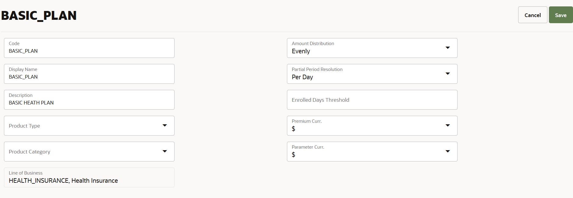
Region Component
A region is an array of tiles grouping properties together, to be displayed in a specific part of the UI page. It shows a list of properties that belong together, in one or two column layout.
The region component has the following structure:
"region": {
  "set1":{
    "tiles": [
      {
        "title": "",-- boilerplate key for the title,
        "sequence": 1,
        "properties": [
          ...
        ]
      },
      {
        "title": "",
        "sequence": 2,
        "properties": [
          ...
        ]
     },
   ...]
  },
  "set2:{
    tiles:[...]
  }
}
UI Specifications
A region can show up to two adjacent columns; 'set1' specifies the first column, 'set2' the second. The columns are specified by a list of tiles, each 'tile' typically consisting of a boilerplate text and a field value.
Tiles are ordered by the sequence. For a tile, if a given property value exceeds the section margin all overflowing characters are hidden (e.g. 'this text exceeds the maxi…'). Upon hovering over the value, the full text is displayed. When a large number of properties are configured to be displayed in the region component, only what can be shown within the optimal component height are shown by default. A link 'see more' is placed to indicate that there are more properties, on click 'see more'; all the remaining properties are displayed.
This component supports view and edit modes. For details on property representation in view and edit modes, boilerplate rules with respect to mandatory properties, and property validation refer to the property guide.
If there is no property to be displayed in a tile, then the tile is not shown in the view mode. Example, a tile is configured with properties to be shown only when they have a value (display: notNull) and if none of them have a value, then the tile is not displayed in the view mode. However, if the said property is an editable property, then the property (and thereby the tile) is shown in the edit mode.
