View and Edit Object - List
This floor plan template can be used to view, edit, remove or add an object from an object list. Specific detail objects(sub resource or multi value properties like dynamic records) are not immediately displayed but are available in the overflow region area for each record.
Use Cases
This search page can be used when:
The View and Edit Object - List floor plan is used to provide user with the ability to view, search and edit data on the same page i.e. to provide ability to add and edit multiple objects at the same time
This template is especially designed for handling DML operations on an object list and can be used for simple entities
Individual objects with all their attributes to be displayed on the same page
Used for objects with limited number of properties
Few examples of pages that currently use this template:
-
Titles
-
Prefixes
-
Currencies
-
Calculation periods
-
Destinations
-
Access Restrictions
-
Boiler plate text
Presentation Configuration
A customer can change certain aspects of a page by changing or updating the floor plans and its properties. This is done by customizing the components within the floor plan’s JSON payload.
For more details refer Customizing Floor Plan Components page.
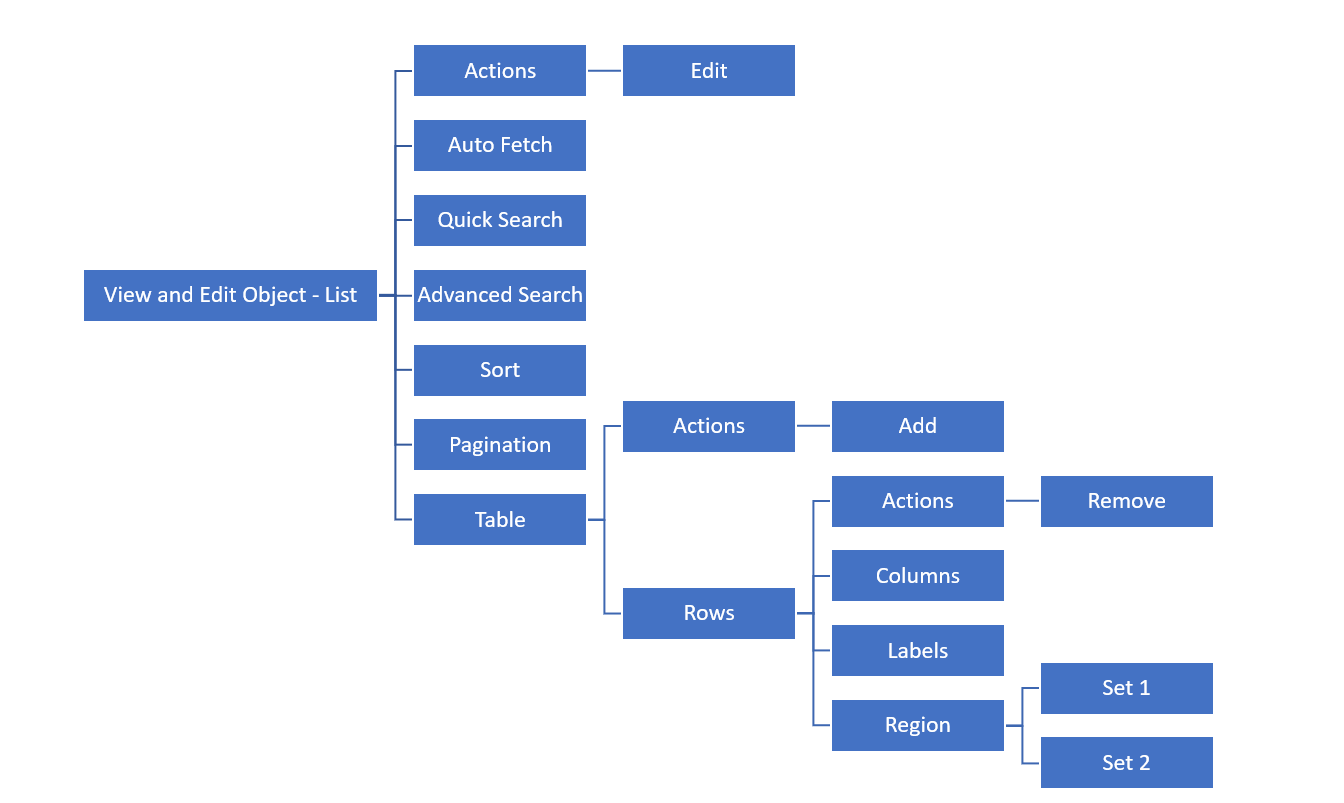
JSON Template (payload structure)
The JSON template for the CRUD page is as specified below:
{
  "resource":,
  "floorplan_object_01":{
    "actions":["edit"],
    "autoFetch":"true"/"false",
    "quickSearch":{
    },
    "advancedSearch":{
    },
    "sort":{
    },
    "pagination":{
     "pageSize":"",
    }
    "table":{
      ..
    }
}
Components
Pages using View and Edit Object - List template can have the following components
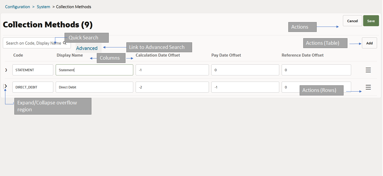
Entity name and results count
-
Non-configurable, default functionality
-
The entity name plural is displayed above the table. Next to it the total count is displayed.
-
The count is only displayed when the user has performed a search.
-
If no results match the search criteria, the message indicating that no rows were found is shown by the results component.
Primary Navigation Actions
Non-configurable, default functionality
The primary navigation actions 'Cancel' and 'Save' are available on the page in the edit mode
Action 'Save' saves the object list and brings the object list back to view mode.
-
During save operation page gets into page gets into the Busy State-'Cancel Not Allowed.
-
When the request is processed and a response has been received, the page leaves the busy state and the object is displayed again in the view mode in case of success or in the edit mode in case of failure
Either a success confirmation or object validation message(s) gets displayed. Server side validation errors are shown in the overflow area of the erroneous record and a generic message about the presence of errors is shown above the table component
If the user decides to 'Cancel' editing the object list, a confirmation message is displayed in case there are outstanding edits on the page
Optimistic locking is applicable when an object list is saved
Configurable Actions in floor plan
-
Optional component
-
By default no action is available unless specified in the floor plan
-
Only 'edit' can be configured at page level, action link 'Edit' is show when defined
-
The primary navigation action 'Edit' is available on the page in the view mode only (when configured)
-
Action 'Edit' brings the object list in the edit mode and the object list can now be updated.
-
When action 'edit' is not defined then the page gets rendered as view only.
-
This also implies that the object cannot be brought into edit state. Action edit must be configured on the plan to get the object in edit mode
-
-
Example use case: To make a page view only, no actions are defined at page and table level
Quick Search
-
Optional component
-
Center aligned
-
Can be customized to search on multiple attributes including flex codes, reference fields
-
For more details refer UI-presentation-configuration/components/quick-search.adoc[quick search] component
Advanced Search
-
Optional component
-
Displayed as a hyperlink which will display the advanced search dialog
-
Enables search on a combination of attributes
-
For more details refer advancedsearch component
Sort
-
Optional component
-
Displayed next to Advanced search when defined
-
Can have only default or multiple sort criteria
-
For more details refer sortcomponent page
Pagination
-
Optional component
-
Used to control number of records to be displayed on a page
-
Can be configured to display 5, 10 (default), 20, 50 or 100 records by using the 'Show' drop down list
Table
Required component
Used to display the object list in form of a table
If no records available or no results match the search criteria, the message indicating that no rows were found is shown
For more details refer table component page
Table component consists of the following sub components:
Actions (Table Level)
-
'Add' link is shown at the table level when configured
-
Action 'Add' enables addition of a new record to the object list i.e. a new row gets added at the top
-
Multiple records can be added at the same time
-
It also brings the object list in edit mode
Rows:
Rows can be configured with the following components
Actions
-
'Remove' is shown for each record when configured in the row component
-
Action 'Remove', deletes the object from the list
-
It also brings the object list in edit mode
Columns
-
Each property defined in this section forms a column in the table.
Labels
-
It is used to display property values in form of a label and can take in exactly one property per label
-
Multiple labels can be added to the results
Region:
-
Used if additional properties need to be displayed in the row overflow region
-
Hidden by default, user is required to click on the expand arrow to display the overflow area
-
Set 1 and Set 2: Sets are used to display multiple propertied as a set. Each result can have up to 2 sets and each set can have multiple tiles
For more details refer tablecomponent page
Conditions
-
Optional component
-
Can be used to control conditional display of fields
-
For more details refer to conditions component page