View and Edit Recursive
This floor plan template can be used to view, edit or create an object (resource) and is typically opened from the result list page. Specific detail objects (sub resources) are often not immediately displayed, and the user has to navigate to a sub page, which also follows the same template definition.
Use Cases
This template is commonly used for large objects
It is also used for objects which support customization using time valid dynamic fields and/or dynamic records.
Where tabbed layout is required i.e. giving user capability to view, add or update the sub-resources
Giving user capability to view/edit one record at a time
Few examples of pages that currently use this template:
-
Dynamic Logic
-
Messages
-
Integrations (OIG)
-
Sub-flows (OIG)
-
Individual/Organization providers (Policies)
Page Layout and Components
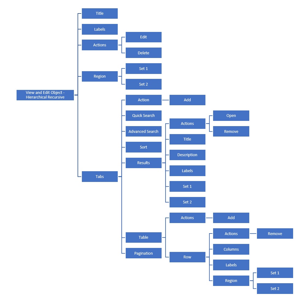
View and Edit Object - Recursive Structure
Presentation Configuration
A customer can change certain aspects of a page by changing or updating the floor plans and its properties. This is done by customizing the components within floor plan’s JSON payload.
For more details refer Customizing Floor Plan Components page.
JSON Template (payload structure)
The following JSON outlines the structure of the View and Edit Object - Recursive page template:
{
  "resource":,
  "floorplan_object_00":{
    "title":{
      ..
    },
    "labels":[{
      ..
    }],
    "actions":["edit","delete"],
    "region":{
      ..
    },
    "tabs":[
      {
        ..
      }
      ..
    ],
    "conditions":[{
    ...
    }]
  }
}
Components
View and Edit Object – Recursive can have the following components
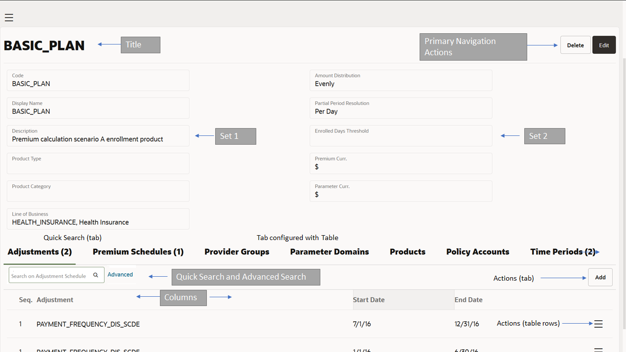
Title
-
Optional Component
-
Shown as the main title for page
-
The title is left aligned and is set to the singular resource name followed by the value of the title property as specified by the floor plan
-
If more than one value is provided, the properties are shown comma separated
-
If no property is specified, then only the singular resource name is shown
Labels
-
Optional Component
-
Labels are shown below the title and are left aligned
-
It is used to display property values in form of a label and can take in exactly one property per label
-
Multiple labels can be added to the page
-
If the value or the number of labels configured is such that it exceeds the section margin, then all overflowing characters and labels are hidden (e.g. 'this text exceeds the maxi…'). Upon hovering over the displayed value, the full value and the remaining labels are displayed. Section 2 in the above image shows the placeholder for labels.
-
For more details refer label component
Actions
-
Optional Component
-
'Edit' and 'Delete' are shown next to the title (right aligned) on the page when configured
-
When action 'edit' is not defined then the page gets rendered as view only with only delete action (if configured).
-
No tab level action that can manipulate the object, example add, remove etc (except view - when configured) are shown
-
This also implies that the object cannot be brought into edit state. Action edit must be configured on the plan to get the object in edit mode
-
-
Next to actions, a toggle switch is available to switch for the recursive pages which have at least one tab which uses results and have a linked recursive page to expanded view.
-
Expended view makes it possible to view the complete object at once. Its an efficent means to create object as it reassembles a form layout.
-
-
Only available when object is in view mode and hidden in edit mode i.e. replaced with primary navigation actions during edit
-
Action 'Delete', deletes the object from the list. A dialog seeking user confirmation 'Delete this record?' with 'Ok' and 'Cancel' is displayed when this action is selected. Selecting 'Ok' deletes the record.
-
When deletion of the record is successful, a success confirmation message '\{object name singular} deleted ' is shown
-
If any messages are returned from the server other than success; then they are displayed under the title
-
Action 'Edit' brings the object in the edit mode and the object can now be updated
-
Action Edit also brings the tables within the tabs in edit mode
-
Refer Object Navigation and Actions section for more details
Region
-
The region is used to display an array of tiles grouping properties together
-
The region component is placed below the labels
-
Depending on the status of the object region component shows the properties in either View mode or edit mode
-
Region section can have two sets i.e. Set 1 and Set 2 and each set have multiple tiles
-
Sets are used to display multiple properties as a set
-
For more details region component
Tabs
Optional Component
The tab component provides means to show the sub-resources in form of a tab
tabResource must be defined for each tab
The sub-resource is either displayed using Table Component or Results Component within the tab (Only one can be used at a time)
A page can have multiple tabs, the display order is controlled by sequence of each tab
The title of the tab is center aligned. Next to the title the total count of records in displayed, no count is displayed when there are no records.
For a tab with hierarchical list, count of total number of grand children is shown
The tab supports hierarchical list - a sub-resource up-to two level deep, i.e sub-resource of a sub-resource of an object - configuration with results component. For example, claim line message on the claim object can be configured in the tab on a page that has a parent resource as 'Claim'.
Tab component consists of the following:
Actions
-
Optional component
-
Applicable only when results component is used within the tab
-
By default, no action is available unless specified in the floor plan
-
Only 'add' available at tab level, action link ‘Add’ is show when defined
-
Redirects user to the create object page (recursive) in create object mode
-
Refer Object Navigation and Actions section for more details
Quick Search
-
Optional component
-
Can be customized to search on multiple attributes including flex codes, reference fields
-
For more details refer quick search component
Advanced Search
-
Optional component
-
Displayed as a hyperlink which will display the advanced search dialog
-
Enables search on a combination of attributes
-
For more details refer advanced search component
Sort
-
Optional component
-
Can have only default or multiple sort criteria
-
For more details refer sort component page
Results
When the Results component is used to display sub resource details, then the user can navigate to a new page with the context of the sub resource.
This new page is based on the same floor plan template i.e. View and Edit Object – Recursive
This navigation behavior - object page (parent resource) → tab with results:detail object (child)) → Sub resource object page - > tab: detail object (grandchild ) and so on is recursive
Results component within the tab consists of the following:
Actions
-
Optional Component
-
'Open' and 'Remove' are shown for each result when configured in the results component.
-
Action 'Remove', removes the object from the list and brings the object in Edit mode, the object will be deleted once user saves the changes by using 'Save' button in primary navigation
-
Action 'Open', opens the detail object (sub resource) page in view or edit mode, depending on the state of the parent object.
-
Additional details available in Object Navigation and Actions section below
Title
-
Shown as the main title for each record in the results
Description
-
Set property will be displayed as description displayed below the title
Labels
-
It is used to display property values in form of a label and can take in exactly one property per label
-
Multiple labels can be added to the results
Set 1 and Set 2
-
Sets are used to display multiple properties as a set
-
Each result can have up to 2 sets
For more details refer results component page
Table
Used to display the sub-resource in form of a table within the tab
If no records available or no results match the search criteria, the message indicating that no rows were found is shown
For more details refer table component page
Table component consists of the following sub components:
Actions (Table Level)
'Add' link is shown at the table level when configured
-
Action 'Add' enables addition of a new record to the object list i.e. a new row gets added at the top
-
Multiple records can be added at the same time
-
It also brings the object in edit mode
Rows:
Rows can be configured with the following components
Actions
-
'Remove' is shown for each record when configured in the row component
-
Action 'Remove', deletes the object from the list
-
It also brings the object in edit mode
Columns
-
Each property defined in this section forms a column in the table.
Labels
-
It is used to display property values in form of a label and can take in exactly one property per label
-
Multiple labels can be added to the results
Region:
-
Used if additional properties need to be displayed in the row overflow region
-
Hidden by default, user is required to click on the expand arrow to display the overflow area
-
Set 1 and Set 2: Sets are used to display multiple propertied as a set.
-
Refer region component for more details
Pagination
-
Optional component
-
Used to control number of records to be displayed on a page
-
Can be configured to display 5, 10 (default), 20, 50 or 100 records by using the 'Show' drop down list
For more details refer tab component page
Conditions
-
Optional component
-
Can be used to control conditional display of fields
-
For more details refer to conditions component page
Responsiveness
The CRUD page can be used in desktop and tablet format. In the tablet format for the region layout the items in the second column (set2) drop underneath the items in the first column. The tabs are shown using the 'Overflow using conveyor belt' pattern as described in the JET cookbook.
Object Navigation and Actions
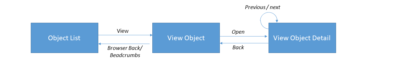
View Object
The object can be opened by:
-
a direct URL*
-
the object list view
View object navigation concepts , the UI interactions with the object may vary depending on whether the detail is accessed though table or results view in the tab.
Actions
Primary Navigation Actions
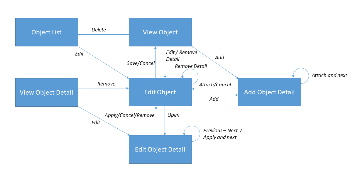
The primary navigation actions 'Edit' and 'Delete' are available on the parent object in the view mode (when specified in the floor plan). Action 'Edit' brings the object in edit mode to be updated. Action Edit also brings the tables within the tabs in edit mode.For more details on the 'Edit' mode, refer to the section 'Edit Object' in the guide. Note that the effect of not having action 'edit' configured in the floor plan is that the object and its details are shown in view mode (with the possibility to delete the object, if action delete is configured in the floor plan).
Action 'Delete' deletes an object. This requires the user to confirm the delete of the object. Once the object is deleted the user is redirected to the object search page.
For a detail object (sub resource) page when applicable, the primary navigation actions 'Edit' and 'Remove' are available.
For actions edit and remove to be available, the system requires that the 1) top level object is editable and 2) actions edit and remove are specified in the floor plan. The effect of not configuring action 'edit' for a detail object floor plan is that the object detail page is shown in view only mode.
'Edit' brings the detail object to the edit mode and it can now be updated. It also brings the parent object into the edit mode. Action 'Remove' removes the detail object from the list, brings the user back to the immediate parent object (note: not to the parent - top level - object) page. It also brings the parent object in the edit mode.
No primary navigation actions are shown for the detail object page when the detail object is non updatable, for example, message group details on message. The resource metadata provides details on whether a child list can be updated or not.
Other Actions
The other actions that are available to the user on the details are 'Add' , 'Open' and 'Remove' on the detail object (depending on the configuration of tab and results or table component).
Tab with Results Component
Action 'Add' opens the detail object page in the create mode. When more than one view and edit object plans are evaluated by the system, then they are all shown as available options in the drop down. User selects one of the options and the create object page is shown using the selected floor plan. If only one plan is evaluated, then the drop down is not shown and on selecting the action 'Add', system immediately opens the create object page using the evaluated template. For details on floor plan evaluation refer to the chapter 'Presentation Configuration in the guide.
Add as drop down list - The floor plan description is shown. The options are ordered based on the floor plan code ascending. Selecting a plan from the list, opens the create object page for the resource using the selected template.
Action 'Open', opens the detail object (sub resource) page in view or edit mode, depending on the state of the parent object. If the parent object is in the view mode, the detail object opens in the view mode. If the parent object is in the edit mode, the detail object opens in the edit mode. If the detail object cannot be updated then the action 'open', always opens the detail object in view mode. There is one exception to the rule: for a detail object that cannot be updated, the detail page always opens in the view mode.
The title on each row in the results is clickable and takes the user to the detail object page (in a new page or pop-up for Hierarchical List ) in the view or edit mode depending on the state of the parent object and whether detail object can be updated or not. The title for each results when specified is clickable and performs the same action as 'open'.
Action 'Remove' removes the detail object from the list. It also brings the parent object in the edit mode.
Tab with Table Component
Action 'Add' enables addition of a new record to the object list. It also brings the object list in edit mode.
Action 'Remove' removes the detail object from the list. It also brings the object list in the edit mode.
Detail Object Index
This information is always in (view/update/create) displayed in the detail object page.
Secondary Navigation Actions
In the detail object (sub resource) page, secondary navigation action 'Previous', ' Back to Immediate Parent*' and 'Next' are available as Links. If the detail object is the last, 'Next' is disabled, similarly if the detail object is the first in the list, action 'Previous' is disabled.
In case of a tab with Hierarchical List, when a user selects action 'Open', the detail object opens in a pop-up and the secondary navigation actions are not shown.
~* The singular resource name of the immediate parent is displayed.~
Edit Object
The user can start to edit an object by clicking the 'Edit' button from:
-
the object list screen
-
the object screen
-
one of the detail objects
Edit object navigation concepts, the UI interactions with the object may vary depending on whether the detail is accessed though table or results view in the tab. Also note that the object is shown in edit more only if action 'Edit' is configured in the floor plan otherwise it is shown in the view mode.Object detail is shown shown is edit more only if top level object is editable ( action edit is configured) and action edit is configured in the detail object plan.
Actions
Primary Navigation Actions
The primary navigation actions 'Cancel' and 'Save' are available on the parent object in the edit mode. Note that actions 'Edit' and 'Delete' are no longer available.
Action 'Save' saves the object and brings the object back to view mode. Once the user selects action 'Save' the page gets into the Busy State-'Cancel Not Allowed'. When the request is processed and a response has been received, the page leaves the busy state and the object is displayed again in the view mode. After saving, either a success confirmation or object validation is displayed.
Optimistic locking is applicable when an object is saved.
If the user decides to 'Cancel' editing an object, a confirmation message is displayed if the object has outstanding changes. This message requires the user to confirm the cancellation. If confirmed (Yes), all the updates on the object are discarded and the user is brought back to the parent object in the view mode. If the cancel action is undone (No), the dialog is closed and the object stays in the edit mode.
For a detail object page, the primary navigation actions in the edit mode are 'Cancel', 'Remove' (is available only when configured in the plan), 'Apply', and 'Apply and Next'. Note that action 'Edit' is no longer available. Action 'Remove' removes the detail object from the list and takes the user back to the immediate parent object. It also brings the top level parent object in the edit mode. A
If the user decides to cancel editing a detail, is then is brought back to the immediate parent page (in the edit mode). Note that, details previously added or edited are not canceled.
Action 'Apply', applies the changes on the detail object and brings the user back to the immediate parent object page in the edit mode. Action 'Apply and Next' applies the changes on the detail object and opens the next detail in the edit mode. Action 'Apply and Next' is not shown for the last object in the list. For a tab displaying Hierarchical List (i.e grandchildren), the primary navigation action 'Apply and Next' is not available in the pop-up.
Secondary Navigation Actions
In the detail object page, actions 'Previous', ' Back to Immediate Parent' and 'Next' are available as links, same as in the detail object view mode.
When a detail object is in the edit mode and the user has taken some actions, clicking on one of the links displays a pop-up asking for user confirmation 'Apply the changes?', When confirmed (Apply), the changes are applied and the user is taken to the next, previous or to the immediate parent in the edit mode (based on the link clicked by the user). When canceled (Cancel), the updates to the detail object are discarded and the user is taken to the next, previous or to the immediate parent in the edit mode.
For a tab displaying Hierarchical List (i.e grandchildren), the secondary navigation actions are not shown in the pop-up.
Create Object
The page to create an object is accessible in the following ways:
-
the object list page (e.g. a search page) - action Create
-
with a direct URL - when more than one floor plan apply, it is possible to specify the floor plan code as request parameter
^Create object navigation concepts , the UI interactions with the object may vary depending on whether the detail is accessed though table or results view in the tab.^
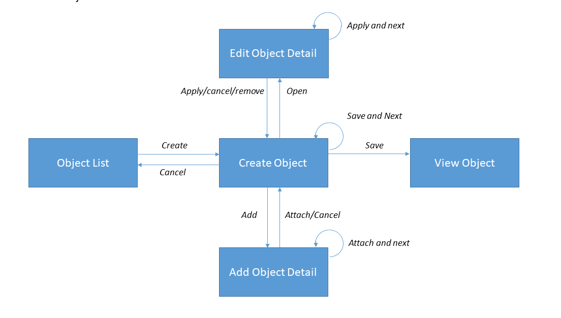
Actions
Primary Navigation Actions
The primary navigation actions 'Cancel', 'Save' and 'Save and Next' are available on the parent object in the edit mode.
Action 'Save' saves the object and this is same as described in the section edit object.
When user selects 'Save and Next', the object is saved and a new create object page is displayed. If the save is not successful, then the errors are displayed with the object/page still being in the create mode. This action also brings the object into busy state (similar to the action 'Save'), while waiting for the server response.
If at any point during the process of creating an object the user decides to cancel (without saving the object), the create object page is closed and the user is redirected to the object list page. Before closing the page an action confirmation message requires the user to confirm the cancellation.
For an detail object page, the primary navigation actions in the create mode are 'Cancel', 'Attach', and 'Attach and Next'. New details can be attached to the object using 'Attach' or 'Attach and Next'. When attaching a detail, the user can attach another detail using the same plan (Attach and Next) or go back to the immediate parent (Attach). When a detail is attached (even though the object is not saved), it is perceived to be present on the object. If the user goes back to that detail, to edit it, it is opened in the edit mode.
If the user decides to cancel attaching a detail, is then brought back to the immediate parent page (in edit or create mode, depending on the state of the object). Note that, details previously added or edited are not canceled.