Search Object - List View
This floor plan template applies to search pages which requires the results to be displayed in form of a list. The search page allows user to query on a specific resource defined in the floor plan.
Use Cases
This template is most often used to search relevant items by specifying search, filter and sort criteria and thereby get a status summary of a set of list items (e.g. claims, messages, integrations etc.)
It provides an entry to create a new object or to navigate to the details of a single item to view or update them. It is also possible to delete an item directly from the pages using this template.
Few examples of pages that currently use this template:
-
Access Roles Search
-
Dynamic Logic Search
-
Enrollment Product Search (Policies)
-
Integration Search (OIG)
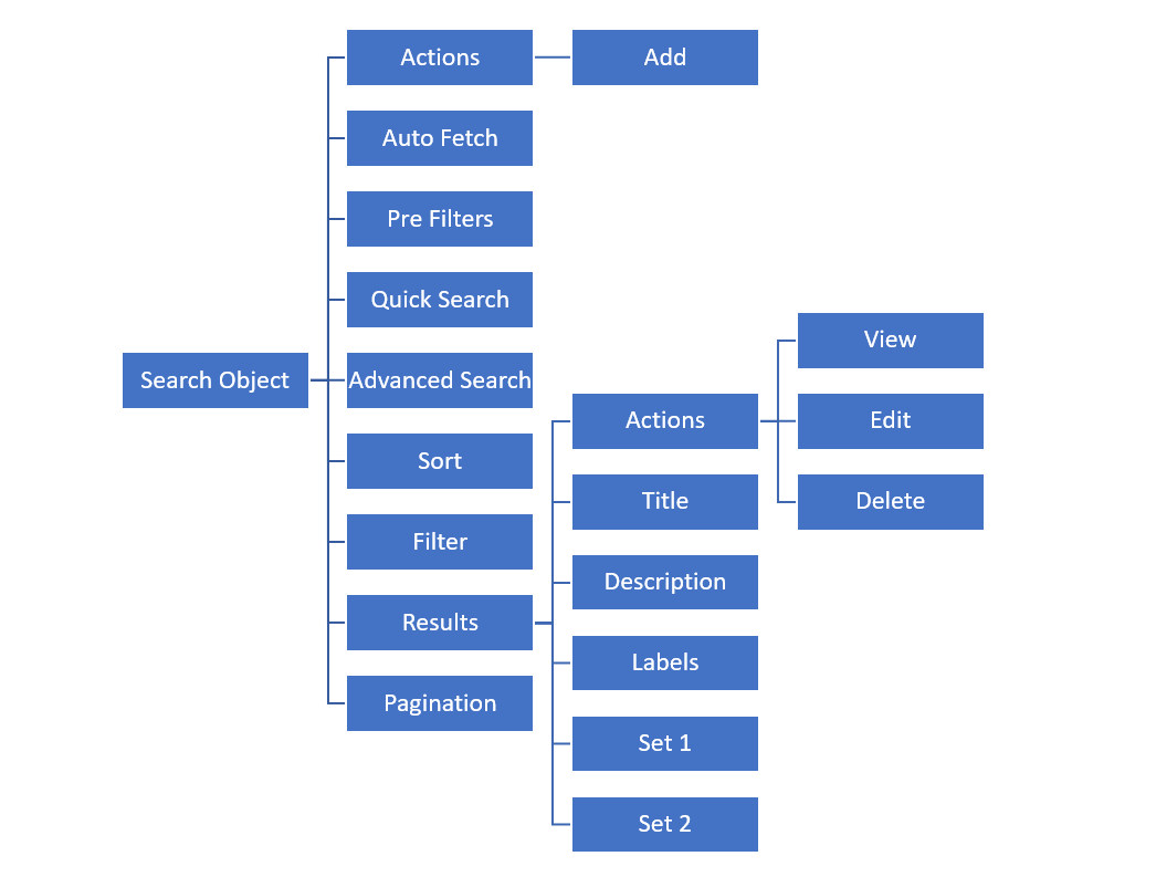
Search Object - List View Structure

Presentation Configuration
A customer can change certain aspects of a page by changing or updating the floor plans and its properties. This is done by customizing the components within floor plan’s JSON payload.
For more details refer Customizing Floor Plan Components page.
JSON Template (payload structure)
The following JSON outlines the structure of the Search Object - List View page template.
{
  "resource":
  "floorplan_search_listview":{
    "actions":[
      "add"
    ],
    "preFilter":""
    "quickSearch":{
      ..
    },
    "advancedSearch":{
    ..
    },
    "sort":{
    ..
    },
    "filter":{
    },
   "results":{
     ...
    },
    "pagination":{
     "pageSize":"",
    }
  }
}Components
Search Object - List View template can have the following components
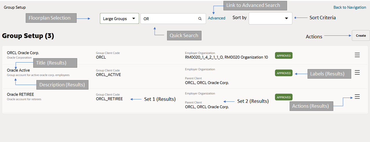
Entity name and results count
-
Non-configurable, default functionality
-
The entity name plural is displayed above the results. Next to it the total count is displayed.
-
The count is only displayed when the user has performed a search.
-
If no results match the search criteria, the message indicating that no rows were found is shown by the results component.
Floor Plan Selection:
-
Non-configurable, default functionality
-
Search Object - List View template supports multiple floor plans for the same page
-
The user can switch context with a drop-down located next to the quick search input
Actions
-
Optional component
-
By default no action is available unless specified in the floor plan
-
Only 'Add' available at page level, action link 'Create' is show when defined
-
Redirects user to the create object page (recursive) in create object mode
-
When more than one view and edit object plans are evaluated by the system, then they are all shown as available options in the drop down. User selects one of the options and the create object page is shown using the selected floor plan.
-
Create as drop down list - The floor plan description is shown. The options are ordered based on the floor plan code ascending. Selecting a plan from the list, opens the create object page for the resource using the selected template.
-
If only one plan is evaluated, then the drop down is not shown and on selecting the action 'Create', system immediately opens the create object page using the evaluated template.
-
For details on floor plan evaluation refer to the chapter 'Presentation Configuration' in the guide.
-
Example use case: To make a search object list page view only, no actions will be defined at page and results level
Auto Fetch
-
Optional property
-
Set true to auto fetch records
Pre filters
-
Optional component
-
The setting 'preFilter' takes in criteria that is executed for all the searches as 'and' condition.
-
This limits the result set on which the search is performed.
-
The filter conditions can be set using HTTP Query API grammar; e.g. setting preFilter to 'integration.code.eq('PROVIDER_EXTRACT') for exchanges search page, will shown exchanges having integration code equal to 'PROVIDER_EXTRACT'
-
Example use case: To limit the results based on the value of a field within the resource in case if multiple search object list floor plans are defined.
Quick Search
-
Optional component
-
Center aligned
-
Can be customized to search on multiple attributes including flex codes, reference fields
-
For more details refer quick search component
Advanced Search
-
Optional component
-
Displayed as a hyperlink which will display the advanced search dialog
-
Enables search on a combination of attributes
-
For more details refer advanced search component
Sort
-
Optional component
-
Displayed next to Advanced search when defined
-
Can have only default or multiple sort criteria
-
For more details refer sort component page
Filter
-
Optional component
-
Filter criteria is defined to give users option to further filter the search results
-
A filter entry is used to restrict the search query, not to compose a new query
-
Example use case: Filter defined on a resource which may have multiple statues like completed, in-progress, started etc.
-
For more details refer filter component page
Results
Required component
Used to display the search results
If no results match the search criteria, the message indicating that no rows were found is shown by the results component.
Results component consists of the following sub components
Actions
-
'View', 'Edit' and 'Delete' are shown for each result when configured in the results component.
-
Action 'Delete', deletes the object from the list. A dialog seeking user confirmation 'Delete this record?' with 'Ok' and 'Cancel' is displayed when this action is selected. Selecting 'Ok' deletes the record. When deletion of the record is successful, a success confirmation message '\{object name singular} deleted ' is shown as specified in the message handling guide section 'Success confirmation'.
-
If any messages are returned from the server other than success; then they are shown as specified in the message handling guide section 'Cross field & server side validation'
-
Action 'View' opens the 'View and Edit' object page in the view mode and the action 'Edit' opens it in the edit mode.
-
The title of each row in the results section is clickable and takes the user to the 'View and Edit' object page in the view mode.
Title
-
Shown as the main title for each record in the results
Description
-
Set property will be displayed as description displayed below the title
Labels
-
It is used to display property values in form of a label and can take in exactly one property per label
-
Multiple labels can be added to the results
Set 1 and Set 2
-
Sets are used to display multiple properties as a set
-
Each result can have up to 2 sets
-
It is recommended to use only Set 1 when using the filter component on the page
For more details refer results component page
Pagination
-
Optional component
-
Used to control number of records to be displayed on a page
-
Can be configured to display 5, 10 (default), 20, 50 or 100 records by using the 'Show' drop down list
