Table
The table component shows the object 'list' in a table view. It has the following structure:
"table":{
  "actions": [
    "add"
  ],
  row:{
    "actions": [
      "remove",
      "view"
     ],
    "labels": [{
      ...
    }],
    "columns":{
      "flexColumns":true|false
      "properties": [{
        ...
     }],
    "region":{
    ...
    },
  }
}
The component has the following sub settings.
| Setting | Description |
|---|---|
actions |
Add The events that follow when the action 'Add' is performed is floor plan specific. The consuming floor plan specifies the next possible object state when an action is taken. For details refer to the floor plan specifications. |
row.actions |
Remove /View The events that follow when the action 'Remove' or View is performed is floor plan specific. The consuming floor plan specifies the next possible object state when an action is taken. For details refer to the floor plan specifications. |
row.columns |
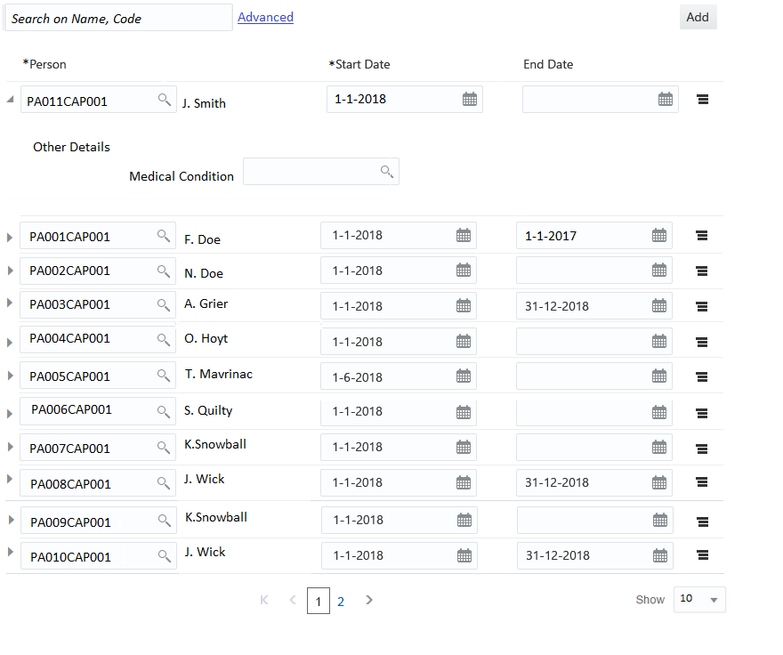
Each property forms a column in the table. The label of the property is shown as the column header. Refer to the property component description for details. Note that a multi value property is not supported as a column property. Setting flexColumns to true make it possibility to auto exclude column to avoid horizontal scroll, this feature renders only the columns that can be shown based on screen resolution. The columns which are excluded can be added to the view by explicitly selecting them. By defualt this setting is false. |
row.region |
Region component- displayed as an overflow area |
row.labels |
Label component - displayed as an extra column in the table |
This component supports the following features:
-
Column resize
-
Horizontal/Vertical scrollbar to support responsiveness.
-
Editable rows
-
Possibility to add a new row.
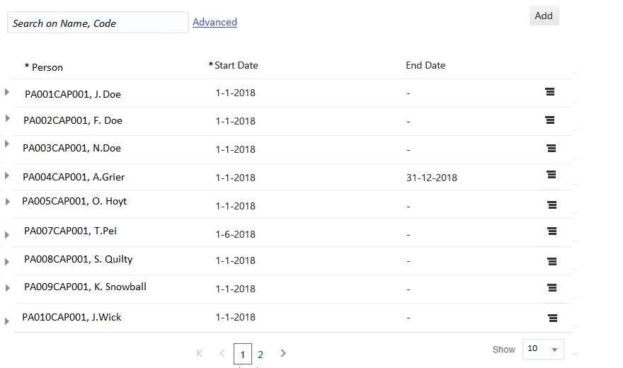
UI Specifications
The column Headers and the 'Add' button are always displayed whether there are object details to show or not.
The column headers and values are left aligned.
If the region component is defined, than an collapsible overflow area is added. The overflow area is not expanded by default.
If multiple labels are defined for a row, then each label is shown as a separate column.
Example
The table supports view and edit mode for the properties. When the object list is in the edit state (this is controlled by the page), the table rows are shown as editable. The property representation in view and edit mode follows the standards as described in the property guide. The field level validations are applicable when adding or modifying rows.
An empty row is added in the table when a user performs the action 'Add'. The overflow area (if applicable) is shown expanded for the new row. If a label component is present, then it shows up as a non editable field.If label component is set as any of the existing column property and any change to the column property value, also changes the value of the label component on tab out. The object record is removed from the table when a user performs the action 'Remove'.