JavaFX Scene Builder User Guide
6 Using the Hierarchy Panel
This chapter describes the Hierarchy panel of JavaFX Scene Builder.
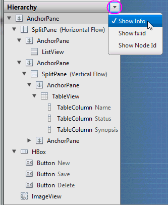
The Hierarchy panel, shown in Figure 6-1, is located on the lower left side of the tool's window. You can hide the Hierarchy panel by selecting View from the Main menu and then selecting Hide Hierarchy, or Hide Left Side Panel to hide it along with the Library panel. It shows all the UI elements that compose your FXML layout. You can use the Hierarchy panel to focus on one specific UI element, whether it is a parent node or a leaf node.
After the element is isolated, you can focus your work on that particular element and its properties by using the Content panel or the Inspector panel. The path from the root of the FXML layout to a particular UI element is displayed in the Selection bar when a UI element is isolated in the Hierarchy panel. The selected UI object is highlighted in the Hierarchy panel and in the Content panel.
You can add a new UI element to your FXML layout by dragging it from the Library panel to the desired location in the Hierarchy panel. This is especially helpful when adding a Popup control, such as a Tooltip or ContextMenu. For example, to add a Tooltip to a Button element, drag the Tooltip control from the Library panel to the target Button element in the Hierarchy panel. The Tooltip becomes a child of that Button element. You can rearrange the order of the UI elements in your layout by dragging them in and out of containers within the Hierarchy panel.
The Hierarchy panel is also useful for adding graphic element to a UI element that has the graphic property, per its API. For example, you can add a graphic element to a Button element, but not to a GridPane element. Use the following steps to add a Circle graphic element to a Button element using the Hierarchy panel:
-
From the Library panel, drag a Circle element to the target Button layer in the Hierarchy panel.
-
Without releasing the mouse cursor, hover over the Button layer for a second and you will notice a new sub-layer is created for the Circle.
-
Release your mouse cursor and the Circle appears in the Content panel, with its default radius of size 100.
-
In the Layout section of the Inspector panel, reduce the circle's radius size to 6 so that it fits more appropriately in the Button.
You can only have one graphic added to an element at any one time. To add a new graphic, you must first delete the existing one.
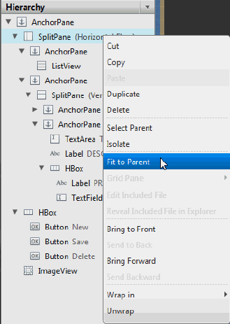
Right-clicking an element in the Content panel or a specific element layer in the Hierarchy panel displays a contextual menu of commands that you can use for the selected element, as shown in Figure 6-2. These commands are a subset of the commands that are available from the Menu Bar.
Figure 6-2 Hierarchy Panel with Drop-down List of Commands

Description of "Figure 6-2 Hierarchy Panel with Drop-down List of Commands"
When you click the drop-down menu, which is circled on the top right corner in Figure 6-1, you can choose to display the fx:id or the Node Id for each of the elements listed in the panel. The default display mode is Show Info, which displays any related information for the element, or the text value if the element has a text property. When you select Show Node Id, each component level displays the same node names used in the Selection bar. The Show fx:id command displays the value of each element's fx:id property, which is used by the application controller class that handles the logic for the UI. If one of these latter two Show commands is chosen, click on the right side of the row for the element type to activate the inline editor so you can edit the Node Id or fx:id values for the UI element.
 Cindy is a technical writer in the JavaFX group.
She has written tutorials, online help, and technical articles for Java and JavaFX technologies.
  Yves is a member of the JavaFX Scene Builder development team. He enjoys creating tutorials to help users quickly learn and adopt developer tools, such as the JavaFX Scene Builder.

