JavaFX Scene Builder User Guide
8 Defining Properties in the Inspector Panel
This chapter describes the JavaFX Scene Builder tool's Inspector panel, including its Properties, Layout, and Code sections.
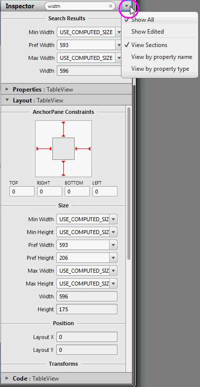
On the right side of the Content panel is the Inspector panel, as shown in Figure 8-1 with the Layout section expanded and the Inspector menu displayed. The Inspector panel is also referred to as the Right Side panel. It contains an Accordion container with multiple sections. The top section contains a Search text field, which you can use to quickly locate the properties you would like to edit. The search results are displayed in the top section, as shown in Figure 8-1. You can directly modify the properties by using the Search Results section. You can display the Inspector menu by clicking the down arrow at the top right corner, which is circled in Figure 8-1. By default, the Show All and View Sections modes are chosen. Choosing the Show Edited mode displays only the properties that appears explicitly in the FXML file. For example, only the Text, LayoutX, and LayoutY properties are displayed in the Inspector panel when a Button element is dropped from the Library panel. Choosing the View by property name or the View by property type modes display all the properties in a single tabbed section, ordered either by name or type.
The Properties, Layout, and Code sections give you access to properties for the selected UI element. Each displayed property name shown in the sections is a representation of the corresponding given property name in the JavaFX API. For example, minWidth property in the JavaFX API is displayed in the Inspector panel as Min Width. When you hover over the property name, a tooltip displays the corresponding JavaFX API name for the property and its description.
You can hide the Inspector panel by selecting View from the Main menu and then selecting Hide Right Side Panel. This feature enables you to have more room for the Content panel. Select View and then Show Right Side Panel to make the panel visible again.
Figure 8-1 Inspector Panel with the Search Results Displayed and Layout Section Opened
Description of "Figure 8-1 Inspector Panel with the Search Results Displayed and Layout Section Opened"
When multiple elements of the same type (for example, two button elements) are selected in the Content panel or the Hierarchy panel, and if any of the properties have a different value, the minus sign (-) is displayed in the text field for that property. If a new value is entered, then the new value is set for all the selected elements.
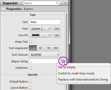
There are some properties that have a cog menu that appears on the right side of the property field when the mouse hovers over the property value editor, as shown in Figure 8-2. The cog menu provides specific actions that can be used for that editor. For example, you can set the existing property value to null or empty. Figure 8-2 shows actions available for a text editor.
Figure 8-2 Cog Menu for Property Value Editors
Description of "Figure 8-2 Cog Menu for Property Value Editors"
Properties Section
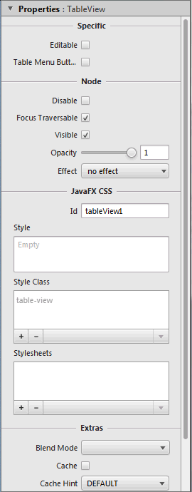
The Properties section of the Inspector panel, shown in Figure 8-3, enables you to define the style of the selected element in the Hierarchy panel or the Content panel.
Figure 8-3 Properties Section of the Inspector Panel
Description of "Figure 8-3 Properties Section of the Inspector Panel"
When the fx:id value is assigned for the selected UI element via the Code Section, that same value is also assigned to the Id field in the CSS subsection of the Properties section only if that Id field is null.
The Style, Style Class, and Stylesheets text areas in the JavaFX CSS subsection enable you to specify the style rule and style sheet to use for a particular UI component and all of its children components. You can add, delete, and put in order the style sheets that will be applied. See the Skinning with CSS and the CSS Analyzer chapter in this document for additional information.
The remaining properties displayed on the Properties section of the Inspector panel depend on the type of UI element that is selected in either the Content panel or in the Hierarchy panel. For example, if you select a radio button, toggle button, or radio menu item in the Content panel, the Properties section shows the Toggle Group property. You can use this property to assign the same ToggleGroup id for each toggle control that you want to add to a toggle group.
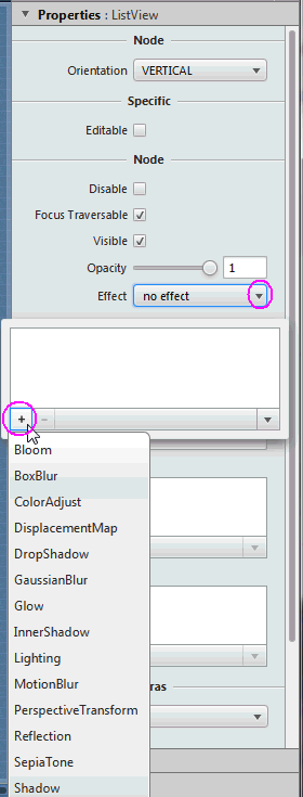
You can go from one property to another by pressing the Tab key. A new value for a property is saved when you press Enter or when you move to another property field. You can manipulate the look of the selected UI element by directly changing the value of the properties that are available and editable. For example, you can define the effects of a selected tree view element by clicking the down arrow button to open the Effects list view and the + button to display the menu of available effects, as shown in Figure 8-4. From the list of effects available, you can select one or more effects to apply to the selected UI element. To determine the order in which the effects are applied, click the up or down buttons. The effects are applied in chronological order from the top of the list to the bottom.
Figure 8-4 Effects Menu in the Properties Section of the Inspector Panel
Description of "Figure 8-4 Effects Menu in the Properties Section of the Inspector Panel"
Layout Section
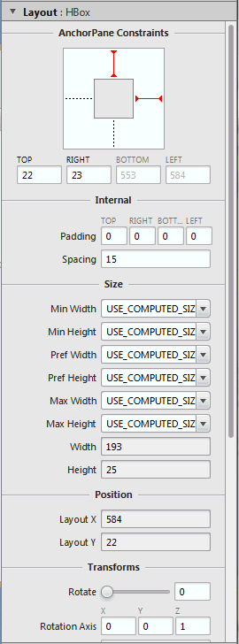
The Layout section of the Inspector panel, shown in Figure 8-5, helps you to specify the runtime behavior of the layout when the application's window is resized. It also enables you to change the size (such as, Pref Width and Pref Height) and position (such as, Layout X and Layout Y) of the selected element. Some of the information displayed in the Layout section pertains to the selected element itself (such as Min Width, Max Height, or Pref Width), and some of the information depends on the type of the container element. If the selected element is contained in an AnchorPane container, then an AnchorPane section is present in the Layout section. If the selected element is contained in a Grid Pane container, then there is a Grid Pane subsection in the Layout section of the Inspector panel. Some containers, however, do not have any associated contextual information, and so no contextual container subsection appears in the Layout section.
The AnchorPane Constraints subsection only appears when a selected element has an AnchorPane as its most immediate container. For example, in Figure 8-5, the selected HBox element's container is an AnchorPane. You can use either the diagram or the text fields in the AnchorPane Constraint subsection to manage the anchor pane's anchors. The anchors help you manage the behavior of the selected UI element when you resize the window. You can click the anchor lines to specify whether the object's size changes as the application's window is adjusted. The lines change from dashed lines to solid red lines when you click them. You can also specify the numerical values in the fields below the diagram. A grayed out numerical value means the anchor is disabled.
If the HBox element's most immediate container is a StackPane element, then the top subsection of the Layout section will be labeled as StackPane Constraints and different editable properties will be displayed.
The Transforms subsection enable you to define settings for different types of transformations, such as rotation, scaling, and translation.
Figure 8-5 Layout Section of the Inspector Panel
Description of "Figure 8-5 Layout Section of the Inspector Panel"
Code Section
Figure 8-6 displays the opened Code section when the topmost Anchor Pane layer is selected in the Hierarchy panel. In the fx:id field, you can assign a unique value for the selected UI element. If the controller class name is already set, you can select the fx:id value from a drop-down list for the fx:id field. In the Controller class field, you set the name of the controller class that provides the logic to handle the behavior of the objects in your FXML layout. If the controller class file already exists in the same folder as the FXML layout file you are working on, you can select the controller class from the drop-down list by clicking the down arrow that is circled in Figure 8-6. The path field contains the fully qualified Java class name of the controller class file, which must be located in the same folder, a sub-folder, or a parent folder in which the FXML file is saved. A suggested Java class name is displayed when you click the down arrow that is circled in Figure 8-6 and the controller class location has already been resolved by Scene Builder. If you are using NetBeans IDE with JavaFX Scene Builder and your FXML file is located in a NetBeans project, then the Controller class java file can be located in any java package inside your NetBeans project's src folder.
|
Tip: The Controller Class text field is only visible when the root container is selected in the Hierarchy panel. |
Figure 8-6 Code Section of the Inspector Panel When Root Anchor Pane is Selected

Description of "Figure 8-6 Code Section of the Inspector Panel When Root Anchor Pane is Selected"
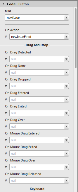
The Code section, shown in Figure 8-7, enables you to specify the action that should be taken when a drag-and-drop, keyboard, mouse, or any other event occurs on the selected element. From the drop-down list on the event text field, select the corresponding command that should be executed when a specific event or events occur for that UI element. The given command is a call to the controller method event handler. It is specified by a leading number sign (#), which is already added by default, followed by the name of the handler method. The method is expected to conform to the signature of a standard event handler, which means that it takes a single argument of a type that extends the javafx.event.Event class and should return void. For example, Figure 8-7 shows that when the OnAction event occurs on the button, the newIssueFired() controller method is executed. If you choose View from the Menu bar and then Show Sample Controller Skeleton, a skeleton sample source file that gives an example of what the method should look like in your controller source code.
Figure 8-7 Code Section of the Inspector Panel
Description of "Figure 8-7 Code Section of the Inspector Panel"
 Cindy is a technical writer in the JavaFX group.
She has written tutorials, online help, and technical articles for Java and JavaFX technologies.
  Yves is a member of the JavaFX Scene Builder development team. He enjoys creating tutorials to help users quickly learn and adopt developer tools, such as the JavaFX Scene Builder.
