JavaFX Scene Builder User Guide
7 Designing UI with the Library Panel
This chapter describes Scene Builder's Library panel and the JavaFX UI controls that are accessible from it. Included in the chapter is information about some of the container elements available in the Library panel. Also discussed is how to handle custom and unknown UI types.
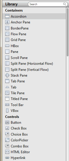
The Library panel, shown in Figure 7-1, is located on the left side of the Main window. You can hide the Library panel by selecting View from the Main menu and then selecting Hide Library or Hide Left Side Panel to hide it along with the Hierarchy panel. The Library panel includes the list of Containers, Controls, Popup Controls, Menu Content, Shapes, and Charts elements that are available in JavaFX Scene Builder. These UI elements are the same UI elements that are delivered with the JavaFX platform.
As mentioned earlier, when you open a new FXML layout in Scene Builder, it contains an AnchorPane as the default root container. You can use other root containers as well. You can add onto that root container as many containers or UI elements as needed for your FXML layout.
To add one of the UI elements from the Library panel, you select an item from the list on the panel and drag it onto the Content panel. You can also press the Enter key or double-click a selected item in the Library panel to add it to the Content panel. Either of these actions is equivalent to choosing the Insert command from the Menu bar, or choosing Modify and then Add command if the highlighted element in the Library is a Popup Control.
Use the Search field, located at the top right corner of the panel, to filter the list of elements available in the Library. For example, typing button in the Search field displays all the button type elements.
The following sections discuss some of the container elements that are available in the Library panel and how to maximize their usage in the JavaFX Scene Builder tool. Also described are custom and unknown types. To learn more about all the other UI elements offered with the JavaFX SDK platform, see the JavaFX API documentation.
Grid Pane Container
The Grid Pane container enables you to create a flexible layout of UI elements that are organized in rows and columns. Use the Grid Pane in your layout by selecting Grid Pane from the Container section of the Library panel and dragging it to the Content panel. You can then add other UI elements within the Grid Pane container, and elements are automatically arranged based on the padding, gap, and other properties.
You can also add a Grid Pane container element so that it contains the UI elements that you have already added to your layout. Use the following steps:
-
Choose Edit and then Select All from the Main menu to select all of the elements in your layout.
-
Add the Grid Pane container by selecting Arrange from the Main menu, Wrap in, and then Grid Pane from the list of containers.
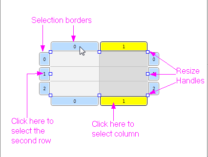
When an empty grid pane is not selected in the Content panel, it is not visible. To make its borders visible, click the corresponding layer in the Hierarchy panel for that Grid Pane. To work with a specific grid pane, click directly within its perimeter, but not on any of the elements that it contains. When selected, a Grid Pane is surrounded by a light blue colored border tabs and each corresponding index number is displayed, as shown in Figure 7-2. You select either a single column or row by clicking within the selection border tab. The tabs of a selected column or row acquires a yellow background, as shown by column 1 in Figure 7-2.
To see the submenu of actions that you can take on a grid pane, do one of the following:
-
Right-click anywhere in the Content panel, choose Grid Pane from the contextual menu.
-
From the Main menu, choose Modify and then Grid Pane.
You can move a row up or down, and move a column left or right. You can also delete or add a row or column, and increase or decrease the span for a row or column.
The Layout section of the Inspector panel also enables you to modify the currently selected Grid Pane. The properties related to the selected row or column are displayed and can be managed in the GridPane Row or GridPane Column section.
You can move an element from one grid cell to another existing grid cell. In the Content panel, select the element that you want to relocate, and with the mouse button pressed, drag the element to the target grid cell, as shown in Figure 7-3. Notice that the target grid cell changes to have a gray background as soon as you hover your cursor over it. When you release the mouse button, the element is moved to the target grid cell location in the Grid Pane.
Figure 7-3 Moving an Element to Another Grid Cell
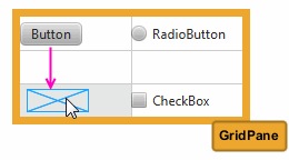
Description of "Figure 7-3 Moving an Element to Another Grid Cell"
To move an element to a new row or column that has not been created, select the element in the Content panel and drag it to the divider line that is between the rows or columns where you want the new row or column to be inserted. As you hover the mouse over the cell divider, the cell divider line becomes thicker and gray. When you release the cursor, the new row or column is created, and the element is dropped in the target grid cell. Figure 7-4 shows a Button element being dragged to a new grid cell on the second row of a new column that is about to be inserted.
Figure 7-4 Moving an Element to a New Row or Column
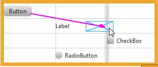
Description of "Figure 7-4 Moving an Element to a New Row or Column"
Border Pane Container
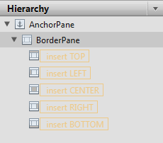
The Border Pane container enables you to layout UI elements in the top, right, left, bottom, and center positions of the container. Use the Border Pane in your layout by selecting the BorderPane element from the Container section of the Library panel and dragging it to the Content panel. Figure 7-5 shows the Hierarchy panel after the BorderPane element is added.
Figure 7-5 Hierarchy Panel After BorderPane Container Is Added
Description of "Figure 7-5 Hierarchy Panel After BorderPane Container Is Added"
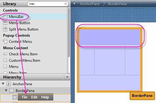
You can add a UI element to the Border Pane container by dragging it from the Library panel onto the specific position in the Border Pane. You can also drag an element from the Library panel to the Hierarchy panel, as shown in Figure 7-6. Notice that when the element is dragged over a target layer in the Hierarchy panel, the layer's corresponding position in the Border Pane changes to a darker shade in color, as shown on the right side of Figure 7-6.
Figure 7-6 Add Menu Bar Element to the BorderPane
Description of "Figure 7-6 Add Menu Bar Element to the BorderPane"
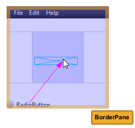
You can move an element from one position to another. In the Content panel, select the element that you want to relocate and with the mouse button pressed, drag the element to the target position, as shown in Figure 7-7. Notice that the background color of the target position gets darker as soon as you hover your cursor over it. When you release the mouse button, the element is moved to the target position location in the Border Pane.
Figure 7-7 Moving an Element to Another Position
Description of "Figure 7-7 Moving an Element to Another Position"
Tab Pane Container
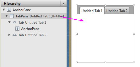
The Tab Pane is one of the container elements available in the Library panel. By default, the Tab Pane comes with two Tab elements, which contain an Anchor Pane element each, as shown in Figure 7-8.
Figure 7-8 Tab Pane Element Added in the Hierarchy Panel and Content Panel
Description of "Figure 7-8 Tab Pane Element Added in the Hierarchy Panel and Content Panel"
You can change a Tab element's default title by double-clicking the title and directly editing its Text property in the Content panel. To add another Tab element to a Tab Pane container, drag and drop a Tab element from the Library panel to the Tab Pane in the Content panel. The new Tab element is added to the right of any existing Tab elements. Use the Hierarchy panel to change the order of the Tab elements within the Tab Pane. Drag and drop the Tab element's row to the target location within the Tab Pane container in the Hierarchy panel.
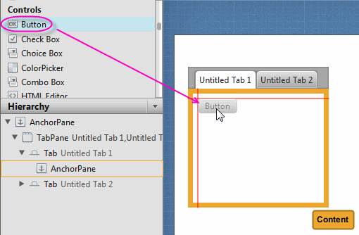
To add UI elements to a Tab element's Anchor Pane, click the title of the target Tab element to select it. Drag and drop the UI element that you want to add from the Library panel to the Tab element, as shown in Figure 7-9.
Figure 7-9 Add UI Elements from Library Panel to the Tab Element in Content Panel
Description of "Figure 7-9 Add UI Elements from Library Panel to the Tab Element in Content Panel"
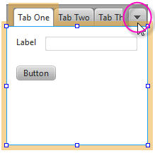
Depending on the length of each Tab element's title and the number of Tab elements in your Tab Pane container, there comes a point when some Tabs become hidden. When this occurs, a drop-down menu is automatically added to the Tab Pane container's menu bar, as shown in Figure 7-10. This drop-down menu enables the tab of choice to be selected. This menu is not active in the Content panel, but is functional when you view the layout in the Preview window. If the Tab Pane container is resized so that all the Tab elements are fully visible, the drop-down menu is automatically removed from the Tab Pane's menu bar.
Figure 7-10 Tab Pane with Multiple Tab Elements and a Drop-Down Menu
Description of "Figure 7-10 Tab Pane with Multiple Tab Elements and a Drop-Down Menu"
Menu Controls
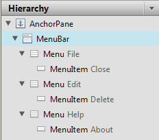
The Controls section of the Library panel contains three menu-related control elements: MenuBar, Menu Button, and Split Menu Button. When you drag and drop a MenuBar from the Library panel onto the Content panel, it comes populated with Menu elements that are labeled File, Edit, and Help. By default, each of these Menu elements contains one Menu Item element, as shown in Figure 7-11.
Figure 7-11 Menu Bar and Its Contents Displayed in the Hierarchy Panel
Description of "Figure 7-11 Menu Bar and Its Contents Displayed in the Hierarchy Panel"
Because the Menu and Menu Item elements do not have graphical representations that are visible in the Content panel, you use the Hierarchy panel to select and manage these elements. You can change the order of how the Menu elements are displayed in the Menu bar by selecting the Menu element in the Hierarchy panel and dragging it to a new location within the Menu where you want it to appear. You can directly modify the text property of the Menu or Menu Item element by selecting it and clicking on the text area, which puts you into edit mode. You can also use the Properties section of the Inspector panel to modify the Text field.
You can add other menu-related items, such as another Menu Item or a Separator Menu Item, by dragging the element from the Library panel to the desired Menu location in the Hierarchy panel. To create a second-level menu, drop a Menu element within an already existing Menu element in the Hierarchy panel.
Use the Preview menu to see your Menu bar in action. From the Preview window, you can click a Menu item and any of its submenus. If your current platform supports it, you can choose the Use System Menu Bar property from the Properties section of the Inspector panel to make the Preview window display the menu bar as it would appear on your native system.
Custom and Unknown Element Types
A custom type element is any UI element type that is not part of the JRE 7 (Java with JavaFX) libraries of UI elements. It is a Java class that has been created by the user or by a third party. A custom element type is an "Unknown Type" until it is resolved. Choose the Preview command from the Menu bar and then the Resolve Unknown Types command to define the classpath to use for the custom element type.
You can also load an FMXL file that already contains your own custom UI controls, unless those UI controls require specific builder or builder factories. When you initially load your FXML file that contains element types that Scene Builder does not recognize, a dialog box appears enabling you to enter the classpath for the custom UI types.
In some cases, JavaFX Scene Builder is able to load a file that contains unknown element types even if you choose to not provide their classpaths. The unknown type will not be displayed in either the Control panel or the Hierarchy panel, but their FXML elements will be preserved.
If you provide a class path for your custom element types, Scene Builder should be able to render them in the Content panel and the Hierarchy panel. The properties that are specific to the custom element type will appear in the Miscellaneous category of the Properties section of the Inspector panel. Since JavaFX Scene Builder does not know about your custom types, it might not be able to display their subnodes in the Hierarchy panel. You can also copy and paste a custom type to create another element of the same custom type.
Using Your Own Custom Type
If you want to add your own custom UI controls in your FXML layout, use the following suggested steps:
-
Create a skeleton FXML file by choosing the File and then New commands from the Menu bar in JavaFX Scene Builder.
-
At the place where you would like to insert your own custom UI control, insert an instance of its closest JavaFX super class as a place holder.
-
Choose Save from the Menu bar and close the FXML file.
-
Using NetBeans IDE, Eclipse IDE, or your favorite text editor, open the FXML file that you just created. Replace the name of the place holder JavaFX element with the name of your own custom class, and also add the appropriate
<?import?>clause at the beginning of the FXML file. -
In JavaFX Scene Builder, choose File and then Open Recent from the Menu bar to open your file again. In the dialog box, enter the class path name to your custom element type and save the change to continue loading the file.
 Cindy is a technical writer in the JavaFX group.
She has written tutorials, online help, and technical articles for Java and JavaFX technologies.
  Yves is a member of the JavaFX Scene Builder development team. He enjoys creating tutorials to help users quickly learn and adopt developer tools, such as the JavaFX Scene Builder.

