Creating and Configuring Graphs for Custom Reports
Note: Custom reports are supported for the Email, SMS, Mobile App (for Push notifications, In-app messages, and messages sent to Message Center), and Web Push channels. Learn more about the prerequisites to creating custom reports. Additionally, when creating custom reports, keep in mind these important considerations for Mobile App custom reports and for Message Center dimensions.
Dashboards provide the ability to create custom reports (also called analysis), and you can use graphs to present the report data in a more visual way.
To create a graph:
- Create your report, then select the Results tab and click
 .
. - Select the graph type you want.
Tip: Select Recommended Visualization for help selecting a graph type.
A graph is added below the current view. If the table includes multiple columns, the system automatically selects some filterable prompts for the graph.
To configure a graph:
- After creating your graph in the Results tab, click
 on your graph.
 - Make your changes using the toolbar buttons.
You can drag and drop columns into different sections from any folder in Subject Areas to add columns.
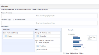
- Use the following sections in the Layout panel to configure the graph:
- Graph Prompts: Drop columns into this section to create a filterable prompt for the graph.
Tip: Prompts are drop-down fields that allow report users to dynamically filter the results of a report.
- Measures: Drop columns into this section to specify which values to plot.
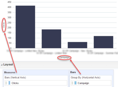
- Bar, Line, etc.: The name of this section varies, depending on the type of graph you selected. Drop columns into this section to select the object for which to plot values. For example, if you select Campaign in a bar chart, each bar will represent a campaign.
Example: In the illustration below, the graph shows clicks for each selected campaign. ”Clicks” was selected as Measures, and “Campaign” was selected as Bars.

- Graph Prompts: Drop columns into this section to create a filterable prompt for the graph.
- Click Done.

