Time Period Comparison Dashboard
Note: This dashboard is available only to users with the Email Analytics Manager role.
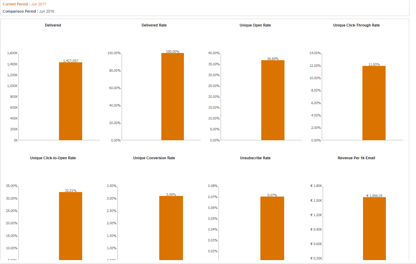
This dashboard shows changes in key performance metrics for email campaigns over specific time periods such as year over year or month over month.
This dashboard includes the following charts:
To open the Time Period Comparison Dashboard and select a Comparison Period:
- Click
 Insight on the side navigation bar, and select Interactive Dashboards.
 - Click Dashboards > Analytics.
- On the Analytics page, select the Email tab and expand Performance.
- Click Time Period Comparison.
- Select the month to compare from the Analysis Month drop-down list.
- Select the intervals to compare from the Comparison Type drop-down list.
- Click Apply.
Tip: The current and comparison periods are displayed above the charts.
Measures
A measure is a numerical measurement representing the calculations gathered from your Oracle Responsys account and applied to your reports.
| Measure | Definition |
|---|---|
| Delivered | Number of successfully delivered messages (that is, Sent minus Bounced) |
| Delivered Rate | (Delivered / Total Emails Sent) * 100% |
| Unique Open Rate | (Unique Opens / Delivered) * 100% |
| Unique Click-Through Rate | (Unique Clicks / Delivered) * 100% |
| Unique Click-to-Open Rate | (Unique Clicks / Unique Opens) * 100% |
| Unique Conversion Rate | (Unique Conversions / Delivered) * 100% |
| Unsubscribe Rate | (Unsubscribes / Delivered) * 100% Unsubscribes do not register as Clicks and therefore do not contribute to the calculation of Click-Through Rate, which is why a campaign's Click-Through Rate may be different from its Unsubscribe Rate. Learn more about setting up the default unsubscribe action for campaigns. |
| Revenue Per 1K Email | (Total Revenue / Total Delivered) * 1000 |
Time Period Comparison Charts
Use this chart to analyze the following key performance metrics over time: delivered, delivered rate, unique open rate, unique-click-through rate, unique click-to-open rate, unique conversion rate, unsubscribe rate, and revenue per 1k email.