Lists - Previous UI Version Layout
This help topic describes how to work with lists that do not use the redesigned list view layout and functionality.
For a list of lists using the redesigned list view layout and functionality, see Feature Changes in the Redesigned User Experience.
For information about the redesigned layout and functionality, see Lists.
Some of the lists available in SuiteProjects Pro such as the report status list, for example, do not currently use the redesigned list view layout and functionality. This help topic provides information about lists in the previous version of the SuiteProjects Pro UI for reference.
-
Advanced filters - Select an existing filter from the dropdown list to show the filter conditions. Select All to show all items in the list. Select New filter ... to create a new filter. The advanced filter functionality is otherwise similar to the default advanced filter functionality for redesigned list views. See Default Advanced Filters UI.
-
Tab navigation - Click one of the tabs in the list toolbar to go to a different list tab or to a different view accessible from the list.
-
List layout - This functionality is similar to list layout for redesigned list views. See Personalized List Layouts.
-
Columns selection - This functionality is similar to the column selection for redesigned list views. See Selecting List Columns.
-
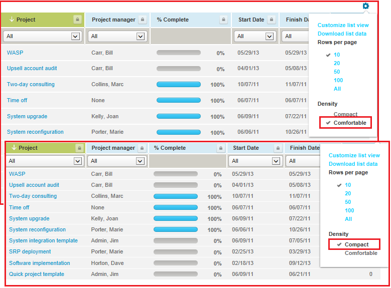
List settings - Click the settings icon
 to show the list settings menu. The menu options include:
-
Customize list view - This functionality is equivalent to the newer column selection panel. You should use the newer column selection tool that includes significant usability improvements.
-
Download list data - Click to download your list data. The download file format options are the same as for the redesigned list views. See Download Your List Data.
-
Rows per page - Select the maximum number of rows the list can show per page.
-
Density - Select comfortable or compact to control the density of the list data. In compact mode the margins are trimmed and headings wrapped to make more information visible.
-
Resize columns - When enabled, you can drag the right-side border of a column to change its width, and an additional option is available to reset column sizes.
-
-
Column headers - You can:
-
Click a column header to sort the list data by this column, or change the sort order. The column shows with a green color background if used for sorting the list data.
-
Use column filters under the column header to apply simple filter conditions and limit the number of rows shown in the list.
-
Click the run icon
 to run bulk actions on all rows that have the box checked in the same column.
-
-
List data - The list data supports the QuickViews functionality, lets you identify active list items at a glance with a green color check mark
 .
. -
Page navigation - The page navigation enabled you to move through the list quickly regardless of its size. Click the First icon
 , Prev link, Next link, or Last icon
  to go to the first, previous, next or last page of list data, respectively. The page of data that is currently shown is indicated with a dark gray background, and up to 5 contiguous page numbers are shown. If the list contains more pages of data, you can point to the numbers and select a page number to jump to that page.
