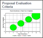
Proposal evaluation Criteria
This chart displays a bubble chart for proposal (charter) that qualify the filter criteria. The X and Y Axis are represented by evaluation criteria, and the size of the bubble is determined by the initial financial forecast value of the proposal. You must select the appropriate Initiative (if applicable) and the # of Proposal (Charter) to display. (Max 40 at a time).
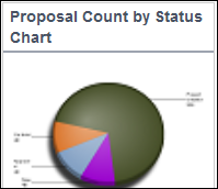
Proposal Count by Status
This pie chart displays a count of proposals that meet the selected filter criteria and its current status. The proposals are grouped by their status. Click once to view the proposals that make up the slice, and twice to view the Proposal Listing report pertaining to the selected slice.
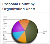
Proposal Count by Organization
This pie chart displays a count of proposals that meet the selected filter criteria and the top-level organization it belongs to. Click once to view the proposals that make up the slice, and twice to view the Proposal Listing report pertaining to the selected slice.
Dashboard Component Properties
Component Name | Data Available for X-axis | Data Available for Y-axis | Category | Sub-Category | Default Drill Down | Supported Chart Type |
|---|---|---|---|---|---|---|
Proposal Evaluation Criteria |
|
| Proposal |
| Measure List, Data and Chart | Bubble |
Proposal Count by Status |
|
| Proposal | Count | Proposal Listing Report | Pie |
Proposal Count by Organization Chart |
|
| Proposal | Count | Proposal Listing Report | Pie |
See Also
Legal Notices
Copyright © 2000, 2016,
Oracle and/or its affiliates. All rights reserved.
Last Published Tuesday, June 21, 2016