Working with landing page content components and layouts
The Oracle Eloqua landing page Design Editor uses content components and layouts to help you build your landing page.
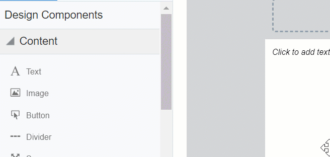
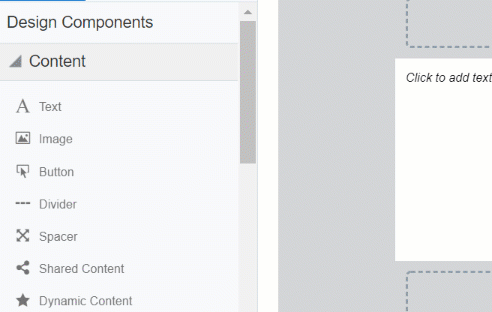
Content components
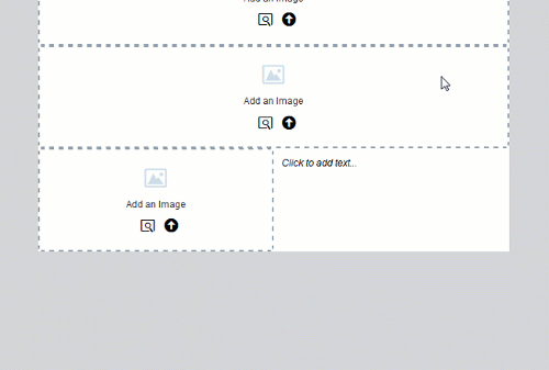
Content components are types of elements that you can include in your landing page. Content types include text, buttons, images, forms, and more. You can add content components to sections of a layout. Content added to layouts creates a content component in your landing page.
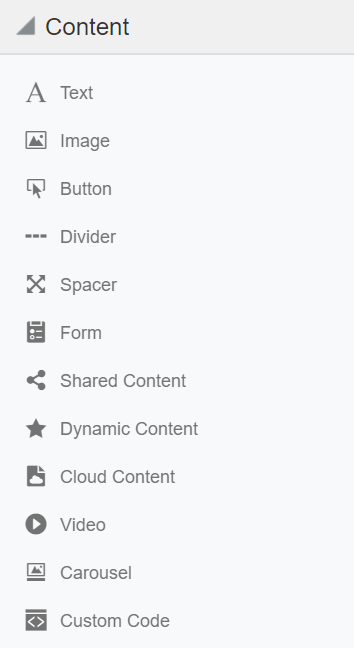
The following content types are available:
- Text: Add summaries, instructions, and other relevant information to your landing page using the text content component. The default typeface and color will automatically be applied, unless text is customized with the toolbar. Use the toolbar to insert hyperlinks and field merges, modify text style and color, add bullets, and so on. You can also write right-to-left.
- Images: Add images from the Oracle Eloqua component library, from your machine, or Oracle CX Content (formerly Oracle Content and Experience Cloud).
- Buttons: Buttons are an effective way to create calls-to-action in your landing pages. Button content is text only and cannot use images. Select hover state to better indicate when a user hovers over the button. You can hide buttons in mobile and write right-to-left when adding button text.
- Dividers: Dividers are horizontal lines used to visually separate content on your landing pages.
- Spacers: Spacers are used to create blank areas on your landing pages. The size, background color, and border can be customized.
- Shared content: Shared content is reusable content snippets that you can create once, then reuse in different emails and landing pages. It allows you to "build once, re-use everywhere" for your most valuable common pieces of content. Shared content is stored in the component library.
- Forms: Easily insert Oracle Eloqua forms in your landing pages. The form's styling, such as field spacing, background color, and font, can be customized in the Design Editor to match the rest of your landing page. Existing Oracle Eloqua forms brought into the responsive editor will be automatically responsive. Learn more about adding forms.
- Dynamic content: Dynamic content allows you to display information that changes based on specific rules and conditions. For example, you could personalize a landing page with the recipient's sales rep information based on the city, state, country, or region specified in the contact's profile. Dynamic content is reusable content stored in the component library. Learn more about
- Cloud content: Cloud content is content provided by an external service. Cloud content apps must be installed by your administrator.
- Video: Natively insert Vimeo or YouTube videos to your landing page to better engage users and share rich media content. Learn more about adding videos.
- Custom code: Adding custom code provides additional ways to style your landing pages.
- Carousels: Image carousels cycle through several image slides automatically at a specified speed or manually. They allow you to present similar and reinforcing content in the same space and make for a more engage landing page. Learn more about adding image carousels.
Note: Oracle Eloqua validates that dynamic and shared content is responsive. If there are issues with responsiveness, a notification appears  . Click the notification icon to review the issues. You can edit the content components from the Design Editor or from the component library. As you make changes, review the responsive validation errors in the rich text editor.
  indicates that there are no responsive concerns.
  indicates that there might be responsive issues.
Tip: When inserting hyperlinks on your landing page, you can select Lightbox as your link type. Clicking the hyperlink displays a pop-up on your landing page that can contain images, buttons, text, or a form.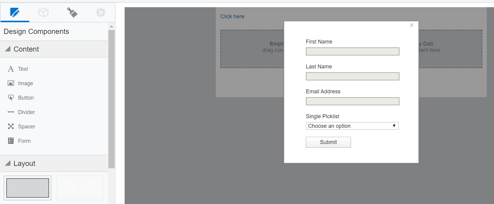
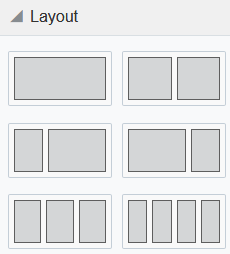
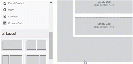
Layouts
Layouts determine where you can place content components. Layouts consist of one or more columns that you can add content components to. Oracle Eloqua provides you with several layouts that you can customize with content components.
Learn how to work with these design components:
- Adding content components or layouts
- Copying content components or layouts
- Moving content components or layouts
- Deleting content components or layouts
- Resizing columns
- Padding and borders
Adding content components or layouts
After you initially choose a layout for your landing page, you can add content components and layouts to customize the landing page design.
To add content components or layouts:
- With your landing page open, drag content component or layout to your landing page.
Copying content components or layouts
To copy content components or layouts:
- With your landing page open, click the content component or layout you want to copy.
- Click
 .
.
- Move the content component or layout to the location you want it.
Moving content components or layouts
You can move a content component vertically or horizontally. You can move a content component to a new layout. You can move a layout vertically.
Note: You cannot move content components if you are in the mobile view. You can move a layout in mobile view.
To move content components or layouts:
- With your landing page open, click the content component or layout you want to move.
- Click
 and drag the content component or layout to the new location.
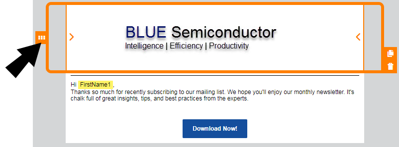
Deleting content components or layouts
To delete content components or layouts:
- With your landing page open, click the content component or layout you want to delete.
- Click
 . You can click
  to undo your change.
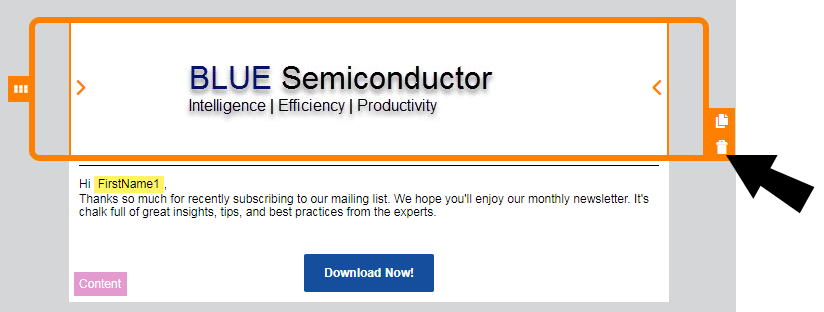
Resizing columns
To resize columns in a layout:
- With your landing page open, click on the layout that contains the columns you want to resize.
- Click on
 or
or  to decrease or increase the size of the columns.
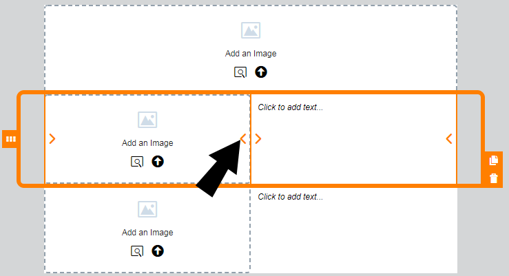
Padding and borders
You can add padding to most content components and add borders to both a content component and layout.
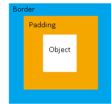
Padding
You can adjust the space around a content component using the padding options available from the panel. You cannot adjust the padding for a layout.
Borders
Add a border around the content component or layout by turning on borders. For multi-column layouts, you can adjust the borders for each column.
The border goes around the padding.