Chart Tab
The Chart tab lets you create visualizations of your dataset query results. All fields in the dataset appear in the Dataset Panel on the left. To build your chart, drag fields from the Dataset Panel to the Layout panel, then click the Refresh icon  . The chart is displayed in the viewer on the right.
You can create multiple charts using the same dataset query results.
For information about how to use the Chart tab to create a chart with your dataset query results, see Workbook Charts.
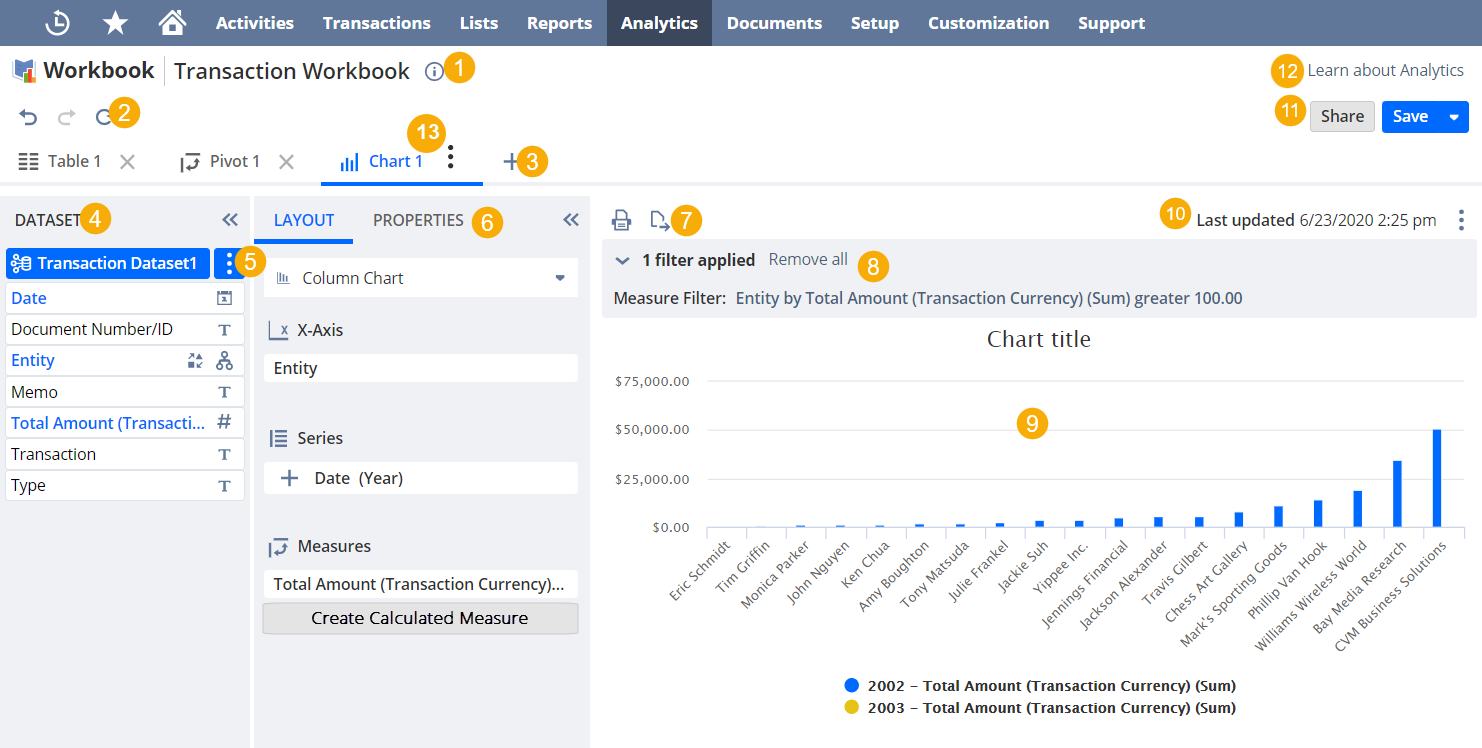
The image below shows the parts of the Chart tab:
-
Workbook Information - Click to view or edit the workbook name, description, internal ID, or add a translatable portlet name to your Analytics portlets. This information is available from anywhere within the workbook.
For more information about translatable Analytics portlet names, see Adding Translatable Analytics Portlet Names.
-
Undo, Redo, and Refresh - Undo or redo your latest edits, and refresh the data in the workbook visualization you are currently in. The undo and redo options apply to any action within the workbook and not only the current tab you are in. For more information about data refreshing, see Data Refresh in SuiteAnalytics Workbook.
-
Add - Click the add icon to add a new workbook visualization.
-
Dataset Panel - The Dataset Panel is on the far left area and has all the fields from the selected dataset. To build a visualization, drag fields from the Dataset Panel to the Layout Panel or the Table Viewer. You can also edit the dataset or switch to a different one using the Dataset Selector at the top.
-
To view or edit a dataset, click its name in the Dataset Selector.
-
To see more information about a field, point to it and click the
 icon.
icon. -
To collapse the Dataset Panel and expand the Viewer, click the double arrows
 .
.
-
-
Dataset Selector - This list lets you access and edit the datasets connected to the visualization, select a different one, or connect a dataset that's not already used in another visualization. In visualizations with linked datasets, you can also edit the dataset link.
-
To view or edit a dataset, click its name in the Dataset Selector. Alternatively, click the menu icon and select Open Dataset.
-
To connect or create a new dataset, click the arrow and select Connect Dataset.
-
To edit the dataset link, click the dataset menu icon and select Edit Dataset Link.
-
To save or discard changes to the selected dataset, click the menu icon and select Save Changes or Discard Changes. You need to save or discard changes to all connected datasets before you can save the workbook.
-
-
Layout panel - The Layout panel shows your chart layout. For date and numeric fields, the summary type is shown next to the field. Every time you change your layout, click the Refresh icon
to see the updates.-
To select a chart type, click the chart type link and select an option. The following options are available:
-
Column Chart
-
Bar Chart
-
Area Chart
-
Line Chart
-
Stacked Column Chart
-
Stacked Bar Chart
-
Stacked Area Chart
For more information, see Chart Types.
-
-
To show measures as a percentage of the totals for each record, click Show percentage. You can do this for stacked charts only.
-
To add fields to the layout, drag them from the Dataset Panel to the section you want. As with pivot tables, you can group multiple fields in the same chart component to change the level of detail. For more information, see Grouping Pivot Table Fields.
-
To add a calculated measure, click Create Calculated Measure and set up your calculations. Calculated measures are displayed with a calculator
 icon. For more information, see Calculated Measures.
 -
If you're in a NetSuite account with multiple currencies or subsidiaries and your workbook has fields with values in different currencies, click the Field Menu icon
 next to the field and select Currency... to convert or consolidate. You need to do this to run calculations on those fields. For more information, see Currency in Datasets and Workbooks.
 -
To create a value-based filter for the chart, click the Field Menu icon
and select Filter [Field name].... You can also create measure-based filters if you select the Top 10 [Field name], Bottom 10 [Field name], or Filter [Field name] by options. For more information, see Workbook Visualization Filters. -
To rename a field, click the Field Menu icon
and select Rename.... -
To format numbers in the chart, click the Field Menu icon
and select Format.... For more information, see Customizing Numeric Values. -
To change the summary type for dates and numbers, click the Field Menu icon
next to the field and select the summary type you want. -
To change a field's the summary type, click the Field Menu icon
and select the summary type you want. -
To add a title, subtitle, or axis labels, click the Properties subtab and fill in the fields.
-
To collapse the Layout panel and expand the Chart Viewer, click the double arrows
.
-
-
Chart menu - This menu has additional options for the chart in the viewer. The following options are available:
-
Print
 - Print the current chart.
 -
Export
 - Export the current chart as an SVG file.
-
-
Chart filter summary - Shows a summary of the filters applied to the chart. Filter conditions created on the Chart tab only affect the chart, not the dataset.
-
Chart Viewer - Shows your chart after you update the layout and click Refresh
.In the Chart Viewer, you can do the following:
-
To see the exact amount for a measure, point to the bar or data point you want in the chart.
-
To hide specific data points, click the corresponding color in the legend below the chart.
-
-
The data refresh details you see depend on whether the Cached Data in Datasets feature is enabled or not:
-
Cached Response / Real-time Response Data from [time] - Displayed when the Cached Data in Datasets feature is enabled. It tells you if the visualization is showing real-time or cached data, and when it was last updated.
-
Last Updated - Displayed when the Cached Data in Datasets feature is disabled. It shows when the data in the current visualization was last updated. To get the latest results, click the Refresh icon.
For more information, see Data Refresh in SuiteAnalytics Workbook.
-
-
Workbook Menu - You can open this menu from any workbook visualization.
-
Click Share to share the workbook and any connected datasets with other users in your account.
For more information, see Accessing and Sharing Workbooks and Datasets
-
Click Save to save your workbook, including all your selections in each visualization. You can only save your workbook if the connected datasets have been saved too. If you don't own the connected datasets, save copies with different names.
-
-
Learn about Analytics - Click Learn about Analytics to open a panel with all SuiteAnaltyics Workbook videos and their descriptions. To watch a video, click the thumbnail and it opens in a new window.
-
Tab Menu - Hover over the Tab menu icon
and select Rename Tab or Delete Tab. You can also rename your table view by double-clicking the tab name.