34 Bubble Chart
This chapter describes the bubble chart, a two-axis chart that plots bubbles for the data points in a series.
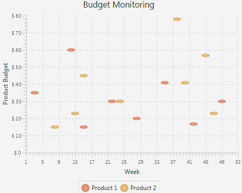
Each data item can be defined by two or three parameters. Figure 34-1 shows a typical bubble chart, where each data item is presented by the three following parameters: X value, Y value, and the radius of the bubble.
Creating a Bubble Chart
To create a bubble chart in your JavaFX application, at minimum, you must instantiate the BubbleChart class, define horizontal and vertical axes, and specify one or more series of data by using constructors of the XYChart.Data class with two or three parameters. Example 34-1 creates a bubble chart with two series of data. Each data item is represented by X and Y values: a number of a week and an amount of product budget.
Example 34-1 Creating a Bubble Chart with Two Data Parameters
import javafx.application.Application;
import javafx.scene.Scene;
import javafx.scene.chart.BubbleChart;
import javafx.scene.chart.NumberAxis;
import javafx.scene.chart.XYChart;
import javafx.stage.Stage;


public class BubbleChartSample extends Application {

    @Override public void start(Stage stage) {
        stage.setTitle("Bubble Chart Sample");
        final NumberAxis xAxis = new NumberAxis(1, 53, 4);
        final NumberAxis yAxis = new NumberAxis(0, 80, 10);
        final BubbleChart<Number,Number> blc = new
            BubbleChart<>(xAxis,yAxis);
        xAxis.setLabel("Week");
        yAxis.setLabel("Product Budget");
        blc.setTitle("Budget Monitoring");

        XYChart.Series series1 = new XYChart.Series();
        series1.setName("Product 1");
        series1.getData().add(new XYChart.Data(3, 35));
        series1.getData().add(new XYChart.Data(12, 60));
        series1.getData().add(new XYChart.Data(15, 15));
        series1.getData().add(new XYChart.Data(22, 30));
        series1.getData().add(new XYChart.Data(28, 20));
        series1.getData().add(new XYChart.Data(35, 41));
        series1.getData().add(new XYChart.Data(42, 17));
        series1.getData().add(new XYChart.Data(49, 30));

        XYChart.Series series2 = new XYChart.Series();
        series2.setName("Product 2");
        series2.getData().add(new XYChart.Data(8, 15));
        series2.getData().add(new XYChart.Data(13, 23));
        series2.getData().add(new XYChart.Data(15, 45));
        series2.getData().add(new XYChart.Data(24, 30));
        series2.getData().add(new XYChart.Data(38, 78));
        series2.getData().add(new XYChart.Data(40, 41));
        series2.getData().add(new XYChart.Data(45, 57));
        series2.getData().add(new XYChart.Data(47, 23));

        Scene scene  = new Scene(blc);
        blc.getData().addAll(series1, series2);
        stage.setScene(scene);
        stage.show();
    }

    public static void main(String[] args) {
        launch(args);
    }
}
The result of compiling and running this application is shown in Figure 34-2.
Figure 34-2 Bubble Chart with Two Data Parameters

Description of "Figure 34-2 Bubble Chart with Two Data Parameters"
This application defines lower and upper boundaries of the data ranges and the tick units within the constructors of the NumberAxis class. Additionally, the minor tick count is set to 4, so that each minor tick corresponds to a particular week.
To indicate that the vertical axis renders the amount of money in US dollars, use a tick label formatter as shown in Example 34-2.
Example 34-2 Formatting Tick Labels
yAxis.setTickLabelFormatter(new NumberAxis.DefaultFormatter(yAxis,"$ ",null));
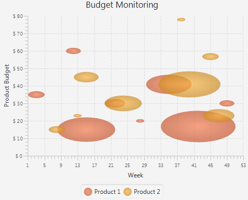
The NumberAxis.DefaultFormatter class adds prefixes and suffixes to the tick labels of the specified axis. In Example 34-2, the formatter defines a dollar sign ($) prefix for each tick label of the vertical axis. The null value for the suffix parameter indicates that no suffixes are added. Figure 34-3 shows the bubble chart after the formatting has been applied.
Figure 34-3 Specifying Prefixes for Tick Labels

Description of "Figure 34-3 Specifying Prefixes for Tick Labels"
Using the Extra Value Property
The bubble chart shown in Figure 34-1 provides information about budgets of two products for the period of a year. However, you can enhance this application and benefit from the additional capabilities of the BubbleChart class. Use the extraValue property and define three parameters in XYChart.Data objects when specifying the series of data for your bubble chart.
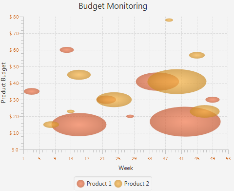
The code fragment shown in Example 34-3 demonstrates how to modify data series for the Budget Monitoring application, so that each bubble shows the percentage of consumed budget for a particular product. The third parameter in the XYChart.Data object defines the radius of each bubble: the bigger the radius, the higher the percentage of the budget consumed. Thus, a radius of 7.5 corresponds to consuming 75% of the budget, 5.5 to 55%, and so on.
Example 34-3 Adding Extra Value
XYChart.Series series1 = new XYChart.Series();
series1.setName("Product 1");
series1.getData().add(new XYChart.Data(3, 35, 2));
series1.getData().add(new XYChart.Data(12, 60, 1.8));
series1.getData().add(new XYChart.Data(15, 15, 7));
series1.getData().add(new XYChart.Data(22, 30, 2.5));
series1.getData().add(new XYChart.Data(28, 20, 1));
series1.getData().add(new XYChart.Data(35, 41, 5.5));
series1.getData().add(new XYChart.Data(42, 17, 9));
series1.getData().add(new XYChart.Data(49, 30, 1.8));

XYChart.Series series2 = new XYChart.Series();
series2.setName("Product 2");
series2.getData().add(new XYChart.Data(8, 15, 2));
series2.getData().add(new XYChart.Data(13, 23, 1));
series2.getData().add(new XYChart.Data(15, 45, 3));
series2.getData().add(new XYChart.Data(24, 30, 4.5));
series2.getData().add(new XYChart.Data(38, 78, 1));
series2.getData().add(new XYChart.Data(40, 41, 7.5));
series2.getData().add(new XYChart.Data(45, 57, 2));
series2.getData().add(new XYChart.Data(47, 23, 3.8));
The result of adding the modified code fragment to the Budget Monitoring application and then compiling and running it is shown in Figure 34-4.
Figure 34-4 Demonstrating Percentage of Consumed Budget

Description of "Figure 34-4 Demonstrating Percentage of Consumed Budget"
Changing the Appearance Visual Setting of the Plot and Tick Marks
You can alter the appearance of the chart plot and axes. Examine some methods and properties available in the JavaFX SDK API to modify the look of the Budget Monitoring application.
The verticalGridLinesVisible and horizontalGridLinesVisible properties enable and disable showing the grid lines.
In addition to the plot properties, you can modify the properties of the axis to attain the required appearance. Code lines in Example 34-4 specify the CHOCOLATE color for the tick labels.
Example 34-4 Defining a Fill Color for the Tick Labels
xAxis.setTickLabelFill(Color.CHOCOLATE);
yAxis.setTickLabelFill(Color.CHOCOLATE);
Finally, you can adjust the position of the tick labels relative to the tick marks. Use the setTickLabelGap method to specify the gap between tick labels and the tick mark lines on the vertical axis: yAxis.setTickLabelGap(10).
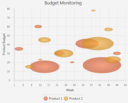
Figure 34-5 shows the output of the Budget Monitoring application after all the modifications are incorporated in the code.
Figure 34-5 Changes in the Appearance of the Bubble Chart

Description of "Figure 34-5 Changes in the Appearance of the Bubble Chart"
Related API Documentation


