32 Line Chart
This chapter describes the line chart, a type of two-axis chart that presents data as a series of points connected by straight lines.
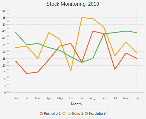
The line chart is often used to illustrate the dynamics of data over a particular interval of time. Figure 32-1 demonstrates a typical line chart with three series of data.
Each two-axis chart has two axes, the plot of data points, and the legend. You can also specify a title for the chart.
Chart Settings
For each chart, you can specify the title and its position relative to the graph. The title can be located on the top, right, left, or bottom of the graph. Similarly, you can specify the position of the chart legend.
For a two-axis graph, you can manage the appearance of the chart plot, the chart area where the graphical symbols corresponding to data values are rendered. You can set alternative columns and rows as well as horizontal and vertical grid lines and zero lines.
You can alter the default appearance of each chart by defining the following settings:
-
The axis label
-
The axis position relative to the chart plot
-
The upper and lower boundaries of the axis range
-
The minimum and maximum tick marks, tick units, the gap between two tick marks, and tick labels
You can also specify that any changes to the axis and its range will be animated, or you can enable the axis to automatically determine its range from the data.
Chart Data
The XYChart class, a super class for all two-axis charts, provides basic capabilities for building area, line, bar, scatter, and bubble charts. Use the XYChart.Data class to specify the data model for these types of charts. The xValue property defines the value of a chart element to be plotted on the X axis, and the yValue property defines the value for the Y axis. You can also set the extra value for each chart element. This value can be plotted in any way the chart needs, or it can be used to store additional information about the chart element. For example, it can be used to define a radius for bubble charts.
For two-axis charts, you can define several series of data by using the XYChart.Series class. You can also assign a particular name to each series to display in the chart legend.
Creating a Line Chart
To create a line chart, at a minimum, you must define two axes, create the LineChart object by instantiating the LineChart class, create one or more series of data by using the XYChart.Series class, and assign the data to the chart. Example 32-1 implements these tasks.
Example 32-1 Simple Line Chart
import javafx.application.Application;
import javafx.scene.Scene;
import javafx.scene.chart.LineChart;
import javafx.scene.chart.NumberAxis;
import javafx.scene.chart.XYChart;
import javafx.stage.Stage;


public class LineChartSample extends Application {

    @Override public void start(Stage stage) {
        stage.setTitle("Line Chart Sample");
        //defining the axes
        final NumberAxis xAxis = new NumberAxis();
        final NumberAxis yAxis = new NumberAxis();
        xAxis.setLabel("Number of Month");
        //creating the chart
        final LineChart<Number,Number> lineChart =
                new LineChart<Number,Number>(xAxis,yAxis);

        lineChart.setTitle("Stock Monitoring, 2010");
        //defining a series
        XYChart.Series series = new XYChart.Series();
        series.setName("My portfolio");
        //populating the series with data
        series.getData().add(new XYChart.Data(1, 23));
        series.getData().add(new XYChart.Data(2, 14));
        series.getData().add(new XYChart.Data(3, 15));
        series.getData().add(new XYChart.Data(4, 24));
        series.getData().add(new XYChart.Data(5, 34));
        series.getData().add(new XYChart.Data(6, 36));
        series.getData().add(new XYChart.Data(7, 22));
        series.getData().add(new XYChart.Data(8, 45));
        series.getData().add(new XYChart.Data(9, 43));
        series.getData().add(new XYChart.Data(10, 17));
        series.getData().add(new XYChart.Data(11, 29));
        series.getData().add(new XYChart.Data(12, 25));

        Scene scene  = new Scene(lineChart,800,600);
        lineChart.getData().add(series);

        stage.setScene(scene);
        stage.show();
    }

    public static void main(String[] args) {
        launch(args);
    }
}
In this example, both vertical and horizontal axes are created by using the NumberAxis class, a subclass of the Axis class, to represent numerical values. Having declared both X and Y axes numerical, you should specify Number parameters for XYChart.Data objects when creating a series of data. The first parameters of XYChart.Data objects define values for the horizontal axis, whereas, the second parameters of the XYChart.Data objects define values for the vertical axis.
The result of compiling and running this application is shown in Figure 32-2.
Figure 32-2 Line Chart with One Series of Data
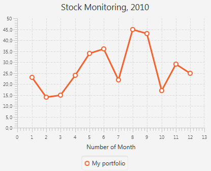
Description of "Figure 32-2 Line Chart with One Series of Data"
The line chart shown in Figure 32-2 uses symbols to highlight each data item on the chart. If you want to show trends instead of specific data values on your line chart, you can disable the chart symbols as shown in Example 32-2.
The sample of a trend chart is shown in Figure 32-1.
In Figure 32-1, axes are shown in their default positions relative to the chart plot. However, you can display an axis on another side of the chart plot by applying the setSide method. Example 32-3 demonstrates how to move the horizontal axis to the top of the chart plot.
Creating Categories for a Line Chart
Use the CategoryAxis class instead of the NumberAxis class to render non-numerical data in a line chart.
Examine the modified code of the application shown in Example 32-4. It creates the horizontal axis by instantiating the CategoryAxis class. The declaration of the LineChart object is modified to accommodate the change of the X axis type.
Example 32-4 Using Category Axis to Show Months
import javafx.application.Application;
import javafx.scene.Scene;
import javafx.scene.chart.CategoryAxis;
import javafx.scene.chart.LineChart;
import javafx.scene.chart.NumberAxis;
import javafx.scene.chart.XYChart;
import javafx.stage.Stage;


public class LineChartSample extends Application {

    @Override public void start(Stage stage) {
        stage.setTitle("Line Chart Sample");
        final CategoryAxis xAxis = new CategoryAxis();
        final NumberAxis yAxis = new NumberAxis();
        xAxis.setLabel("Month");

        final LineChart<String,Number> lineChart =
                new LineChart<String,Number>(xAxis,yAxis);

        lineChart.setTitle("Stock Monitoring, 2010");

        XYChart.Series series = new XYChart.Series();
        series.setName("My portfolio");

        series.getData().add(new XYChart.Data("Jan", 23));
        series.getData().add(new XYChart.Data("Feb", 14));
        series.getData().add(new XYChart.Data("Mar", 15));
        series.getData().add(new XYChart.Data("Apr", 24));
        series.getData().add(new XYChart.Data("May", 34));
        series.getData().add(new XYChart.Data("Jun", 36));
        series.getData().add(new XYChart.Data("Jul", 22));
        series.getData().add(new XYChart.Data("Aug", 45));
        series.getData().add(new XYChart.Data("Sep", 43));
        series.getData().add(new XYChart.Data("Oct", 17));
        series.getData().add(new XYChart.Data("Nov", 29));
        series.getData().add(new XYChart.Data("Dec", 25));


        Scene scene  = new Scene(lineChart,800,600);
        lineChart.getData().add(series);

        stage.setScene(scene);
        stage.show();
    }

    public static void main(String[] args) {
        launch(args);
    }
}
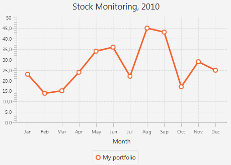
The XYChartData objects contain the month name and the corresponding numerical value. The label of the horizontal axis is modified accordingly.
The result of compiling and running the modified code of the application is shown in Figure 32-3.
Often, line charts enable analyzing different set of data over the same period of time. Use several series of XYChart.Data objects to implement this task in your application.
Adding Series to the Line Chart
Example 32-5 provides source code for the stock monitoring application with three series of data. In addition to the series used in Example 32-4, the previous example, two new series are declared.
The series are assigned to the chart by using consecutive calls of the getData and addAll methods.
Example 32-5 Adding Two More Series to the Stock Monitoring Sample
import javafx.application.Application;
import javafx.scene.Scene;
import javafx.scene.chart.CategoryAxis;
import javafx.scene.chart.LineChart;
import javafx.scene.chart.NumberAxis;
import javafx.scene.chart.XYChart;
import javafx.stage.Stage;


public class LineChartSample extends Application {

    @Override public void start(Stage stage) {
        stage.setTitle("Line Chart Sample");
        final CategoryAxis xAxis = new CategoryAxis();
        final NumberAxis yAxis = new NumberAxis();
         xAxis.setLabel("Month");
        final LineChart<String,Number> lineChart =
                new LineChart<String,Number>(xAxis,yAxis);

        lineChart.setTitle("Stock Monitoring, 2010");

        XYChart.Series series1 = new XYChart.Series();
        series1.setName("Portfolio 1");

        series1.getData().add(new XYChart.Data("Jan", 23));
        series1.getData().add(new XYChart.Data("Feb", 14));
        series1.getData().add(new XYChart.Data("Mar", 15));
        series1.getData().add(new XYChart.Data("Apr", 24));
        series1.getData().add(new XYChart.Data("May", 34));
        series1.getData().add(new XYChart.Data("Jun", 36));
        series1.getData().add(new XYChart.Data("Jul", 22));
        series1.getData().add(new XYChart.Data("Aug", 45));
        series1.getData().add(new XYChart.Data("Sep", 43));
        series1.getData().add(new XYChart.Data("Oct", 17));
        series1.getData().add(new XYChart.Data("Nov", 29));
        series1.getData().add(new XYChart.Data("Dec", 25));

        XYChart.Series series2 = new XYChart.Series();
        series2.setName("Portfolio 2");
        series2.getData().add(new XYChart.Data("Jan", 33));
        series2.getData().add(new XYChart.Data("Feb", 34));
        series2.getData().add(new XYChart.Data("Mar", 25));
        series2.getData().add(new XYChart.Data("Apr", 44));
        series2.getData().add(new XYChart.Data("May", 39));
        series2.getData().add(new XYChart.Data("Jun", 16));
        series2.getData().add(new XYChart.Data("Jul", 55));
        series2.getData().add(new XYChart.Data("Aug", 54));
        series2.getData().add(new XYChart.Data("Sep", 48));
        series2.getData().add(new XYChart.Data("Oct", 27));
        series2.getData().add(new XYChart.Data("Nov", 37));
        series2.getData().add(new XYChart.Data("Dec", 29));

        XYChart.Series series3 = new XYChart.Series();
        series3.setName("Portfolio 3");
        series3.getData().add(new XYChart.Data("Jan", 44));
        series3.getData().add(new XYChart.Data("Feb", 35));
        series3.getData().add(new XYChart.Data("Mar", 36));
        series3.getData().add(new XYChart.Data("Apr", 33));
        series3.getData().add(new XYChart.Data("May", 31));
        series3.getData().add(new XYChart.Data("Jun", 26));
        series3.getData().add(new XYChart.Data("Jul", 22));
        series3.getData().add(new XYChart.Data("Aug", 25));
        series3.getData().add(new XYChart.Data("Sep", 43));
        series3.getData().add(new XYChart.Data("Oct", 44));
        series3.getData().add(new XYChart.Data("Nov", 45));
        series3.getData().add(new XYChart.Data("Dec", 44));

        Scene scene  = new Scene(lineChart,800,600);
        lineChart.getData().addAll(series1, series2, series3);

        stage.setScene(scene);
        stage.show();
    }


    public static void main(String[] args) {
        launch(args);
    }
}
Each series of data has its unique name defined by using the setName method.
The result of compiling and running this application is shown in Figure 32-4.
Figure 32-4 Stock Monitoring Example with Tree Series of Data
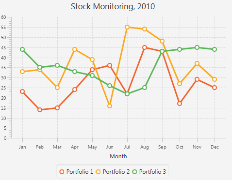
Description of "Figure 32-4 Stock Monitoring Example with Tree Series of Data"
Note that the different colors of the lines are defined by the declared order of the corresponding series in the addAll method. Change the order as follows: lineChart.getData().addAll(series3, series1, series2), and then compile and run the application. The modified output is shown in Figure 32-5.
Figure 32-5 Alternative Order of Series in the Line Chart
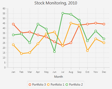
Description of "Figure 32-5 Alternative Order of Series in the Line Chart"
Related API Documentation
