23 Titled Pane and Accordion
This chapter explains how to use a combination of the accordion and title panes in your JavaFX applications.
A titled pane is a panel with a title. It can be opened and closed, and it can encapsulate any Node such as UI controls or images, and groups of elements added to a layout container.
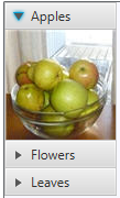
Titled panes can be grouped by using the accordion control, which enables you to create multiple panes and display them one at a time. Figure 23-1 shows an accordion control that combines three titled panes.
Figure 23-1 Accordion with Three Titled Panes
Description of "Figure 23-1 Accordion with Three Titled Panes"
Use the Accordion and TitledPane classes in the JavaFX SDK API to implement these controls in your applications.
Creating Titled Panes
To create a TitledPane control define a title and some content. You can do this by using the two-parameter constructor of the TitledPane class, or by applying the setText and setContent methods. Both ways are shown in Example 23-1.
Example 23-1 Declaring a TitledPane Object
//using a two-parameter constructor
TitledPane tp = new TitledPane("My Titled Pane", new Button("Button"));
//applying methods
TitledPane tp = new TitledPane();
tp.setText("My Titled Pane");
tp.setContent(new Button("Button"));
Compiling and running an application with either of the code fragments produces the control shown in Figure 23-2.
Do not explicitly set the minimal, maximum, or preferred height of a titled pane, as this may lead to unexpected behavior when the titled pane is opened or closed.
The code fragment shown in Example 23-2 adds several controls to the titled pane by putting them into the GridPane layout container.
Example 23-2 Titled Pane with the GridPane Layout Container
TitledPane gridTitlePane = new TitledPane();
GridPane grid = new GridPane();
grid.setVgap(4);
grid.setPadding(new Insets(5, 5, 5, 5));
grid.add(new Label("First Name: "), 0, 0);
grid.add(new TextField(), 1, 0);
grid.add(new Label("Last Name: "), 0, 1);
grid.add(new TextField(), 1, 1);
grid.add(new Label("Email: "), 0, 2);
grid.add(new TextField(), 1, 2);
gridTitlePane.setText("Grid");
gridTitlePane.setContent(grid);
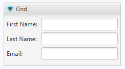
When you run and compile an application with this code fragment, the output shown in Figure 23-3 appears.
Figure 23-3 Titled Pane that Contains Several Controls
Description of "Figure 23-3 Titled Pane that Contains Several Controls"
You can define the way a titled pane opens and closes. By default, all titled panes are collapsible and their movements are animated. If your application prohibits closing a titled pane, use the setCollapsible method with the false value. You can also disable animated opening by applying the setAnimated method with the false value. The code fragment shown in Example 23-3 implements these tasks.
Adding Titled Panes to an Accordion
In your applications, you can use titled panes as standalone elements, or you can combine them in a group by using the Accordion control. Do not explicitly set the minimal, maximum, or preferred height of an accordion, as this may lead to unexpected behavior when one of its titled pane is opened.
Adding several titled panes to an accordion is similar to adding toggle buttons to a toggle group: only one titled pane can be opened in an accordion at a time. Example 23-4 creates three titled panes and adds them to an accordion.
Example 23-4 Accordion and Three Titled Panes
import javafx.application.Application;
import javafx.scene.Group;
import javafx.scene.Scene;
import javafx.scene.control.Accordion;
import javafx.scene.control.TitledPane;
import javafx.scene.image.Image;
import javafx.scene.image.ImageView;
import javafx.stage.Stage;

public class TitledPaneSample extends Application {
    final String[] imageNames = new String[]{"Apples", "Flowers", "Leaves"};
    final Image[] images = new Image[imageNames.length];
    final ImageView[] pics = new ImageView[imageNames.length];
    final TitledPane[] tps = new TitledPane[imageNames.length];

    public static void main(String[] args) {
        launch(args);
    }

    @Override public void start(Stage stage) {
        stage.setTitle("TitledPane");
        Scene scene = new Scene(new Group(), 80, 180);

        final Accordion accordion = new Accordion ();

        for (int i = 0; i < imageNames.length; i++) {
            images[i] = new
                Image(getClass().getResourceAsStream(imageNames[i] + ".jpg"));
            pics[i] = new ImageView(images[i]);
            tps[i] = new TitledPane(imageNames[i],pics[i]);
        }
        accordion.getPanes().addAll(tps);
        accordion.setExpandedPane(tps[0]);

        Group root = (Group)scene.getRoot();
        root.getChildren().add(accordion);
        stage.setScene(scene);
        stage.show();
    }
}
Three titled panes are created within the loop. Content for each titled pane is defined as an ImageView object. The titled panes are added to the accordion by using the getPanes and addAll methods. You can use the add method instead of the addAll method to add a single titled pane.
By default, all the titled panes are closed when the application starts. The setExpandedPane method in Example 23-4 specifies that the titled pane with the Apples picture will be opened when you run the sample, as shown in Figure 23-4.
Figure 23-4 Accordion with Three Titled Panes

Description of "Figure 23-4 Accordion with Three Titled Panes"
Processing Events for an Accordion with Titled Panes
You can use titled panes and accordions to present different data in your applications. Example 23-5 creates a standalone titled pane with the GridPane layout container and three titled panes combined by using the accordion. The standalone titled pane contains UI elements of an email client. The accordion enables the selection of an image to appear in the Attachment field of the Grid titled pane.
Example 23-5 Implementing ChangeListener for an Accordion
import javafx.application.Application;
import javafx.beans.value.ObservableValue;
import javafx.geometry.Insets;
import javafx.scene.Group;
import javafx.scene.Scene;
import javafx.scene.control.Accordion;
import javafx.scene.control.Label;
import javafx.scene.control.TextField;
import javafx.scene.control.TitledPane;
import javafx.scene.image.Image;
import javafx.scene.image.ImageView;
import javafx.scene.layout.GridPane;
import javafx.scene.layout.HBox;
import javafx.stage.Stage;

public class TitledPaneSample extends Application {
    final String[] imageNames = new String[]{"Apples", "Flowers", "Leaves"};
    final Image[] images = new Image[imageNames.length];
    final ImageView[] pics = new ImageView[imageNames.length];
    final TitledPane[] tps = new TitledPane[imageNames.length];
    final Label label = new Label("N/A");

    public static void main(String[] args) {
        launch(args);
    }

    @Override public void start(Stage stage) {
        stage.setTitle("TitledPane");
        Scene scene = new Scene(new Group(), 800, 250);

        // --- GridPane container
        TitledPane gridTitlePane = new TitledPane();
        GridPane grid = new GridPane();
        grid.setVgap(4);
        grid.setPadding(new Insets(5, 5, 5, 5));
        grid.add(new Label("To: "), 0, 0);
        grid.add(new TextField(), 1, 0);
        grid.add(new Label("Cc: "), 0, 1);
        grid.add(new TextField(), 1, 1);
        grid.add(new Label("Subject: "), 0, 2);
        grid.add(new TextField(), 1, 2);
        grid.add(new Label("Attachment: "), 0, 3);
        grid.add(label,1, 3);
        gridTitlePane.setText("Grid");
        gridTitlePane.setContent(grid);

        // --- Accordion
        final Accordion accordion = new Accordion ();
        for (int i = 0; i < imageNames.length; i++) {
            images[i] = new
                Image(getClass().getResourceAsStream(imageNames[i] + ".jpg"));
            pics[i] = new ImageView(images[i]);
            tps[i] = new TitledPane(imageNames[i],pics[i]);
        }
        accordion.getPanes().addAll(tps);
        accordion.expandedPaneProperty().addListener(
            (ObservableValue<? extends TitledPane> ov, TitledPane old_val,
            TitledPane new_val) -> {
                if (new_val != null) {
                    label.setText(accordion.getExpandedPane().getText() +
                            ".jpg");
                }
        });

        HBox hbox = new HBox(10);
        hbox.setPadding(new Insets(20, 0, 0, 20));
        hbox.getChildren().setAll(gridTitlePane, accordion);

        Group root = (Group)scene.getRoot();
        root.getChildren().add(hbox);
        stage.setScene(scene);
        stage.show();
    }
}
When a user opens a titled pane in the accordion, the expandedPaneProperty of the accordion changes. The expanded titled pane in the accordion is used to construct a file name of the attachment. This file name is set as text of the corresponding Label object.
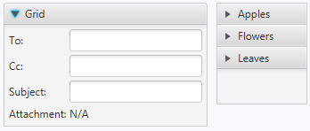
Figure 23-5 shows how the application looks after its start. The Attachment label contains "N/A," because none of the titled panes are selected.
Figure 23-5 Initial View of the TitledPaneSample Application
Description of "Figure 23-5 Initial View of the TitledPaneSample Application"
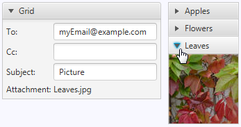
If you expand the Leaves titled pane, the Attachment label will contain "Leaves.jpg," as shown in Figure 23-6.
Figure 23-6 TitledPaneSample Application with the Leaves Titled Pane Expanded
Description of "Figure 23-6 TitledPaneSample Application with the Leaves Titled Pane Expanded"
Because the TitledPane and Accordion classes are both extensions of the Node class, you can apply visual effects or transformations to them. You can also change the appearance of the controls by applying CSS styles.
Related API Documentation


