Note: Self Service dashboards that users create through Visual Insight typically contain data from outside the XBRi application, which may contain unmasked personal data viewable to all users. Oracle recommends using the Share functionality to restrict access to reports, documents, and dashboards, including the import data brought in through Self-Service BI. The Customer Admin will need to determine by either group(s) or individual(s) who can import data according to their company data privacy policy.
Visual Insight allows you to quickly create a customized, interactive Visual Insight quick dashboard that can be used to explore business data. You can create a quick dashboard using existing or imported data, perform manipulations on the data to customize the information that is included in the quick dashboard, and add visual representations of the data (called visualizations) to the quick dashboard to make the data easier to interpret. Quick dashboards can be viewed in the Quick Dashboard Editor, or on an iPad or Android tablet with XBR Ingenium. You can share a quick dashboard through e-mail, by linking to the quick dashboard, or by embedding the quick dashboard in a web page.
Visual Insight allows you to streamline the tasks required to create a polished quick dashboard using the data. For example, you can:
Quickly add, rearrange, or remove report objects from a visualization in a quick dashboard.
Create additional visualizations to display the data in multiple ways, then easily modify, rearrange, or resize visualizations in a quick dashboard.
Add filtering based on report objects to a quick dashboard, to allow users to only display the information they are interested in.
Add thresholds to a quick dashboard, to change the display of data based on the value of a metric.
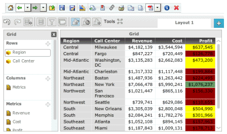
For example, in the image below, data in a quick dashboard is displayed using a Grid visualization, which contains revenue, cost, and profit data for each Call Center in a Region. Profit values of less than $300,000 are displayed using a red background, while values of greater than $800,000 are displayed in green.
You can easily drag and drop report objects to add them to the visualization, move objects to the columns or rows of the grid, or create a new metric from the metrics displayed in the grid.
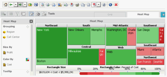
The image below shows a Heat Map visualization in the same quick dashboard, which displays the data using colored rectangles of different sizes and colors depending on the cost and profit data for each Call Center. You can format the colors used to display the rectangles, delete rectangles from the display, and change how the size and position of the rectangles is calculated.
For steps to create a quick dashboard, see Creating a Visual Insight dashboard.
For more information on the types of visualizations available to be added to a quick dashboard, see the appropriate topic below:
Blank visualization: You can create and add a blank visualization for use as a data placeholder. You can add a specific type of blank visualization to the dashboard, such as a Grid or Heat Map, or add a generic blank visualization and choose the visualization's type later.
Density Map visualization: You can display your data as areas on a map, which are automatically displayed in different colors based on the population density of locations of interest in the visualization.
ESRI Map Visualization: You can add an ESRI Map visualization to display your data as map markers on an interactive map.
Graph visualization: You can display the data in a graphical format and choose between a variety of different graphs. For example, you can add pie or ring graphs to a graph visualization, or create a graph visualization with a dual axis or combination graph.
Graph Matrix visualization: You can display the data in a chart containing one graph for every combination of the data you specify, allowing users to examine the data for each combination individually.
Graph visualization with pie or ring graphs: You can add pie or ring graphs to a graph visualization.
Grid visualization: You can display data in an interactive grid, allowing users to pivot, sort, move, drill, filter, and perform additional manipulations on data displayed in the grid.
Heat Map visualization: You can display the data as a combination of colored rectangles. Each rectangle represents an attribute element, and is colored and sized according to the value of metrics in the visualization, allowing users to quickly grasp the state and impact of a large number of variables at one time.
Image Layout visualization: You can display your data as colored geographical regions or as map markers on the map, then change display options such as the color of regions on the map, to allow users to quickly grasp relationships between different locations.
Map visualization: You can display the data as geographical locations on a map, then change the color, size, and display of markers based on the value of a metric, to allow users to quickly grasp relationships between different locations.
Network visualization: You can display the data as a network of nodes, with lines between the nodes representing relationships between attribute elements.
Related topics
Creating a Visual Insight quick dashboard
Adding and removing datasets from a quick dashboard
Formatting and working with quick dashboards
_____________________________
Copyright © 2019, Oracle and/or its affiliates. All rights reserved.
Legal Notices