Select the Visualization Type
The interactive data visualizations in Oracle Log Analytics enable you to get deeper insights into your log data. Based on what you want to achieve with your data set, you can select the visualization type that best suits your application.
Here are some of the things you can do with visualizations:
Compare and Contrast the Data Set Using One or Two Parameters
Use these simple graphs to visualize your data set and compare the log records based on one or two key parameters:
| Visualization Type | What You Input | What Output You Get | What You Can Do |
|---|---|---|---|
|
Pie |
Default Group By field: |
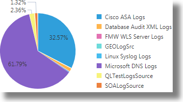
A circular representation of the count of the log records that are grouped using the input parameter. |
Compare the broad groups in the circle that indicate percentages of the whole data set. For example, compare the percentages of the counts of the log records from various log sources. |
|
Bar |
Default X-axis field: Additionally, provide a second parameter in the Group by section to view a colored and stacked bar graph. |
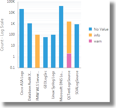
Bar graph: The input parameter represented along the x-axis as segmented columns, with the height of the column denoting the count. Stacked bar graph: The key input parameter is grouped by the second parameter, and is represented as a stacked bar graph along the x-axis. The overall height of the column denotes the count. The colored stack represents the grouping. |
Bar graph: Compare the sizes of the segmented columns to compare the count of the log records based on the input parameter. For example, compare the count of log records from each log source. Stacked bar graph: Here, you can compare not only the count of the values of the input parameter, but also notice the grouping of it, based on the second parameter. In the following example, the count of the log records from the log sources are obtained by the overall height of the segmented columns. The log records in each column are grouped based on the severity of the errors noticed in them. |
|
Horizontal bar |
Default Y-axis field: One parameter, for example, |
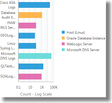
Horizontal bar graph: The input parameter represented along the y-axis as segmented columns, with the width of the row denoting the count. Stacked horizontal bar graph: The key input parameter is grouped by the second parameter, and is represented as a stacked bar graph along the y-axis. The overall width of the row denotes the count. The colored stack represents the grouping. |
Horizontal bar graph: Compare the sizes of the segmented rows to compare the count of the log records based on the input parameter. For example, compare the count of log records from each log source. Stacked horizontal bar graph: Here, you can compare not only the count of the values of the input parameter, but also the grouping of it, based on the second parameter. In the following example, the count of the log records from the log sources are obtained by the overall width of the segmented rows. The log records in each row are grouped based on the entity type. |
|
Map |
Default Group by field: |
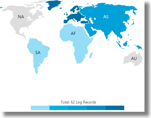
The geographical distribution of the count of log records based on the input geographical parameter. |
Compare the count of the log records based on their geographical distribution. In the following example, the log records are distributed based on the Client Host Continent Code field in the log data. See Maps Visualization. |
|
Line |
Default Group By field: |
A plotted line that presents the count of the input parameter along the y-axis tracked on the timeline along the x-axis. |
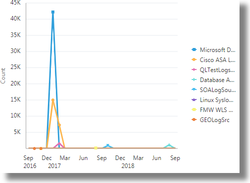
Compare the count of the log records based on the input parameter represented by separate lines plotted against time. In the following example, the count of log records from various log sources are plotted against time in each line. |
|
Word Cloud |
Default Group By field: Additionally, provide a second parameter in the Color section to further group the data set. For example, |
A word cloud where the size of the word tile represents the count. Additionally, when you provide a second input parameter, you can see a colored word cloud where the words are grouped by the second parameter. The groups are represented by colors. |
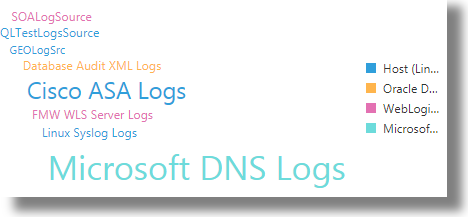
Compare the count of the log records based on the size of the word tiles that represent the input parameter. If you provided the second parameter, then you can also view the color grouping of the word tiles. In the following example, the size of the word tiles represent the count of the log records from each log source. The color of the word tiles indicate the entity type of each group. |
Summarize the Data Set Using Key Parameters
View these charts to get detailed information about the data set:
| Visualization Type | What You Input | What Output You Get | What You Can Do |
|---|---|---|---|
|
Summary table |
Default Display Fields: Optionally, you can select a different math function to perform on the data set. For example, Default Group by field: Optionally, you can select more input parameters for the Group by section that will enable further grouping of the data set. |
A table that displays the following:
|
Summary table is the most versatile visualization chart that can perform statistical analysis on any type of input data. It also permits multiple input parameters in the Group by section, thus enabling more complex deductions from the analysis.
See Summary Tables. |
|
Records |
Default Display Fields: Optionally, you can select more input parameters that will display in the chart. |
A chart of log records that contain:
|
|
|
Table |
Default Display Fields: Optionally, you can select more input parameters that will display in the table. |
A table that displays the following:
|
|
|
Distinct |
Default Display Fields: Optionally, you can select more input parameters that will display in the table. |
A table that lists the unique values of the default field. If you included more fields, then the table displays the following:
|
|
Alternatively, use the Tile ![]() visualization to summarize the data set. By default, the tile visualization summarizes the overall count of the log records. Identify the fields to group the log records in order to refine the summary. For example, you can group the log records by log source. This is a sample summary output of the grouping:
visualization to summarize the data set. By default, the tile visualization summarizes the overall count of the log records. Identify the fields to group the log records in order to refine the summary. For example, you can group the log records by log source. This is a sample summary output of the grouping: 8 Distinct values of Log Source.
Group and Drill Down to the Specific Data Set
Use these simple graph and chart visualizations to group the log records based on a parameter, and then drill down to the individual log records to investigate further.
A histogram is a graph that lets you view the underlying frequency distribution or shape of a continuous data set. It shows the dispersion of log records over a specific time period with segmented columns. You can optionally select a field for the Group by section to group the log records for the histogram visualization.
To learn more about the input parameters and the output for the Records and Table visualizations, see Summarize the Data Set Using Key Parameters.
| Visualization Type | What You Can Do |
|---|---|
|
Records with histogram |
|
|
Table with histogram |
|
Analyze the Data Set Using Multiple Key Parameters
Use these complex graph visualizations to determine the hierarchical and fractional relationships of the fields in the whole data set:
| Visualization Type | What You Input | What Output You Get | What You Can Do |
|---|---|---|---|
|
Sunburst |
Default Value: Optionally, you can select a different field whose count can help to generate the sunburst. Default Group by field: Optionally, you can select more input parameters for the Group by section that will enable further grouping of the data set. For example, |
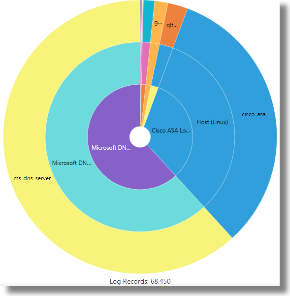
By default, a sunburst that represents the log records grouped by the default parameter. The size of a sector in the circle indicates the count of the log records in the specific data set. If you specified more fields for grouping, you’ll see a concentric sunburst, with the innermost ring representing the first computation of the grouping, and the subsequent rings representing the following computations, in that order. |
Use the sunburst visualization to analyze hierarchical data from multiple fields. The hierarchy is represented in the form of concentric rings, with the innermost ring representing the top of the hierarchy. In the following example, the log records are grouped using the fields |
|
Treemap |
Default Value: Optionally, you can select a different field whose count can help to generate the treemap. Default Group by field: Optionally, you can select more input parameters for the Group by section that will enable further grouping of the data set. |
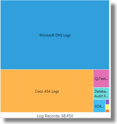
A treemap that represents the log records grouped by the default parameter. The size of the rectangles indicate the count of the log records in the specific data set. If you specified more fields for grouping, you’ll see a nested treemap that groups the log records based on all the parameters that you specified. The nested treemap also shows the fractional relationship of the fields in each data set. |
Use the treemap visualization to analyze the data from multiple fields that are both hierarchical and fractional, with the help of interactive nested rectangles. In the following example, the log records are grouped using the |
Perform Advanced Analysis of the Data Set
Use these visualizations to perform advanced analysis of the large data set to figure out the root cause an issue, to identify potential issues, to view trends, or to detect an anomaly.
| Visualization Type | What You Input | What Output You Get | What You Can Do |
|---|---|---|---|
|
Cluster |
The cluster visualization works on the entire data set and isn’t based on a specific parameter. |
The Cluster view displays a summary banner at the top showing the following tabs:
|
Clustering uses machine learning to identify the pattern of log records, and then to group the logs that have similar patterns. You can investigate further from each of the tabs based on your requirement. When you click any of the tabs, the histogram view of the cluster changes to display the records for the selected tab. Clustering helps significantly reduce the total number of log entries that you have to explore, and points out the outliers. See Clusters Visualization. For an example use case of cluster visualization, see Example Scenario: Detect Anomalies Using Outliers. |
|
Link |
Default Link By field: Optionally, you can select more input parameters for the Link By section for more relevant grouping of the log data. You can also select additional parameters for the Display Fields section. |
The groups table lists parameters like Log Source, Entity Type, Entity, Count, Start Time, End Time, and Group Duration for each group. If you specified more display fields, they’re included in the table too. |
Use the link visualization to perform advanced analysis of log records by combining individual log records from across log sources into groups, based on the fields you selected for linking. The bubble chart shows the anomalies in the patterns based on the analysis of the groups. You can further examine the anomalies by clicking an individual bubble or select multiple bubbles. To view the details of the groups that correspond to the anomaly, select the anomaly bubble in the chart. You can investigate the anomaly to identify and rectify issues. See Link Visualization. For some example use cases of link visualization, see Perform Advanced Analytics with Link. |
|
Link by Cluster |
Select |
The Groups tab displays a bubble chart that represents the groups formed with the selected field and the clusters used for linking in the commonly seen ranges. The link by field is plotted along the x-axis, and the group duration is plotted along the y-axis. The groups table lists parameters like Entity Type, Cluster Sample, Count, Start Time, End Time, and Group Duration for each group. If you specified more display fields, they’re included in the table too. |
Use the combination of link and cluster visualizations to perform this analysis. The machine learning capability of the cluster visualization to identify clusters and potential issues, and the ability of link visualization to group the log records based on the selection of fields are combined to narrow down your analysis to small anomaly groups or potential issues. You can refine your query and be specific about the output required on the bubble chart. The analysis generates clusters that are grouped based on your selection of the field for analysis. You can investigate the anomalies further to arrive at conclusive decisions of the analysis. See Link by Cluster. |
