Previewing Screen Sizes in Site Management Tools
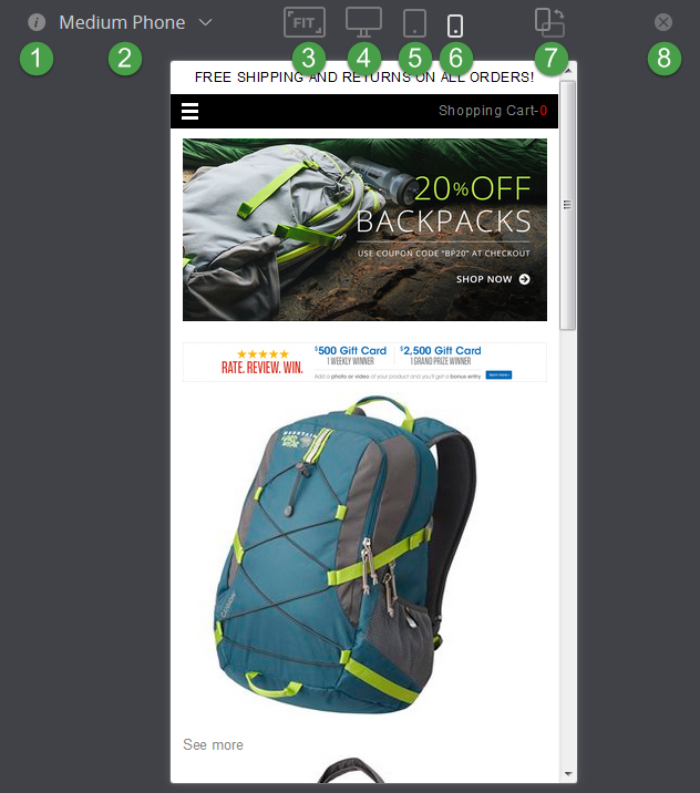
Your site's visitors can view your site on different devices, like smartphones, tablets, laptops, or desktop computers. Use the Preview Screen Sizes feature to quickly see how your site looks on different devices and screen sizes. This lets you view the site like your customers do on their devices. The following screenshot illustrates preview mode for a medium phone.
You can use site navigation as usual while previewing screen sizes. However, if you try to follow a link outside your domain, you'll be redirected back to your site with a message saying you can't navigate away while editing.
|
Item |
Description |
|---|---|
|
1 |
Hover over the information icon to see details for the selected display option. You'll see the orientation, width, and height for that display. This information isn't shown for the fit preview option. |
|
2 |
The Preview Size dropdown lets you pick the preview size for the selected device type. |
|
3 |
Click this icon to fit the preview to your browser window. |
|
4 |
Click the desktop icon to preview your site on standard desktop sizes. Standard desktop display sizes include:
|
|
5 |
Click the tablet icon to preview your site on standard tablet sizes. Standard tablet display sizes include:
|
|
6 |
Click the mobile icon to preview your site on standard smartphone sizes. Standard mobile display sizes include:
|
|
7 |
Click the orientation icon to switch between landscape and portrait modes for tablet and mobile preview. |
|
8 |
Click exit to close the device preview mode. |
To preview screen sizes in Site Management Tools:
-
Log in to Site Management Tools. For details, see Logging into Site Management Tools.
-
Click the Preview Screen Sizes icon
 from the site management toolbar.Note:
You can preview screen sizes only when you're editing or previewing the site.
-
Choose from the following device preview options:
-
Fit - Preview the site based on the current browser window size.
-
Desktop - Preview the site on common desktop display dimensions.
-
Tablet - Preview the site on common tablet screen dimensions.
-
Mobile - Preview the site on common smart phone screen dimensions.
If you want to preview a device size that's not listed, you can set up custom preview sizes. For details, see Site Management Tools Custom Preview Screen Sizes.
-
-
When you preview the site for tablet or mobile, you can also change the orientation. Use the rotate button
 on the toolbar to switch between portrait and landscape.Tip:
The rotate option isn't available for desktop previews. If you need to see desktop in portrait, you can define a portrait desktop option in the adapter file. The following sample code illustrates this type of custom display option:
desktop: [{ name: 'Portrait', width: 768, height: 1024 }] -
Click exit to close the device preview mode.