Using JavaFX UI Controls
6 Checkbox
This chapter teaches how to add checkboxes to your JavaFX applications.
Although checkboxes look similar to radio buttons, they cannot be combined into toggle groups to enable the selection of many options at one time. See the Radio Button and Toggle Button chapters for more information.
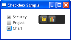
Figure 6-1 shows a screen capture of an application in which three checkboxes are used to enable or disable icons in an application toolbar.
Creating Checkboxes
Example 6-1 creates two simple checkboxes.
Example 6-1 Creating Checkboxes
//A checkbox without a caption
CheckBox cb1 = new CheckBox();
//A checkbox with a string caption
CheckBox cb2 = new CheckBox("Second");

cb1.setText("First");
cb1.setSelected(true);
Once you have created a checkbox, you can modify it by using methods available through the JavaFX APIs. In Example 6-1 the setText method defines the text caption of the c1 checkbox. The setSelected method is set to true so that the cb1 checkbox is selected when the application is started.
Defining a State
The checkbox can be either defined or undefined. When it is defined, you can select or deselect it. However, when the checkbox is undefined, it cannot be selected or deselected. Use a combination of the setSelected and setIndeterminate methods of the CheckBox class to specify the state of the checkbox. Table 6-1 shows three states of a checkbox based on its INDETERMINATE and SELECTED properties.
Table 6-1 States of a Checkbox
| Property Values | Checkbox Appearance |
|---|---|
|
|
|
|
|
|
|
|
|
You might need enabling three states for checkboxes in your application when they represent UI elements that can be in mixed states, for example, "Yes", "No", "Not Applicable." The allowIndeterminate property of the CheckBox object determines whether the checkbox should cycle through all three states: selected, deselected, and undefined. If the variable is true, the control will cycle through all the three states. If it is false, the control will cycle through the selected and deselected states. The application described in the next section constructs three checkboxes and enables only two states for them.
Setting the Behavior
The code fragment in Example 6-2 creates three checkboxes, such that if a checkbox is selected, the corresponding icon appears in a toolbar.
Example 6-2 Setting the Behavior for the Checkboxes
final String[] names = new String[]{"Security", "Project", "Chart"};
final Image[] images = new Image[names.length];
final ImageView[] icons = new ImageView[names.length];
final CheckBox[] cbs = new CheckBox[names.length];

for (int i = 0; i < names.length; i++) {
    final Image image = images[i] =
        new Image(getClass().getResourceAsStream(names[i] + ".png"));
    final ImageView icon = icons[i] = new ImageView();
    final CheckBox cb = cbs[i] = new CheckBox(names[i]);
    cb.selectedProperty().addListener(new ChangeListener<Boolean>() {
        public void changed(ObservableValue<? extends Boolean> ov,
            Boolean old_val, Boolean new_val) {
                icon.setImage(new_val ? image : null);
        }
    });
}
The names array uses a for loop to create an array of checkboxes and a corresponding array of icons. For example, cbs[0], the first checkbox, is assigned the "Security" text caption. At the same time, image[0] receives "Security.png" as a file name for the getResourceStream method when an image for the first icon is created. If a particular checkbox is selected, the corresponding image is assigned to the icon. If a checkbox is deselected, the icon receives a null image and the icon is not rendered.
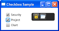
Figure 6-2 shows an application when the Security and Chart checkboxes are selected and the Project checkbox is deselected.
Figure 6-2 Checkbox Application in Action

Description of "Figure 6-2 Checkbox Application in Action"
Styling a Checkbox
The checkboxes in Figure 6-2 have the default look and feel of the CheckBox class. You can alter the appearance of a checkbox by using the setStyle method, as shown in Example 6-3.
Example 6-3 Styling a Checkbox
cb1.setStyle(
    "-fx-border-color: lightblue; "
    + "-fx-font-size: 20;"
    + "-fx-border-insets: -5; "
    + "-fx-border-radius: 5;"
    + "-fx-border-style: dotted;"
    + "-fx-border-width: 2;"
);
The new style includes a dotted light blue border and an increased font size for its text caption. Figure 6-3 shows the cb1 checkbox with this style applied.
To set a specific style for all the checkboxes in your application, use the following procedure:
-
Create a .css file.
-
Create the
checkboxCSS class in the .css file. -
Define all the required styles in the
checkboxCSS class. -
In your JavaFX application, enable the style sheet by using the
setStyleClassmethod.
Related API Documentation
 Alla is a technical writer for Oracle. She lives in St. Petersburg, Russia, and develops tutorials and technical articles for Java and JavaFX technologies. Prior to her assignment at Oracle, she worked as a technical writer in different IT companies.


