Using JavaFX UI Controls
20 Tooltip
In this chapter, you learn about the tooltip, the control that can be set for any UI control to appear when that control is hovered over by the mouse cursor.
The Tooltip class represents a common UI component that is typically used to display additional information about the UI control. The tooltip can be set on any control by calling the setTooltip method.
The tooltip has two different states: activated and showing. When the tooltip is activated, the mouse moves over a control. When the tooltip is in the showing state, it actually appears. A shown tooltip is also activated. There is usually some delay between when the Tooltip becomes activated and when it is actually shown.
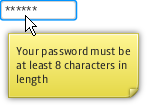
A password field with a tooltip is shown in Figure 20-1.
Figure 20-1 Tooltip Added to a Password Field

Description of "Figure 20-1 Tooltip Added to a Password Field"
Creating a Tooltip
Study the code fragment in Example 20-1 that creates the password field with a tooltip in the JavaFX application shown in the preceding figure.
Example 20-1 Adding a Tooltip to the Password Field
final PasswordField pf = new PasswordField();
final Tooltip tooltip = new Tooltip();
tooltip.setText(
    "\nYour password must be\n" +
    "at least 8 characters in length\n"  +
);
pf.setTooltip(tooltip);
Each UI control from the javafx.scene.control package has the setTooltip method to add a tooltip. You can define a text caption within a Tooltip constructor or by using the setText method.
Because the Tooltip class is an extension of the Labeled class, you can add not only a text caption, but a graphical icon as well. The code fragment in Example 20-2 adds an icon to the tooltip for the password field.
Example 20-2 Adding an Icon to a Tooltip
Image image = new Image(
    getClass().getResourceAsStream("warn.png")
);
tooltip.setGraphic(new ImageView(image));
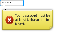
After you add this code fragment to the application, and the code is compiled, and run, the tooltip shown in Figure 20-2 appears.
A tooltip can contain not only additional or auxiliary information, but it can also present data.
Presenting Application Data in Tooltips
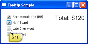
The application in Figure 20-3 uses information presented in the tooltips to calculate the total cost of the hotel stay
Each checkbox is accompanied by a tooltip. Each tooltip displays the rate for a particular booking option. If a user selects a checkbox, the corresponding value is added to the total. If a selected checkbox is deselected, the corresponding value is deducted from the total.
Review the source code of the application shown in Example 20-3.
Example 20-3 Using Tooltips to Calculate Hotel Rates
import javafx.application.Application;
import javafx.beans.value.ChangeListener;
import javafx.beans.value.ObservableValue;
import javafx.geometry.Insets;
import javafx.scene.Group;
import javafx.scene.Scene;
import javafx.scene.control.CheckBox;
import javafx.scene.control.Label;
import javafx.scene.control.Tooltip;
import javafx.scene.layout.HBox;
import javafx.scene.layout.VBox;
import javafx.scene.text.Font;
import javafx.stage.Stage;


public class Main extends Application {

    final static String[] rooms = new String[]{
        "Accommodation (BB)",
        "Half Board",
        "Late Check-out",
        "Extra Bed"
    };
    final static Integer[] rates = new Integer[]{
        100, 20, 10, 30
    };
    final CheckBox[] cbs = new CheckBox[rooms.length];
    final Label total = new Label("Total: $0");
    Integer sum = 0;

    public static void main(String[] args) {
        launch(args);
    }

    @Override
    public void start(Stage stage) {
        Scene scene = new Scene(new Group());
        stage.setTitle("Tooltip Sample");
        stage.setWidth(300);
        stage.setHeight(150);

        total.setFont(new Font("Arial", 20));

        for (int i = 0; i < rooms.length; i++) {
            final CheckBox cb = cbs[i] = new CheckBox(rooms[i]);
            final Integer rate = rates[i];
            final Tooltip tooltip = new Tooltip("$" + rates[i].toString());
            tooltip.setFont(new Font("Arial", 16));
            cb.setTooltip(tooltip);
            cb.selectedProperty().addListener(new ChangeListener<Boolean>() {
                public void changed(ObservableValue<? extends Boolean> ov,
                    Boolean old_val, Boolean new_val) {
                    if (cb.isSelected()) {
                        sum = sum + rate;
                    } else {
                        sum = sum - rate;
                    }
                    total.setText("Total: $" + sum.toString());
                }
            });
        }

        VBox vbox = new VBox();
        vbox.getChildren().addAll(cbs);
        vbox.setSpacing(5);
        HBox root = new HBox();
        root.getChildren().add(vbox);
        root.getChildren().add(total);
        root.setSpacing(40);
        root.setPadding(new Insets(20, 10, 10, 20));

        ((Group) scene.getRoot()).getChildren().add(root);

        stage.setScene(scene);
        stage.show();
    }
}
The code line in Example 20-4 was used in Example 20-3 to create a tooltip and assign a text caption to it. The Integer value of the option price was converted into a String value.
Example 20-4 Setting the Value for a Tooltip
final Tooltip tooltip = new Tooltip("$" + rates[i].toString())
You can alter visual appearance of a tooltip by applying CSS.
Related API Documentation
 Alla is a technical writer for Oracle. She lives in St. Petersburg, Russia, and develops tutorials and technical articles for Java and JavaFX technologies. Prior to her assignment at Oracle, she worked as a technical writer in different IT companies.


