Using JavaFX UI Controls
2 Label
This chapter explains how to use the Label class that resides in the javafx.scene.control package of the JavaFX API to display a text element. Learn how to wrap a text element to fit the specific space, add a graphical image, or apply visual effects.
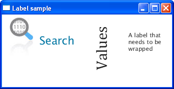
Figure 2-1 shows three common label usages. The label at the left is a text element with an image, the label in the center represents rotated text, and the label at the right renders wrapped text.
Figure 2-1 Sample Application with Labels

Description of "Figure 2-1 Sample Application with Labels"
Creating a Label
The JavaFX API provides three constructors of the Label class for creating labels in your application, as shown in Example 2-1.
Example 2-1 Creating Labels
//An empty label
Label label1 = new Label();
//A label with the text element
Label label2 = new Label("Search");
//A label with the text element and graphical icon
Image image = new Image(getClass().getResourceAsStream("labels.jpg"));
Label label3 = new Label("Search", new ImageView(image));
Once you have created a label in your code, you can add textual and graphical content to it by using the following methods of the Labeled class.
-
The
setText(String text)method – specifies the text caption for the label -
setGraphic(Node graphic)– specifies the graphical icon
The setTextFill method specifies the color to paint the text element of the label. Study Example 2-2. It creates a text label, adds an icon to it, and specifies a fill color for the text.
Example 2-2 Adding an Icon and Text Fill to a Label
Label label1 = new Label("Search");
Image image = new Image(getClass().getResourceAsStream("labels.jpg"));
label1.setGraphic(new ImageView(image));
label1.setTextFill(Color.web("#0076a3"));
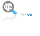
When this code fragment is added to the application, it produces the label shown in Figure 2-2.
When defining both text and graphical content for your button, you can use the setGraphicTextGap method to set the gap between them.
Additionally, you can vary the position of the label content within its layout area by using the setTextAlignment method. You can also define the position of the graphic relative to the text by applying the setContentDisplay method and specifying one of the following ContentDisplay constant: LFFT, RIGHT, CENTER, TOP, BOTTOM.
Setting a Font
Compare the Search labels in Figure 2-1 and Figure 2-2. Notice that the label in Figure 2-1 has a larger font size. This is because the code fragment shown in Example 2-2 does not specify any font settings for the label. It is rendered with the default font size.
To provide a font text size other than the default for your label use the setFont method of the Labeled class. The code fragment in Example 2-3 sets the size of the label1 text to 30 points and the font name to Arial. For label2 sets the text size to 32 points and the font name to Cambria.
Wrapping Text
When you create a label, sometimes you must fit it within a space that is smaller than you need to render. To break up (wrap) the text so that is can fit into the layout area, set the true value for the setWrapText method, as shown in Example 2-4.
Example 2-4 Enable Text Wrapping
Label label3 = new Label("A label that needs to be wrapped");
label3.setWrapText(true);
When label3 is added to the content of an application, it is rendered as shown in Figure 2-3.
Suppose that the layout area of the label is limited not only by its width, but also by its height. You can specify the behavior of a label when it is impossible to render the entire required text string. Use the setTextOverrun method of the Labeled class and one of the available OverrunStyle types to define how to process the part of the text string that cannot be rendered properly. See the API documentation for more information about OverrunStyle types.
Applying Effects
Although a label is static content and cannot be edited, you can apply visual effects or transformations to it. The code fragment in Example 2-5 rotates label2 270 degrees and translates its position vertically.
Example 2-5 Rotating a Label
Label label2 = new Label ("Values");
label2.setFont(new Font("Cambria", 32));
label2.setRotate(270);
label2.setTranslateY(50);
Rotation and translation are typical transformations available in the JavaFX API. Additionally, you can set up an effect that zooms (magnifies) the label when a user hovers the mouse cursor over it.
The code fragment shown in Example 2-6 applies the zoom effect to label3. When the MOUSE_ENTERED event is fired on the label, the scaling factor of 1.5 is set for the setScaleX and setScaleY methods. When a user moves the mouse cursor off of the label and the MOUSE_EXITED event occurs, the scale factor is set to 1.0, and the label is rendered in its original size.
Example 2-6 Applying the Zoom Effect
label3.setOnMouseEntered(new EventHandler<MouseEvent>() {
    @Override public void handle(MouseEvent e) {
        label3.setScaleX(1.5);
        label3.setScaleY(1.5);
    }
});

label3.setOnMouseExited(new EventHandler<MouseEvent>() {
    @Override public void handle(MouseEvent e) {
        label3.setScaleX(1);
        label3.setScaleY(1);
    }
});
Figure 2-4 shows the two states of label3.
Related API Documentation
 Alla is a technical writer for Oracle. She lives in St. Petersburg, Russia, and develops tutorials and technical articles for Java and JavaFX technologies. Prior to her assignment at Oracle, she worked as a technical writer in different IT companies.


