Using JavaFX UI Controls
9 Scroll Bar
This chapter explains how to create scrollable panes by using the scroll bar control.
The ScrollBar class enables you to create scrollable panes and views in your application. Figure 9-1 shows the three areas of a scroll bar: the thumb, the right and left buttons (or down and up buttons), and the track.
Creating a Scroll Bar
Take a moment to review the code fragment in Example 9-1.
Example 9-1 Simple Scroll Bar
ScrollBar sc = new ScrollBar();
sc.setMin(0);
sc.setMax(100);
sc.setValue(50);
The setMin and setMax methods define the minimum and maximum values represented by the scroll bar. When a user moves the thumb, the value of the scroll bar changes. In Example 9-1, the value equals 50, so when the application starts, the thumb is in the center of the scroll bar. By default, the scroll bar is oriented horizontally. However, you can set the vertical orientation by using the setOrientation method.
The user can click the left or right button (down or up button for the vertical orientation) to scroll by a unit increment. The UNIT_INCREMENT property specifies the amount by which the scroll bar is adjusted when a button is clicked. Another option is clicking within the track by a block increment. The BLOCK_INCREMENT property defines the amount by which the scroll bar is adjusted when the track of the bar is clicked.
In your application, you can use one of several scroll bars to scroll through graphical content that exceeds the borders of the available space.
Using a Scroll Bar in Your Application
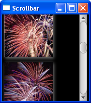
Examine the scroll bar in action. The application shown in Example 9-2 implements a scrollable scene to view the images. The task of this application is to enable users to view the content of the vertical box, which is longer than the scene's height.
Example 9-2 Scrolling Through Multiple Images
import javafx.application.Application;
import javafx.beans.value.ChangeListener;
import javafx.beans.value.ObservableValue;
import javafx.geometry.Orientation;
import javafx.scene.Group;
import javafx.scene.Scene;
import javafx.scene.control.ScrollBar;
import javafx.scene.effect.DropShadow;
import javafx.scene.image.Image;
import javafx.scene.image.ImageView;
import javafx.scene.layout.VBox;
import javafx.scene.paint.Color;
import javafx.stage.Stage;

public class Main extends Application {

    final ScrollBar sc = new ScrollBar();
    final Image[] images = new Image[5];
    final ImageView[] pics = new ImageView[5];
    final VBox vb = new VBox();
    DropShadow shadow = new DropShadow();

    @Override
    public void start(Stage stage) {
        Group root = new Group();
        Scene scene = new Scene(root, 180, 180);
        scene.setFill(Color.BLACK);
        stage.setScene(scene);
        stage.setTitle("Scrollbar");
        root.getChildren().addAll(vb, sc);

        shadow.setColor(Color.GREY);
        shadow.setOffsetX(2);
        shadow.setOffsetY(2);

        vb.setLayoutX(5);
        vb.setSpacing(10);

        sc.setLayoutX(scene.getWidth()-sc.getWidth());
        sc.setMin(0);
        sc.setOrientation(Orientation.VERTICAL);
        sc.setPrefHeight(180);
        sc.setMax(360);

        for (int i = 0; i < 5; i++) {
            final Image image = images[i] =
                new Image(getClass().getResourceAsStream(
                    "fw" +(i+1)+ ".jpg")
                );
            final ImageView pic = pics[i] =
                new ImageView(images[i]);
            pic.setEffect(shadow);
            vb.getChildren().add(pics[i]);
        }

        sc.valueProperty().addListener(new ChangeListener<Number>() {
            public void changed(ObservableValue<? extends Number> ov,
                Number old_val, Number new_val) {
                    vb.setLayoutY(-new_val.doubleValue());
            }
        });

        stage.show();
    }

    public static void main(String[] args) {
        launch(args);
    }
}
The first lines of the code add a vertical box with the images and a scroll bar to the scene.
The Y coordinate of the vertical box changes when the VALUE property of the scroll bar is changed, so that each time the thumb is moved, or either a button or the track is clicked, the vertical box moves, as shown in Example 9-3.
Example 9-3 Implementing the Scrolling of the Vertical Box
sc.valueProperty().addListener(new ChangeListener<Number>() {
    public void changed(ObservableValue<? extends Number> ov,
        Number old_val, Number new_val) {
            vb.setLayoutY(-new_val.doubleValue());
        }
});
Compiling and running this application produces the output shown in Figure 9-2.
This application shows one typical use of the ScrollBar class. You can also customize this class to create a scroll area within a scene. As for every UI control and every node, the scroll bar can be styled to change its appearance from the default implementation.
Related API Documentation
 Alla is a technical writer for Oracle. She lives in St. Petersburg, Russia, and develops tutorials and technical articles for Java and JavaFX technologies. Prior to her assignment at Oracle, she worked as a technical writer in different IT companies.


