Using JavaFX UI Controls
7 Choice Box
This chapter describes choice boxes, the UI controls that provide support for quickly selecting between a few options.
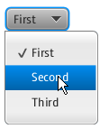
Use the ChoiceBox class to add choice boxes to your JavaFX applications. Its simple implementation is shown in Figure 7-1.
Figure 7-1 Creating a Choice Box with Three Items

Description of "Figure 7-1 Creating a Choice Box with Three Items"
Creating a Choice Box
Example 7-1 creates a choice box with three items.
Example 7-1 Creating a Choice Box
ChoiceBox cb = new ChoiceBox(FXCollections.observableArrayList(
    "First", "Second", "Third")
);
Example 7-1 shows a list of items created and populated within a constructor of the ChoiceBox class. The list items are specified by using an observable array. Alternatively, you can use an empty constructor of the class and set the list items by using the setItems method shown in Example 7-2.
Example 7-2 Choice Box with Text Elements and a Separator
ChoiceBox cb = new ChoiceBox();
cb.setItems(FXCollections.observableArrayList(
    "New Document", "Open ",
    new Separator(), "Save", "Save as")
);
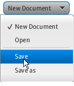
Note that a choice box can contain not only text elements, but other objects as well. A Separator control is used in Example 7-2 to separate the items. When this code fragment is integrated into the application, it produces the output shown in Figure 7-2.
Figure 7-2 Menu Created by Using a Choice Box

Description of "Figure 7-2 Menu Created by Using a Choice Box"
In real-life applications, the choice boxes are used to build multiple-choice lists.
Setting the Behavior for a Choice Box
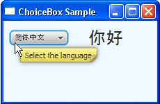
The application shown in Figure 7-3 provides a multiple-choice box with five options. When a particular language is selected, the corresponding greeting is rendered.
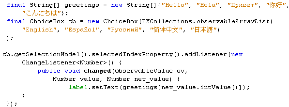
Figure 7-4 provides a code fragment to illustrate how an item selected from the choice box defines which greeting should be rendered.
A ChangeListener<Number> object detects the index of the currently selected item by consecutive calls of the getSelectionModel and selectedIndexProperty methods. The getSelectionModel method returns the selected item, and the selectedIndexProperty method returns the SELECTED_INDEX property of the cb choice box. As a result, the integer value as an index defines an element of the greetings array and specifies a String text value for the label. If, for example, a user selects the second item, which corresponds to Spanish, the SELECTED_INDEX is equal to 1 and "Hola" is selected from the greetings array. Thus, the label renders "Hola."
You can make the ChoiceBox control more informative by assigning a tooltip to it. A tooltip is a UI control that is available in the javafx.scene.control package. A tooltip can be applied to any of the JavaFX UI controls.
Applying a Tooltip
The Tooltip class provides a prefabricated tooltip that can be easily applied to a choice box (or any other control) by calling the setTooltip method shown in Example 7-3.
Typically a user defines the text of the tooltip within a constructor of the Tooltip class. However, if the logic of your application requires UI to set the text dynamically, you can apply a tooltip by using an empty constructor and then assign the text to it by using the setText method.
After the tooltip is applied to the cb choice box, a user who positions the cursor over the choice box sees the image shown in Figure 7-5.
Figure 7-5 Choice Box with the Applied Tooltip

Description of "Figure 7-5 Choice Box with the Applied Tooltip"
To further enhance your application, you can style the choice box with the CSS properties or apply visual effects or transformations.
Related API Documentation
 Alla is a technical writer for Oracle. She lives in St. Petersburg, Russia, and develops tutorials and technical articles for Java and JavaFX technologies. Prior to her assignment at Oracle, she worked as a technical writer in different IT companies.


