Using JavaFX UI Controls
14 Combo Box
This chapter explains how to use combo boxes in your JavaFX application. It discusses editable and uneditable combo boxes, teaches you how to track changes in the editable combo boxes and handle events on them, and explains how to use cell factories to alter the default implementation of a combo box.
A combo box is a typical element of a user interface that enables users to choose one of several options. A combo box is helpful when the number of items to show exceeds some limit, because it can add scrolling to the drop down list, unlike a choice box. If the number of items does not exceed a certain limit, developers can decide whether a combo box or a choice box better suits their needs.
You can create a combo box in the JavaFX application by using the ComboBox class of the JavaFX API. Figure 14-1 shows an application with two combo boxes.
Figure 14-1 Application with Two Combo Boxes
Description of "Figure 14-1 Application with Two Combo Boxes"
Creating Combo Boxes
When creating a combo box, you must instantiate the ComboBox class and define the items as an observable list, just like other UI controls such as ChoiceBox, ListView, and TableView. Example 14-1 sets the items within a constructor.
Example 14-1 Creating a Combo Box with an Observable List
ObservableList<String> options =
    FXCollections.observableArrayList(
        "Option 1",
        "Option 2",
        "Option 3"
    );
final ComboBox comboBox = new ComboBox(options);
Another possibility is to create a combo box by using an empty constructor and call the setItems method on it, as follows: comboBox.setItems(options);
When the combo box is added to the application scene, it appears in the user interface as shown in Figure 14-2.
At any time, you can supplement the list of items with new values. Example 14-2 implements this task by adding three more items to the comboBox control.
Example 14-2 Adding Items to a Combo Box
comboBox.getItems().addAll(
    "Option 4",
    "Option 5",
    "Option 6"
);
The ComboBox class provides handy properties and methods to use with combo boxes.
You can use the setValue method to specify the item selected in the combo box. When you call the setValue method on the ComboBox object, the selected item of the selectionModel property changes to this value even if the value is not in the combo box items list. If the items list then changes to include this value, the corresponding item becomes selected.
Similarly, you can obtain the value of the selected item by calling the getValue method. When a user selects an item, the selected item of the selectionModel property and the combo box value property are both updated to the new value.
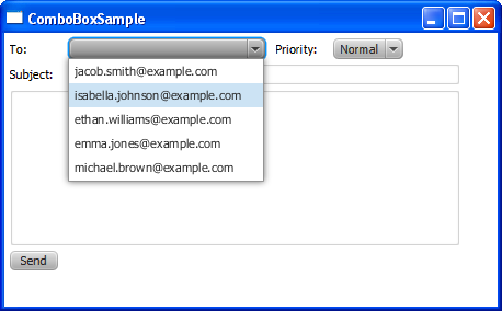
You can also restrict the number of visible rows in the ComboBox drop down list when it is displayed. The following code line enables the display of three items for the comboBox control: comboBox.setVisibleRowCount(3) As the result of calling this method, the number of visible rows is limited to three, and a scroll bar appears (as shown in Figure 14-3).
Figure 14-3 Setting the Number of Visible Rows for a Combo Box

Description of "Figure 14-3 Setting the Number of Visible Rows for a Combo Box"
Although the ComboBox class has a generic notation and enables users to populate it with items of various types, do not use Node (or any subclass) as the type. Because the scene graph concept implies that only one Node object can be in one place of the application scene, the selected item is removed from the ComboBox list of items. When the selection changes, the previously selected item returns to the list and the new selection is removed. To prevent this situation, use the cell factory mechanism and the solution described in the API documentation. The cell factory mechanism is particularly helpful when you need to change the initial behavior or appearance of the ComboBox object.
The ComboBoxSample application is designed to illustrate how to use combo boxes in a typical email interface. Example 14-3 creates a such an interface, in which two combo boxes are used to select the email recipient and the priority of the message.
Example 14-3 Creating Combo Boxes and Adding Them to the Scene
import javafx.application.Application;
import javafx.geometry.Insets;
import javafx.scene.Group;
import javafx.scene.Scene;
import javafx.scene.control.*;
import javafx.scene.layout.GridPane;
import javafx.stage.Stage;

public class ComboBoxSample extends Application {
    public static void main(String[] args) {
        launch(args);
    }

    final Button button = new Button ("Send");
    final Label notification = new Label ();
    final TextField subject = new TextField("");
    final TextArea text = new TextArea ("");

    String address = " ";

    @Override public void start(Stage stage) {
        stage.setTitle("ComboBoxSample");
        Scene scene = new Scene(new Group(), 450, 250);

        final ComboBox emailComboBox = new ComboBox();
        emailComboBox.getItems().addAll(
            "jacob.smith@example.com",
            "isabella.johnson@example.com",
            "ethan.williams@example.com",
            "emma.jones@example.com",
            "michael.brown@example.com"
        );

        final ComboBox priorityComboBox = new ComboBox();
        priorityComboBox.getItems().addAll(
            "Highest",
            "High",
            "Normal",
            "Low",
            "Lowest"
        );

        priorityComboBox.setValue("Normal");

        GridPane grid = new GridPane();
        grid.setVgap(4);
        grid.setHgap(10);
        grid.setPadding(new Insets(5, 5, 5, 5));
        grid.add(new Label("To: "), 0, 0);
        grid.add(emailComboBox, 1, 0);
        grid.add(new Label("Priority: "), 2, 0);
        grid.add(priorityComboBox, 3, 0);
        grid.add(new Label("Subject: "), 0, 1);
        grid.add(subject, 1, 1, 3, 1);
        grid.add(text, 0, 2, 4, 1);
        grid.add(button, 0, 3);
        grid.add (notification, 1, 3, 3, 1);

        Group root = (Group)scene.getRoot();
        root.getChildren().add(grid);
        stage.setScene(scene);
        stage.show();
    }
}
Both combo boxes in Example 14-3 use the getItems and addAll methods to add items. When you compile and run this code, it produces the application window shown in Figure 14-4.
Figure 14-4 Email Recipient and Priority Combo Boxes
Description of "Figure 14-4 Email Recipient and Priority Combo Boxes"
Editable Combo Boxes
Typically, email client applications enable users to both select recipients from the address book and type a new address. An editable combo box perfectly fits this task. Use the setEditable(true) method of the ComboBox class to make a combo box editable. With the setPromptText method, you can specify the text to appear in the combo box editing area when no selection is performed. Examine the modified code of the application in Example 14-4. The bold lines are the additions made to Example 14-3.
Example 14-4 Processing Newly Typed Values in an Editable Combo Box
import javafx.application.Application;
import javafx.beans.value.ChangeListener;
import javafx.beans.value.ObservableValue;
import javafx.event.ActionEvent;
import javafx.event.EventHandler;
import javafx.geometry.Insets;
import javafx.scene.Group;
import javafx.scene.Scene;
import javafx.scene.control.*;
import javafx.scene.layout.GridPane;
import javafx.stage.Stage;

public class ComboBoxSample extends Application {
        public static void main(String[] args) {
        launch(args);
    }

    final Button button = new Button ("Send");
    final Label notification = new Label ();
    final TextField subject = new TextField("");
    final TextArea text = new TextArea ("");

    String address = " ";

    @Override public void start(Stage stage) {
        stage.setTitle("ComboBoxSample");
        Scene scene = new Scene(new Group(), 450, 250);

        final ComboBox emailComboBox = new ComboBox();
        emailComboBox.getItems().addAll(
            "jacob.smith@example.com",
            "isabella.johnson@example.com",
            "ethan.williams@example.com",
            "emma.jones@example.com",
            "michael.brown@example.com"
        );
        emailComboBox.setPromptText("Email address");
        emailComboBox.setEditable(true);
        emailComboBox.valueProperty().addListener(new ChangeListener<String>() {
            @Override
            public void changed(ObservableValue ov, String t, String t1) {
                address = t1;
            }
        });

        final ComboBox priorityComboBox = new ComboBox();
        priorityComboBox.getItems().addAll(
            "Highest",
            "High",
            "Normal",
            "Low",
            "Lowest"
        );

        priorityComboBox.setValue("Normal");


        button.setOnAction(new EventHandler<ActionEvent>() {
            @Override
            public void handle(ActionEvent e) {
                if (emailComboBox.getValue() != null &&
                    !emailComboBox.getValue().toString().isEmpty()){
                        notification.setText("Your message was successfully sent"
                            + " to " + address);
                        emailComboBox.setValue(null);
                        if (priorityComboBox.getValue() != null &&
                            !priorityComboBox.getValue().toString().isEmpty()){
                                priorityComboBox.setValue(null);
                            }
                        subject.clear();
                        text.clear();
                }
                else {
                    notification.setText("You have not selected a recipient!");
                }
            }
        });

        GridPane grid = new GridPane();
        grid.setVgap(4);
        grid.setHgap(10);
        grid.setPadding(new Insets(5, 5, 5, 5));
        grid.add(new Label("To: "), 0, 0);
        grid.add(emailComboBox, 1, 0);
        grid.add(new Label("Priority: "), 2, 0);
        grid.add(priorityComboBox, 3, 0);
        grid.add(new Label("Subject: "), 0, 1);
        grid.add(subject, 1, 1, 3, 1);
        grid.add(text, 0, 2, 4, 1);
        grid.add(button, 0, 3);
        grid.add (notification, 1, 3, 3, 1);

        Group root = (Group)scene.getRoot();
        root.getChildren().add(grid);
        stage.setScene(scene);
        stage.show();

    }
}
Besides the ability to edit emailComboBox, this code fragment implements event handling for this control. The newly typed or selected value is stored in the address variable. When users press the Send button, the notification containing the email address is shown.
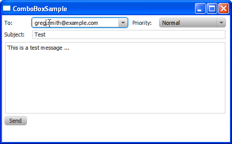
Figure 14-5 captures the moment when a user is editing the email address of Jacob Smith and changing it to greg.smith@example.com.
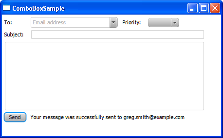
When the Send button is pressed, all the controls return to their default states. The clear methods are called on the TextField and TextArea objects, and the null value is set for the combo box selected items. Figure 14-6 shows the moment after the Send button is pressed.
Figure 14-6 User Interface After the Send Button Is Pressed
Description of "Figure 14-6 User Interface After the Send Button Is Pressed"
Applying Cell Factories to Combo Boxes
You can use the cell factory mechanism to alter the default behavior or appearance of a combo box. Example 14-5 creates a cell factory and applies it to the priority combo box to highlight priority types with special colors.
Example 14-5 Implementing a Cell Factory for the Priority Combo Box
import javafx.application.Application;
import javafx.beans.value.ChangeListener;
import javafx.beans.value.ObservableValue;
import javafx.event.ActionEvent;
import javafx.event.EventHandler;
import javafx.geometry.Insets;
import javafx.scene.Group;
import javafx.scene.Scene;
import javafx.scene.control.*;
import javafx.scene.layout.GridPane;
import javafx.scene.paint.Color;
import javafx.stage.Stage;
import javafx.util.Callback;

public class ComboBoxSample extends Application {
        public static void main(String[] args) {
        launch(args);
    }

    final Button button = new Button ("Send");
    final Label notification = new Label ();
    final TextField subject = new TextField("");
    final TextArea text = new TextArea ("");

    String address = " ";

    @Override public void start(Stage stage) {
        stage.setTitle("ComboBoxSample");
        Scene scene = new Scene(new Group(), 450, 250);

        final ComboBox emailComboBox = new ComboBox();
        emailComboBox.getItems().addAll(
            "jacob.smith@example.com",
            "isabella.johnson@example.com",
            "ethan.williams@example.com",
            "emma.jones@example.com",
            "michael.brown@example.com"
        );
        emailComboBox.setPromptText("Email address");
        emailComboBox.setEditable(true);
        emailComboBox.valueProperty().addListener(new ChangeListener<String>() {
            @Override public void changed(ObservableValue ov, String t, String t1) {
                address = t1;
            }
        });

        final ComboBox priorityComboBox = new ComboBox();
        priorityComboBox.getItems().addAll(
            "Highest",
            "High",
            "Normal",
            "Low",
            "Lowest"
        );

        priorityComboBox.setValue("Normal");
        priorityComboBox.setCellFactory(
            new Callback<ListView<String>, ListCell<String>>() {
                @Override public ListCell<String> call(ListView<String> param) {
                    final ListCell<String> cell = new ListCell<String>() {
                        {
                            super.setPrefWidth(100);
                        }
                        @Override public void updateItem(String item,
                            boolean empty) {
                                super.updateItem(item, empty);
                                if (item != null) {
                                    setText(item);
                                    if (item.contains("High")) {
                                        setTextFill(Color.RED);
                                    }
                                    else if (item.contains("Low")){
                                        setTextFill(Color.GREEN);
                                    }
                                    else {
                                        setTextFill(Color.BLACK);
                                    }
                                }
                                else {
                                    setText(null);
                                }
                            }
                };
                return cell;
            }
        });


        button.setOnAction(new EventHandler<ActionEvent>() {
            @Override
            public void handle(ActionEvent e) {
                if (emailComboBox.getValue() != null &&
                    !emailComboBox.getValue().toString().isEmpty()){
                        notification.setText("Your message was successfully sent"
                            + " to " + address);
                        emailComboBox.setValue(null);
                        if (priorityComboBox.getValue() != null &&
                            !priorityComboBox.getValue().toString().isEmpty()){
                                priorityComboBox.setValue(null);
                            }
                        subject.clear();
                        text.clear();
                }
                else {
                    notification.setText("You have not selected a recipient!");
                }
            }
        });

        GridPane grid = new GridPane();
        grid.setVgap(4);
        grid.setHgap(10);
        grid.setPadding(new Insets(5, 5, 5, 5));
        grid.add(new Label("To: "), 0, 0);
        grid.add(emailComboBox, 1, 0);
        grid.add(new Label("Priority: "), 2, 0);
        grid.add(priorityComboBox, 3, 0);
        grid.add(new Label("Subject: "), 0, 1);
        grid.add(subject, 1, 1, 3, 1);
        grid.add(text, 0, 2, 4, 1);
        grid.add(button, 0, 3);
        grid.add (notification, 1, 3, 3, 1);

        Group root = (Group)scene.getRoot();
        root.getChildren().add(grid);
        stage.setScene(scene);
        stage.show();

    }
}
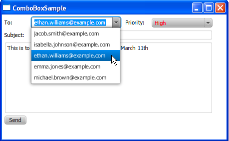
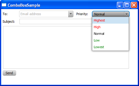
The cell factory produces ListCell objects. Every cell is associated with a single combo box item. The width of each combo box item is set through the setPrefWidth method. The updateItem method sets the red color for the High and Highest items, green color for the Low and Lowest items, and leaves the Normal item black.
Figure 14-7 shows the items of the priority combo box after the cell factory in Example 14-5 is applied.
Figure 14-7 Modified the Priority Combo Box
Description of "Figure 14-7 Modified the Priority Combo Box"
You can further enhance the appearance of the ComboBox control by applying CSS styles or visual effects.
Related API Documentation
 Alla is a technical writer for Oracle. She lives in St. Petersburg, Russia, and develops tutorials and technical articles for Java and JavaFX technologies. Prior to her assignment at Oracle, she worked as a technical writer in different IT companies.


