Using JavaFX UI Controls
24 Color Picker
This chapter describes the ColorPicker control, provides its design overview, and explains how to use it in your JavaFX applications.
The color picker control in the JavaFX SDK is a typical user interface component that enables users to select a particular color from the available range, or set an additional color by specifying an RGB or HSB combination.
Design Overview
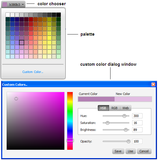
The ColorPicker control consists of the color chooser, color palette, and custom color dialog window. Figure 24-1 shows these elements.
Figure 24-1 Elements of a Color Picker Control
Description of "Figure 24-1 Elements of a Color Picker Control"
Color Chooser
The color chooser element of the color picker is the combo box with the enabled color indicator and the corresponding label shown at the top of Figure 24-1. The color indicator presents the currently selected color.
The implementation of the color picker control allows three looks of the color chooser element: button, split-menu-button, and combo box shown in Figure 24-2.
The button look provides a typical button control with the color indicator and the label. In the split-menu-button look, the button part of the control is separated from the drop-down menu. The combo-box look is the default appearance of the color chooser. It also has a drop-down menu but it is not separated from the button part.
To apply one of the looks, use the corresponding CSS classes. For more information about how to alter the appearance of a color picker, see Changing the Appearance of a Color Picker.
Color Palette
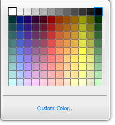
The color palette contains the predefined set of colors and the Custom Color link that points to the Custom Color dialog window. The initial appearance of the color palette is shown in Figure 24-3.
Figure 24-3 Initial Appearance of the Color Palette
Description of "Figure 24-3 Initial Appearance of the Color Palette"
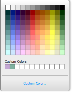
If a custom color is already defined, this color is displayed in the Custom Color area in the color palette, as shown in Figure 24-4.
Figure 24-4 Color Palette with the Custom Color Area
Description of "Figure 24-4 Color Palette with the Custom Color Area"
The color palette supports navigation by using the Up, Down, Left and Right keys.
The set of custom colors cannot be reloaded when the application starts again, unless saved within the application. Each color selected in the palette or in the custom color area is displayed in the color indicator of the color chooser. The color chooser label renders the corresponding hexadecimal web color value.
Custom Color Dialog Window
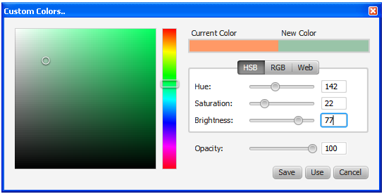
The Custom Color dialog window is a modal window that can be opened by clicking the corresponding link in the color palette. When the Custom Color window opens, it displays values of the color that is currently shown in the color indicator of the color chooser. Users can define a new color by moving the mouse cursor over the color area or over the vertical color bar, shown in Figure 24-5. Note that any time a user manipulates with the circle in the color area or with the rectangle in the color bar, the color value is automatically assigned to the corresponding property of the ColorPicker control.
Another way to define a new color is to set the HSB (Hue Saturation Brightness) or RGB (Red Green Blue) values, or explicitly enter the web color value in the corresponding field. Figure 24-6 shows three panes for the custom color settings.
Figure 24-6 Color Setting Panes in the Custom Colors Dialog Window

Description of "Figure 24-6 Color Setting Panes in the Custom Colors Dialog Window"
Users can also set the transparency of the custom color by moving the Opacity slider or typing the value from 0 to 100.
When all the settings are done and the new color is specified, users can click Use to apply it, or Save to save the color to the custom color area.
Using a Color Picker
Use the ColorPicker class of the JavaFX SDK to build a color picker in your JavaFX application. You can add a color picker directly to the application scene, to a layout container, or to the application toolbar. Example 24-1 shows three ways to declare a ColorPicker object.
Example 24-1 Creating a Color Picker Control
//Empty contructor, the control appears with the default color, which is WHITE
ColorPicker colorPicker1 = new ColorPicker();
//Color constant set as the currently selected color
ColorPicker colorPicker2 = new ColorPicker(Color.BLUE);
//Web color value set as the currently selected color
ColorPicker colorPicker3 = new ColorPicker(Color.web("#ffcce6"));
Try the sample shown in Example 24-2 to evaluate the ColorPicker control in action.
Example 24-2 Using the ColorPicker Control to Alter the Color of the Text Component
import javafx.application.Application;
import javafx.event.*;
import javafx.scene.Scene;
import javafx.scene.control.ColorPicker;
import javafx.geometry.Insets;
import javafx.scene.layout.HBox;
import javafx.scene.paint.Color;
import javafx.scene.text.*;
import javafx.stage.Stage;

public class ColorPickerSample extends Application {
    public static void main(String[] args) {
        launch(args);
    }

    @Override
    public void start(Stage stage) {
        stage.setTitle("ColorPicker");
        Scene scene = new Scene(new HBox(20), 400, 100);
        HBox box = (HBox) scene.getRoot();
        box.setPadding(new Insets(5, 5, 5, 5));

        final ColorPicker colorPicker = new ColorPicker();
        colorPicker.setValue(Color.CORAL);

        final Text text = new Text("Try the color picker!");
        text.setFont(Font.font ("Verdana", 20));
        text.setFill(colorPicker.getValue());

        colorPicker.setOnAction(new EventHandler() {
            public void handle(Event t) {
                text.setFill(colorPicker.getValue());
            }
        });

        box.getChildren().addAll(colorPicker, text);

        stage.setScene(scene);
        stage.show();
    }
}
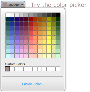
This example creates a color picker and defines its behavior when the color is changed. The Color value obtained through the getValue method of the ColorPicker class is passed to the setFill method of the Text object. This is how the selected color is applied to the "Try the color picker!" text.
When you compile and run this sample, it produces the output shown in Figure 24-7. The figure captures the moment when a newly created custom color is applied to the Text component.
Figure 24-7 ColorPicker and a Text Component
Description of "Figure 24-7 ColorPicker and a Text Component"
Similarly, you can apply the selected color to the graphical Node. Example 24-3 shows how to use a color picker to model a T-shirt.
Example 24-3 Using ColorPicker to Alter the Color of a Graphical Object
import javafx.application.Application;
import javafx.event.Event;
import javafx.event.EventHandler;
import javafx.scene.Scene;
import javafx.scene.control.ColorPicker;
import javafx.beans.value.ChangeListener;
import javafx.beans.value.ObservableValue;
import javafx.scene.control.ComboBox;
import javafx.scene.control.ToolBar;
import javafx.scene.effect.DropShadow;
import javafx.scene.image.Image;
import javafx.scene.image.ImageView;
import javafx.scene.layout.StackPane;
import javafx.scene.layout.VBox;
import javafx.scene.paint.Color;
import javafx.scene.shape.SVGPath;
import javafx.stage.Stage;

public class ColorPickerSample extends Application {

    ImageView logo = new ImageView(
        new Image(getClass().getResourceAsStream("OracleLogo.png"))
    );

    public static void main(String[] args) {
        launch(args);
    }

    @Override
    public void start(Stage stage) {
        stage.setTitle("ColorPicker");

        Scene scene = new Scene(new VBox(20), 300, 300);
        scene.setFill(Color.web("#ccffcc"));
        VBox box = (VBox) scene.getRoot();

        ToolBar tb = new ToolBar();
        box.getChildren().add(tb);

        final ComboBox logoSamples = new ComboBox();
        logoSamples.getItems().addAll(
                "Oracle",
                "Java",
                "JavaFX",
                "Cup");
        logoSamples.setValue("Oracle");

        logoSamples.valueProperty().addListener(new ChangeListener<String>() {
            @Override
            public void changed(ObservableValue ov, String t, String t1) {
                logo.setImage(
                    new Image(getClass().getResourceAsStream(t1+"Logo.png"))
                );
            }
        });


        final ColorPicker colorPicker = new ColorPicker();
        tb.getItems().addAll(logoSamples, colorPicker);

        StackPane stack = new StackPane();
        box.getChildren().add(stack);

        final SVGPath svg = new SVGPath();
        svg.setContent("M70,50 L90,50 L120,90 L150,50 L170,50"
            + "L210,90 L180,120 L170,110 L170,200 L70,200 L70,110 L60,120 L30,90"
            + "L70,50");
        svg.setStroke(Color.DARKGREY);
        svg.setStrokeWidth(2);
        svg.setEffect(new DropShadow());
        svg.setFill(colorPicker.getValue());
        stack.getChildren().addAll(svg, logo);

        colorPicker.setOnAction(new EventHandler() {
            public void handle(Event t) {
                svg.setFill(colorPicker.getValue());
            }
        });

        stage.setScene(scene);
        stage.show();
    }
}
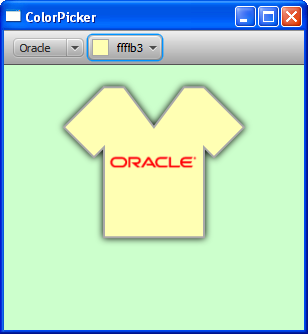
In this example, the color selected in the color picker and obtained through the getValue method is applied to the SVGPath object. This sample produces the output shown in Figure 24-8
Figure 24-8 ColorPickerSample Application
Description of "Figure 24-8 ColorPickerSample Application"
When you work with a color picker, you can obtain the created custom colors by calling the getCustomColors()method. It returns an ObservableList of the Color objects corresponding to the created colors. You cannot upload them to a color picker on the application start. However, you can set one of the custom colors as a ColorPicker value (shown in Example 24-4).
Changing the Appearance of a Color Picker
The default appearance of the color picker control is defined by the com.sun.javafx.scene.control.skin.ColorPickerSkin class. To apply an alternative skin to the color pickers in your JavaFX application, redefine the -fx-skin property of the color-picker CSS class as shown in Example 24-5.
Example 24-5 Setting an Alternative Skin for a Color Picker
.color-picker {
    -fx-skin: "CustomSkin";
}
Use the split-button and arrow-button CSS classes to change the appearance of a color picker control in the JavaFX code, as shown in Example 24-6.
Example 24-6 Setting Appearance for a Color Picker
//Sets the split-menu-button
colorPicker.getStyleClass().add("split-button");
//Sets the button
colorPicker.getStyleClass().add("button");
You can also modify the default style of a color picker and customize its elements with various CSS classes defined in the caspian style sheet. To view this file, go to the \rt\lib directory under the directory in which the JavaFX SDK is installed. Use the following command to extract the style sheet from the JAR file: jar -xf jfxrt.jar com/sun/javafx/scene/control/skin/caspian/caspian.css. See Skinning JavaFX Applications with CSS for more information about CSS classes and properties. Example 24-7 shows how to alter the default background and the label of a color picker.
Example 24-7 Modifying the Default Appearance of a Color Picker
.color-picker {
    -fx-background-color: #669999;
    -fx-background-radius: 0 15 15 0;
}
.color-picker .color-picker-label .text {
    -fx-fill: #ccffcc;
}
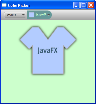
Add these styles to the ControlStyle.css file and enable the style sheets in the JavaFX application by using the following code line: scene.getStylesheets().add("colorpickersample/ControlStyle.css");, then compile and the run the ColorPickerSample. The color picker should change its appearance as shown in Figure 24-9.
Figure 24-9 Modified Appearance of a Color Picker
Description of "Figure 24-9 Modified Appearance of a Color Picker"
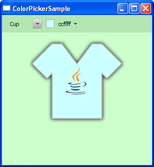
Note that the ColorPicker class is an extension of the ComboBoxBase class and inherits its CSS properties. You can define new styles for the combo-box-base CSS style to unify the combo box and the color picker in the ColorPickerSample application. Replace the styles in the ControlStyle.css file with the styles shown in Example 24-8.
Example 24-8 Setting the Combo-Box-Base Styles
.tool-bar:horizontal {
    -fx-background-color: #b3e6b3;
}

.combo-box-base  {
    -fx-background-color: null;
}

.combo-box-base:hover  {
    -fx-effect: dropshadow( three-pass-box , rgba(0,0,0,0.6) , 8, 0.0 , 0 , 0 );
}
When you compile and run the ColorPickerSample application with the applied styles, the combo box and the color picker look as shown in Figure 24-10.
Figure 24-10 Unified Style of the Combo Box and Color Picker
Description of "Figure 24-10 Unified Style of the Combo Box and Color Picker"
Related API Documentation
 Alla is a technical writer for Oracle. She lives in St. Petersburg, Russia, and develops tutorials and technical articles for Java and JavaFX technologies. Prior to her assignment at Oracle, she worked as a technical writer in different IT companies.


