Using JavaFX UI Controls
5 Toggle Button
In this chapter, you learn about the ToggleButton class, another type of buttons available through the JavaFX API.
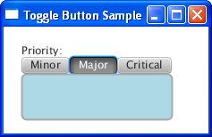
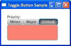
Two or more toggle buttons can be combined into a group where only one button at a time can be selected, or where no selection is required. Figure 5-1 is a screen capture of an application that combines three toggle buttons in a group. The application paints the rectangle with a specific color according to on which toggle button is selected.
Creating a Toggle Button
You can create a toggle button in your application by using any of the three constructors of the ToggleButton class, as shown in Example 5-1.
Example 5-1 Creating Toggle Buttons
//A toggle button without any caption or icon
ToggleButton tb1 = new ToggleButton();
//A toggle button with a text caption
ToggleButton tb2 = new ToggleButton("Press me");
//A toggle button with a text caption and an icon
Image image = new Image(getClass().getResourceAsStream("icon.png"));
ToggleButton tb3 = new ToggleButton ("Press me", new ImageView(image));
The ToggleButton class is an extension of the Labeled class, so you can specify a text caption, an image, or both image and text. You can use the setText and setGraphic methods of the Labeled class to specify textual and graphical content for a toggle button.
Once you have defined toggle buttons in your code, you can combine them in a group and set a specific behavior.
Adding Toggle Buttons to a Group
The implementation of the ToggleButton class is very similar to the implementation the RadioButton class. However, unlike radio buttons, toggle buttons in a toggle group do not attempt to force the selection at least one button in the group. That is, clicking the selected toggle button causes it to become deselected, clicking the selected radio button in the group has no effect.
Take a moment to study the code fragment Example 5-2.
Example 5-2 Combining Toggle Buttons in a Group
final ToggleGroup group = new ToggleGroup();

ToggleButton tb1 = new ToggleButton("Minor");
tb1.setToggleGroup(group);
tb1.setSelected(true);

ToggleButton tb2 = new ToggleButton("Major");
tb2.setToggleGroup(group);

ToggleButton tb3 = new ToggleButton("Critical");
tb3.setToggleGroup(group);
Example 5-2 creates three toggle buttons and adds them to the toggle group. The setSelected method is called for the tb1 toggle button so that it is selected when the application starts. However, you can deselect the Minor toggle button so that no toggle buttons are selected in the group at startup, as shown in Figure 5-2.
Figure 5-2 Three Toggle Buttons in a Group

Description of "Figure 5-2 Three Toggle Buttons in a Group"
Typically, you use a group of toggle buttons to assign a specific behavior for each button. The next section explains how to use these toggle buttons to alter the color of a rectangle.
Setting the Behavior
The setUserData method inherited by the ToggleButton class from the Node class helps you to associate any selected option with a particular value. In Example 5-3, the user data indicates which color should be used to paint the rectangle.
Example 5-3 Setting User Data for the Toggle Buttons
tb1.setUserData(Color.LIGHTGREEN);
tb2.setUserData(Color.LIGHTBLUE);
tb3.setUserData(Color.SALMON);

final Rectangle rect = new Rectangle(145, 50);

final ToggleGroup group = new ToggleGroup();
group.selectedToggleProperty().addListener(new ChangeListener<Toggle>(){
    public void changed(ObservableValue<? extends Toggle> ov,
        Toggle toggle, Toggle new_toggle) {
            if (new_toggle == null)
                rect.setFill(Color.WHITE);
            else
                rect.setFill(
                    (Color) group.getSelectedToggle().getUserData()
                );
         }
});
The ChangeListener<Toggle> object checks a selected toggle in the group. If none of the toggle buttons is selected, the rectangle is painted with the white color. If one of the toggle button is selected, consecutive calls of the getSelectedToggle and getUserData methods return a color to paint the rectangle.
For example, if a user selects the tb2 toggle button, the setSelectedToggle().getUserData() call returns Color.LIGHTBLUE. The result is shown in Figure 5-3.
Figure 5-3 Using Toggle Buttons to Paint a Rectangle

Description of "Figure 5-3 Using Toggle Buttons to Paint a Rectangle"
See the ToggleButtonSample.java file to examine the complete code of the application.
Styling Toggle Buttons
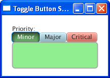
You can enhance this application by applying CSS styles to the toggle buttons. Using CSS in JavaFX 2 applications is similar to using CSS in HTML, because each case is based on the same CSS specification. Example 5-4 uses the setStyle method to alter the -fx-base CSS properties of the toggle buttons.
Example 5-4 Applying CSS Styles to Toggle Buttons
tb1.setStyle("-fx-base: lightgreen;");
tb2.setStyle("-fx-base: lightblue;");
tb3.setStyle("-fx-base: salmon;");
When added to the application code these lines change the visual appearance of the toggle buttons as shown in Figure 5-4.
You might want to try other CSS properties of the ToggleButton class or apply animation, transformations, and visual effects available in the JavaFX API.
Related API Documentation
 Alla is a technical writer for Oracle. She lives in St. Petersburg, Russia, and develops tutorials and technical articles for Java and JavaFX technologies. Prior to her assignment at Oracle, she worked as a technical writer in different IT companies.


