Using JavaFX UI Controls
11 List View
In this chapter, you learn how to create lists in your JavaFX applications.
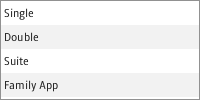
The ListView class represents a scrollable list of items. Figure 11-1 shows the list of available accommodation types in a hotel reservation system.
You can populate the list by defining its items with the setItems method. You can also create a view for the items in the list by applying the setCellFactory method.
Creating a List View
The code fragment in Example 11-1 implements the list with the String items shown in Figure 11-1.
Example 11-1 Creating a List View Control
ListView<String> list = new ListView<String>();
ObservableList<String> items =FXCollections.observableArrayList (
    "Single", "Double", "Suite", "Family App");
list.setItems(items);
To alter the size and height of the list view control, use the setPrefHeight and setPrefWidth methods. Example 11-2 constrains the vertical list to 100 pixels wide by 70 pixels high, which results in the list shown in Figure 11-2.
Example 11-2 Setting Height and Width for a List View
list.setPrefWidth(100);
list.setPrefHeight(70);
You can orient a ListView object horizontally by setting the orientation property to Orientation.HORIZONTAL. This can be done as follows: list.setOrientation(Orientation.HORIZONTAL). The horizontal list with the same items as in Figure 11-1 is shown in Figure 11-3.
At any time, you can track the selection and focus of the ListView object with the SelectionModel and FocusModel classes. To obtain the current state of each item, use a combination of the following methods:
-
getSelectionModel().getSelectedIndex()– Returns the index of the currently selected items in a single-selection mode -
getSelectionModel().getSelectedItem()– Returns the currently selected item -
getFocusModel().getFocusedIndex()– Returns the index of the currently focused item -
getFocusModel().getFocusedItem()– Returns the currently focused item
The default SelectionModel used when instantiating a ListView is an implementation of the MultipleSelectionModel abstract class. However, the default value of the selectionMode property is SelectionMode.SINGLE. To enable multiple selection in a default ListView instance, use the following sequence of calls:
listView.getSelectionModel().setSelectionMode(SelectionMode.MULTIPLE);
Also note that MultipleSelectionModel has the selectedItems and selectedIndices properties, which are both observable lists that can be monitored to detect any multiple selections.
Populating a List View with Data
Example 11-1 shows the simplest way to populate a list view. To enhance your list, you can add data of various types by using the specific extensions of the ListCell class, such as CheckBoxListCell, ChoiceBoxListCell, ComboBoxListCell, and TextFieldListCell. These classes bring additional functionality to the basic list cell. Implementing cell factories for such classes enables developers to change data directly in the list view.
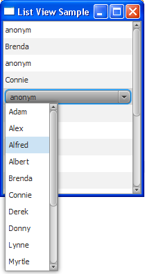
For example, the content of a list cell is not editable by default. However, the ComboBoxListCell class draws a combo box inside the list cell. This modification enables users to build a list of names by selecting them from a combo box, as shown in Example 11-3.
Example 11-3 Adding ComboBoxListCell Items to a List View
import javafx.application.Application;
import javafx.collections.FXCollections;
import javafx.collections.ObservableList;
import javafx.scene.Scene;
import javafx.scene.control.*;
import javafx.scene.control.cell.ComboBoxListCell;
import javafx.scene.layout.StackPane;
import javafx.stage.Stage;

public class ListViewSample extends Application {

    public static final ObservableList names =
        FXCollections.observableArrayList();
    public static final ObservableList data =
        FXCollections.observableArrayList();

    public static void main(String[] args) {
        launch(args);
    }

    @Override
    public void start(Stage primaryStage) {
        primaryStage.setTitle("List View Sample");

        final ListView listView = new ListView(data);
        listView.setPrefSize(200, 250);
        listView.setEditable(true);

        names.addAll(
             "Adam", "Alex", "Alfred", "Albert",
             "Brenda", "Connie", "Derek", "Donny",
             "Lynne", "Myrtle", "Rose", "Rudolph",
             "Tony", "Trudy", "Williams", "Zach"
        );

        for (int i = 0; i < 18; i++) {
            data.add("anonym");
        }

        listView.setItems(data);
        listView.setCellFactory(ComboBoxListCell.forListView(names));

        StackPane root = new StackPane();
        root.getChildren().add(listView);
        primaryStage.setScene(new Scene(root, 200, 250));
        primaryStage.show();
    }
}
The bold line in the example, calls the setCellFactory method to redefine the implementation of the list cell. When you compile and run this example, it produces the application window shown in Figure 11-4.
Figure 11-4 List View with the Combo Box Cells

Description of "Figure 11-4 List View with the Combo Box Cells"
Not only the cell factory mechanism enables you to apply the alternative implementations of the list cells, it can help you to totally customize the appearance of the cells.
Customizing the Content of a List View
Study the following application to learn how to generate the list items by using the cell factory. The application shown in Example 11-4 creates a list of color patterns.
Example 11-4 Creating a Cell Factory
import javafx.application.Application;
import javafx.collections.FXCollections;
import javafx.collections.ObservableList;
import javafx.scene.Scene;
import javafx.scene.control.ListCell;
import javafx.scene.control.ListView;
import javafx.scene.layout.Priority;
import javafx.scene.layout.VBox;
import javafx.scene.paint.Color;
import javafx.scene.shape.Rectangle;
import javafx.stage.Stage;
import javafx.util.Callback;

public class ListViewSample extends Application {

    ListView<String> list = new ListView<String>();
    ObservableList<String> data = FXCollections.observableArrayList(
            "chocolate", "salmon", "gold", "coral", "darkorchid",
            "darkgoldenrod", "lightsalmon", "black", "rosybrown", "blue",
            "blueviolet", "brown");

    @Override
    public void start(Stage stage) {
        VBox box = new VBox();
        Scene scene = new Scene(box, 200, 200);
        stage.setScene(scene);
        stage.setTitle("ListViewSample");
        box.getChildren().addAll(list);
        VBox.setVgrow(list, Priority.ALWAYS);

        list.setItems(data);

        list.setCellFactory(new Callback<ListView<String>,
            ListCell<String>>() {
                @Override
                public ListCell<String> call(ListView<String> list) {
                    return new ColorRectCell();
                }
            }
        );

        stage.show();
    }

    static class ColorRectCell extends ListCell<String> {
        @Override
        public void updateItem(String item, boolean empty) {
            super.updateItem(item, empty);
            Rectangle rect = new Rectangle(100, 20);
            if (item != null) {
                rect.setFill(Color.web(item));
                setGraphic(rect);
            }
        }
    }

    public static void main(String[] args) {
        launch(args);
    }
}
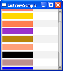
The cell factory produces ListCell objects. Every cell is associated with a single data item and renders a single "row" of the list view. The content that the cell represents through the setGraphic method can include other controls, text, shapes, or images. In this application, the list cell shows rectangles.
Compiling and running the application produces the window shown in Figure 11-5.
You can scroll through the list, selecting and deselecting any of its items. You can also extend this application to fill the text label with the color pattern as shown in the next section.
Processing the List Item Selection
Modify the application code as shown in Example 11-5 to enable processing of the event when a particular list item is selected.
Example 11-5 Processing Events for a List Item
import javafx.application.Application;
import javafx.beans.value.ChangeListener;
import javafx.beans.value.ObservableValue;
import javafx.collections.FXCollections;
import javafx.collections.ObservableList;
import javafx.scene.Scene;
import javafx.scene.control.Label;
import javafx.scene.control.ListCell;
import javafx.scene.control.ListView;
import javafx.scene.layout.Priority;
import javafx.scene.layout.VBox;
import javafx.scene.paint.Color;
import javafx.scene.shape.Rectangle;
import javafx.scene.text.Font;
import javafx.stage.Stage;
import javafx.util.Callback;

public class ListViewSample extends Application {

    ListView<String> list = new ListView<String>();
    ObservableList<String> data = FXCollections.observableArrayList(
            "chocolate", "salmon", "gold", "coral", "darkorchid",
            "darkgoldenrod", "lightsalmon", "black", "rosybrown", "blue",
            "blueviolet", "brown");
    final Label label = new Label();

    @Override
    public void start(Stage stage) {
        VBox box = new VBox();
        Scene scene = new Scene(box, 200, 200);
        stage.setScene(scene);
        stage.setTitle("ListViewSample");
        box.getChildren().addAll(list, label);
        VBox.setVgrow(list, Priority.ALWAYS);

        label.setLayoutX(10);
        label.setLayoutY(115);
        label.setFont(Font.font("Verdana", 20));

        list.setItems(data);

        list.setCellFactory(new Callback<ListView<String>,
            ListCell<String>>() {
                @Override
                public ListCell<String> call(ListView<String> list) {
                    return new ColorRectCell();
                }
            }
        );

        list.getSelectionModel().selectedItemProperty().addListener(
            new ChangeListener<String>() {
                public void changed(ObservableValue<? extends String> ov,
                    String old_val, String new_val) {
                        label.setText(new_val);
                        label.setTextFill(Color.web(new_val));
            }
        });
        stage.show();
    }

    static class ColorRectCell extends ListCell<String> {
        @Override
        public void updateItem(String item, boolean empty) {
            super.updateItem(item, empty);
            Rectangle rect = new Rectangle(100, 20);
            if (item != null) {
                rect.setFill(Color.web(item));
                setGraphic(rect);
            }
        }
    }

    public static void main(String[] args) {
        launch(args);
    }
}
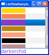
The addListener method called for the selectedItemProperty creates a new ChangeListener<String> object to handle changes of the selected item. If, for instance, the dark orchid item is selected, the label receives the "darkorchid" caption and is filled with the corresponding color. The output of the modified application is shown in Figure 11-6.
Figure 11-6 Selecting a Dark Orchid Color Pattern

Description of "Figure 11-6 Selecting a Dark Orchid Color Pattern"
Related API Documentation
 Alla is a technical writer for Oracle. She lives in St. Petersburg, Russia, and develops tutorials and technical articles for Java and JavaFX technologies. Prior to her assignment at Oracle, she worked as a technical writer in different IT companies.


