B Portal Components
This appendix describes the different portal components that are available to add to your pages and page templates.
This appendix includes the following topics:
See Table B-1, "WebCenter Portal Components" for a listing of all components.
B.1 About Portal Components
Portal components are prepackaged, fully functional application widgets or tags, such as menus and links, that are available for adding to pages and, most notably, to page templates. Out-of-the-box, they are available in the Default Page Template Catalog. Each component provides a ready-to-go piece of the WebCenter Portal user interface (UI). For information about working with portal components, see Chapter 14, "Working with Resource Catalog Components on a Page."
Portal components have associated properties that you can use to refine the appearance and behavior of a component instance.
Table B-1 links to the remaining sections in this appendix. It lists all available portal components and links to more information about each one. Additionally, it provides the XML code for placing the component in a resource catalog in an application built using WebCenter Portal Framework and the tag to use to place the component on a .jspx page.
B.2 Accessing Portal Component Properties
You can access portal component properties in the page editor Structure view.
Note:
When you enter most types of property values in the Component Properties dialog and then click Apply, the dialog remains open. With values other than expected value types, the dialog closes, and the page is refreshed to reflect the new value. For example, if a component takes ajava.util.ArrayList of java.awt.Color classes, then the Component Properties dialog closes and Composer does a full-page-refresh.To access portal component properties:
-
Edit the page or page template that includes the portal component.
See Also:
Section 21.4, "Editing a Page Template" -
In Composer, click the Select tab.
-
Select the portal component on the page, and click Edit Component to open the Component Properties dialog.
-
Revise property values as required.
Note:
When you enter EL on the generic Display Options tab in the Component Properties dialog, the parser reports an error only if it detects invalid syntax, such as a missing closing bracket. Validation is performed only on syntax, not on the expression value. Generic Display Options are those cataloged in Table 14-1, "Display Options Properties".If you need EL assistance, an application developer can provide an EL expression; see the "Expression Language Expressions" appendix in Developing Portals with Oracle WebCenter Portal and Oracle JDeveloper.
EL validation is not performed on non-generic display options.
-
Click Save and then Close to exit Composer.
Tip:
You can try out a change by clicking Apply first and observing the result on the page.
B.3 About Portal
The About Portal component is a link that opens a dialog with information about the current portal (Figure B-1).
Every portal has associated information, called metadata. Portal metadata includes such information as display name, internal identification (GUID), description, current user membership role, user name of the creator, date created, and pretty URL. Users click the About Portal link to access this information.
See Also:
For information about the About Portal dialog, see the "Viewing Information About a Portal" section in Using Oracle WebCenter Portal.This section lists and describes the Display Options associated with the About Portal component. Additionally, it provides the tag that invokes this component on a .jspx page and the XML code that defines this component in a resource catalog.
This section includes the following subsections:
B.3.1 About Portal Component Display Options
Table B-1 lists and describes the Display Options properties associated with the About Portal component.
See Also:
The About Portal component has Style properties you can use to change the component's look and feel. For more information, see Section 14.3.6, "Working with Style and Content Style Properties."Table B-2 About Portal Component Display Options
| Property | Description |
|---|---|
|
|
A URL or relative path to an icon that appears when the component is clicked Use any Web-compatible image from any accessible location. That is, do not put in a path to an image on an external server that requires authentication. Enter a full URL or a path that is relative to the application root. |
|
|
A URL or relative path to an image that appears when the component is disabled See |
|
|
The render mode of the component:
|
|
|
A URL or relative path to an icon that appears when users hover their mouse pointers over the component See |
|
|
A URL or relative path to an icon to represent the active component See |
|
|
A selection of options for placement of the link's associated icon:
|
|
|
The name of the portal to describe in the dialog The default value is Note: If you enter a portal name, be sure to enter the portal's internal name. The portal internal name is the name specified by the Portal URL on the General Settings page of a portal's administration settings. |
|
|
A field for entering tooltip text to display when users hover their mouse pointers over the component |
|
|
Display text for the component The default is |
|
|
An option for hiding or showing the component on the page
Once you hide a component in this way, any child components are also hidden. You can show the component again through Composer Structure view (see Section 12.4.1.3, "About Structure View in Composer"). Right-click the hidden component, and select Show Component from the resulting context menu. |
B.3.2 About Portal Component Tag and XML
The following tag is used to render the About Portal component on a .jspx page:
<wcdc:aboutSpaceLink id="#"
   xmlns:wcdc="http://xmlns.oracle.com/webcenter/spaces/taglib"
   text="#{uib_o_w_w_r_WebCenter.TITLE_SHOW_GROUP_SPACE_INFO}"/>
Example B-1 provides the XML code that represents the component in the resource catalog file (SiteTemplateCatalog.xml) in a Portal Framework application.
Example B-1 XML Code for the About Portal Component
<tag>
   <name>aboutSpaceLink</name>
   <tag-class>oracle.webcenter.webcenterapp.internal.view.taglib.
      AboutSpaceLinkTag</tag-class>
   <body-content>empty</body-content>
   <attribute>
      <name>id</name>
   </attribute>
   <attribute>
      <name>rendered</name>
      <deferred-value>
         <type>boolean</type>
      </deferred-value>
   </attribute>
   <attribute>
      <name>binding</name>
      <deferred-value/>
   </attribute>
   <attribute>
      <name>clientComponent</name>
      <deferred-value>
         <type>boolean</type>
      </deferred-value>
   </attribute>
   <attribute>
      <name>customizationId</name>
      <deferred-value/>
   </attribute>
   <attribute>
      <name>depressedIcon</name>
      <required>false</required>
      <deferred-value/>
   </attribute>
   <attribute>
      <name>disabled</name>
      <required>false</required>
      <deferred-value/>
   </attribute>
   <attribute>
      <name>disabledIcon</name>
      <required>false</required>
      <deferred-value/>
   </attribute>
   <attribute>
      <name>displayType</name>
      <required>false</required>
      <deferred-value/>
   </attribute>
   <attribute>
      <name>hoverIcon</name>
      <required>false</required>
      <deferred-value/>
   </attribute>
   <attribute>
      <name>icon</name>
      <required>false</required>
      <deferred-value/>
   </attribute>
   <attribute>
      <name>iconPosition</name>
      <required>false</required>
      <deferred-value/>
   </attribute>
   <attribute>
      <name>inlineStyle</name>
      <required>false</required>
      <deferred-value/>
   </attribute>
   <attribute>
      <name>shortDesc</name>
      <required>false</required>
      <deferred-value/>
   </attribute>
   <attribute>
      <name>scopeName</name>
      <required>false</required>
      <deferred-value/>
   </attribute>
   <attribute>
      <name>styleClass</name>
      <required>false</required>
      <deferred-value/>
   </attribute>
   <attribute>
      <name>text</name>
      <required>false</required>
      <deferred-value/>
   </attribute>
</tag>
B.4 About WebCenter
The About WebCenter component is a link that opens a dialog with application version and copyright information (Figure B-2).
This section lists and describes the Display Options associated with the About WebCenter component. Additionally, it provides the tag that invokes this component on a .jspx page and the XML code that defines this component in a resource catalog.
This section includes the following subsections:
B.4.1 About WebCenter Component Display Options
The About WebCenter component shares many of the same Display Options properties with the About Portal component. Table B-3 lists and describes the Display Options properties associated with the About WebCenter component that are not included in Table B-2, "About Portal Component Display Options" or that have different default values.
See Also:
The About WebCenter component has Style properties you can use to change the component's look and feel. For more information, see Section 14.3.6, "Working with Style and Content Style Properties."Table B-3 About WebCenter Component Display Options
| Property | Description |
|---|---|
|
|
A field for entering tooltip text to display when users hover their mouse pointers over the component The default is |
|
|
Display text for the component The default is |
|
|
The component type The default is |
See Also:
Display Options properties in the Component Properties dialog provide access to an Expression Language (EL) editor for entering and testing EL values.If you need EL assistance, an application developer can provide an EL expression; see the "Expression Language Expressions" appendix in Developing Portals with Oracle WebCenter Portal and Oracle JDeveloper.
B.4.2 About WebCenter Component Tag and XML
The following tag is used to render the About WebCenter component on a .jspx page:
<wcdc:spacesAction id="#"
   xmlns:wcdc="http://xmlns.oracle.com/webcenter/spaces/taglib"
   type="aboutWebcenter" displayType="link"
   text="#{uib_o_w_w_r_WebCenter.GLOBAL_LINK_ABOUT}"
   shortDesc="#{uib_o_w_w_r_WebCenter.GLOBAL_LINK_ABOUT_DESC}"
   inlineStyle="white-space:nowrap;"/>
Example B-2 provides the XML code that represents the component in the resource catalog file (SiteTemplateCatalog.xml) in a Portal Framework application.
Example B-2 XML Code for the About WebCenter Component
<tag>
   <name>spacesAction</name>
   <tag-class>oracle.webcenter.webcenterapp.internal.view.taglib.SpacesActionTag
      </tag-class>
   <body-content>empty</body-content>
   <attribute>
      <name>id</name>
   </attribute>
   <attribute>
      <name>rendered</name>
      <deferred-value>
         <type>boolean</type>
      </deferred-value>
   </attribute>
   <attribute>
      <name>binding</name>
      <deferred-value/>
   </attribute>
   <attribute>
      <name>clientComponent</name>
      <deferred-value>
         <type>boolean</type>
      </deferred-value>
   </attribute>
   <attribute>
      <name>customizationId</name>
      <deferred-value/>
   </attribute>
   <attribute>
      <name>depressedIcon</name>
      <required>false</required>
      <deferred-value/>
   </attribute>
   <attribute>
      <name>disabled</name>
      <required>false</required>
      <deferred-value/>
   </attribute>
   <attribute>
      <name>disabledIcon</name>
      <required>false</required>
      <deferred-value/>
   </attribute>
   <attribute>
      <name>displayType</name>
      <required>false</required>
      <deferred-value/>
   </attribute>
   <attribute>
      <name>hoverIcon</name>
      <required>false</required>
      <deferred-value/>
   </attribute>
   <attribute>
      <name>icon</name>
      <required>false</required>
      <deferred-value/>
   </attribute>
   <attribute>
      <name>iconPosition</name>
      <required>false</required>
      <deferred-value/>
   </attribute>
   <attribute>
      <name>inlineStyle</name>
      <required>false</required>
      <deferred-value/>
   </attribute>
   <attribute>
      <name>shortDesc</name>
      <required>false</required>
      <deferred-value/>
   </attribute>
   <attribute>
      <name>styleClass</name>
      <required>false</required>
      <deferred-value/>
   </attribute>
   <attribute>
      <name>text</name>
      <required>false</required>
      <deferred-value/>
   </attribute>
   <attribute>
      <name>type</name>
      <required>true</required>
      <deferred-value/>
   </attribute>
</tag>
B.5 Add to Favorites
The Add to Favorites component is a link that enables users to add an item to their Favorites menu (Figure B-3).
For example, users can use this component to add a favorite page, wiki, blog, list, event, task, template, to their Favorites menu.
This section lists and describes the Display Options associated with the Add to Favorites component. Additionally, it provides the tag that invokes this component on a .jspx page and the XML code that defines this component in a resource catalog.
This section includes the following subsections:
B.5.1 Add to Favorites Component Display Options
The Add to Favorites component shares many of the same Display Options properties with the About Portal component. Table B-4 lists and describes the properties for which Add to Favorites has different default values than those described in Table B-2, "About Portal Component Display Options".
See Also:
The Add to Favorites component has Style properties you can use to change the component's look and feel. For more information, see Section 14.3.6, "Working with Style and Content Style Properties."Table B-4 Add to Favorites Component Display Options
| Property | Description |
|---|---|
|
|
The display name of the application object to add as a favorite |
|
|
The URL to use to navigate to the application object |
|
|
A field for entering tooltip text to display when users hover their mouse pointers over the component The default is |
|
|
Display text for the component. The default is Add to Favorites. The default is the rendered value of the EL expression |
See Also:
Display Options properties in the Component Properties dialog provide access to an Expression Language (EL) editor for entering and testing EL values.If you need EL assistance, an application developer can provide an EL expression; see the "Expression Language Expressions" appendix in Developing Portals with Oracle WebCenter Portal and Oracle JDeveloper.
B.5.2 Add to Favorites Component Tag and XML
The following tag is used to render the Add to Favorites component on a .jspx page:
<wcdc:addToFavorites id="#" __taskFlowId="#"
   xmlns:wcdc="http://xmlns.oracle.com/webcenter/spaces/taglib"
   inlineStyle="white-space:nowrap;"
   text="#{uib_o_w_w_r_WebCenter.TITLE_ADD_FAVORITE_DIALOG}"
   shortDesc="#{uib_o_w_w_r_WebCenter.TITLE_ADD_FAVORITE_DIALOG}"/>
Example B-3 provides the XML code that represents the component in the resource catalog file (SiteTemplateCatalog.xml) in a Portal Framework application.
Example B-3 XML Code for the Add to Favorites Component
<tag>   <name>addToFavorites</name>
   <tag-class>oracle.webcenter.webcenterapp.internal.view.taglib.
      AddToFavoritesTag</tag-class>
   <body-content>empty</body-content>
   <attribute>
      <name>id</name>
   </attribute>
   <attribute>
      <name>rendered</name>
      <deferred-value>
         <type>boolean</type>
      </deferred-value>
   </attribute>
   <attribute>
      <name>binding</name>
      <deferred-value/>
   </attribute>
   <attribute>
      <name>clientComponent</name>
      <deferred-value>
         <type>boolean</type>
      </deferred-value>
   </attribute>
   <attribute>
      <name>customizationId</name>
      <deferred-value/>
   </attribute>
   <attribute>
      <name>favoriteTitle</name>
      <required>false</required>
      <deferred-value/>
   </attribute>
   <attribute>
      <name>favoriteURL</name>
      <required>false</required>
      <deferred-value/>
   </attribute>
   <attribute>
      <name>depressedIcon</name>
      <required>false</required>
      <deferred-value/>
   </attribute>
   <attribute>
      <name>disabled</name>
      <required>false</required>
      <deferred-value/>
   </attribute>
   <attribute>
      <name>disabledIcon</name>
      <required>false</required>
      <deferred-value/>
   </attribute>
   <attribute>
      <name>displayType</name>
      <required>false</required>
      <deferred-value/>
   </attribute>
   <attribute>
      <name>hoverIcon</name>
      <required>false</required>
      <deferred-value/>
   </attribute>
   <attribute>
      <name>icon</name>
      <required>false</required>
      <deferred-value/>
   </attribute>
   <attribute>
      <name>iconPosition</name>
      <required>false</required>
      <deferred-value/>
   </attribute>
   <attribute>
      <name>inlineStyle</name>
      <required>false</required>
      <deferred-value/>
   </attribute>
   <attribute>
      <name>shortDesc</name>
      <required>false</required>
      <deferred-value/>
   </attribute>
   <attribute>
      <name>styleClass</name>
      <required>false</required>
      <deferred-value/>
   </attribute>
   <attribute>
      <name>__taskFlowId</name>
      <required>false</required>
      <deferred-value/>
   </attribute>
   <attribute>
      <name>text</name>
      <required>false</required>
      <deferred-value/>
   </attribute>
</tag>
B.6 Administration
The Administration component is a link that opens the Administration page (Figure B-4).

Only application administrators can see this link once it is placed on a page or page template.
See Also:
For information about WebCenter Portal administration, see Administering Oracle WebCenter Portal.This section lists and describes the Display Options associated with the Administration component. Additionally, it provides the tag that invokes this component on a .jspx page and the XML code that defines this component in a resource catalog.
This section includes the following subsections:
B.6.1 Administration Component Display Options
The Administration component shares many of the same Display Options properties associated with the About Portal component. Table B-5 lists the properties that have defaults other than those specified in Table B-2, "About Portal Component Display Options".
See Also:
The Administration component has Style properties you can use to change the component's look and feel. For more information, see Section 14.3.6, "Working with Style and Content Style Properties."Table B-5 Administration Component Display Options
| Property | Description |
|---|---|
|
|
A field for entering tooltip text to display when users hover their mouse pointers over the component The default is |
|
|
Display text for the component The default is |
|
|
The component type The default is |
See Also:
Display Options properties in the Component Properties dialog provide access to an Expression Language (EL) editor for entering and testing EL values.If you need EL assistance, an application developer can provide an EL expression; see the "Expression Language Expressions" appendix in Developing Portals with Oracle WebCenter Portal and Oracle JDeveloper.
B.6.2 Administration Component Tag and XML
The following tag is used to render the Administration component on a .jspx page:
<wcdc:spacesAction id="#"
   xmlns:wcdc="http://xmlns.oracle.com/webcenter/spaces/taglib"
   type="administration" displayType="link" inlineStyle="white-space:nowrap;"
   text="#{uib_o_w_w_r_WebCenter.GLOBAL_LINK_ADMINISTRATION}"
   shortDesc="#{uib_o_w_w_r_WebCenter.GLOBAL_LINK_ADMINISTRATION_DESC}"/>
In the resource catalog, the Administration component uses the same XML code as the About WebCenter component. For more information, see Section B.4.2, "About WebCenter Component Tag and XML."
B.7 Change Membership
The Change Membership component is a link that enables users to request a change to their portal role (Figure B-5).
This section lists and describes the Display Options associated with the Change Membership component. Additionally, it provides the tag that invokes this component on a .jspx page and the XML code that defines this component in a resource catalog.
This section includes the following subsections:
B.7.1 Change Membership Component Display Options
The Change Membership component shares many of the same properties with the About Portal component. Table B-6 lists the properties that have defaults other than those specified in Table B-2, "About Portal Component Display Options".
See Also:
The Change Membership component has Style properties you can use to change the component's look and feel. For more information, see Section 14.3.6, "Working with Style and Content Style Properties."Table B-6 Change Membership Component Display Options
| Property | Description |
|---|---|
|
|
A field for entering tooltip text to display when users hover their mouse pointers over the component The default value is |
|
|
Display text for the component The default is |
See Also:
Display Options properties in the Component Properties dialog provide access to an Expression Language (EL) editor for entering and testing EL values.If you need EL assistance, an application developer can provide an EL expression; see the "Expression Language Expressions" appendix in Developing Portals with Oracle WebCenter Portal and Oracle JDeveloper.
B.7.2 Change Membership Component Tag and XML
The following tag is used to render the Change Membership component on a .jspx page:
<wcdc:changeSpaceMembership id="#"
   xmlns:wcdc="http://xmlns.oracle.com/webcenter/spaces/taglib"
   text="#{uib_o_w_s_r_Spaces.COMMUNITY_CHANGE_MEMBERSHIP}"
   shortDesc="#{uib_o_w_s_r_Spaces.COMMUNITY_CHANGE_MEMBERSHIP}"
   inlineStyle="white-space:nowrap;"/>
Example B-4 provides the XML code that represents the component in the resource catalog file (SiteTemplateCatalog.xml) in a Portal Framework application.
Example B-4 XML Code for the Change Membership Component
<tag>
   <name>changeSpaceMembership</name>
   <tag-class>oracle.webcenter.webcenterapp.internal.view.taglib.
      ChangeSpaceMembershipTag</tag-class>
   <body-content>empty</body-content>
   <attribute>
      <name>id</name>
   </attribute>
   <attribute>
      <name>rendered</name>
      <deferred-value>
         <type>boolean</type>
      </deferred-value>
   </attribute>
   <attribute>
      <name>binding</name>
      <deferred-value/>
   </attribute>
   <attribute>
      <name>clientComponent</name>
      <deferred-value>
         <type>boolean</type>
      </deferred-value>
   </attribute>
   <attribute>
      <name>customizationId</name>
      <deferred-value/>
   </attribute>
   <attribute>
      <name>depressedIcon</name>
      <required>false</required>
      <deferred-value/>
   </attribute>
   <attribute>
      <name>disabled</name>
      <required>false</required>
      <deferred-value/>
   </attribute>
   <attribute>
      <name>disabledIcon</name>
      <required>false</required>
      <deferred-value/>
   </attribute>
   <attribute>
      <name>displayType</name>
      <required>false</required>
      <deferred-value/>
   </attribute>
   <attribute>
      <name>hoverIcon</name>
      <required>false</required>
      <deferred-value/>
   </attribute>
   <attribute>
      <name>icon</name>
      <required>false</required>
      <deferred-value/>
   </attribute>
   <attribute>
      <name>iconPosition</name>
      <required>false</required>
      <deferred-value/>
   </attribute>
   <attribute>
      <name>inlineStyle</name>
      <required>false</required>
      <deferred-value/>
   </attribute>
   <attribute>
      <name>shortDesc</name>
      <required>false</required>
      <deferred-value/>
   </attribute>
   <attribute>
      <name>scopeName</name>
      <required>false</required>
      <deferred-value/>
   </attribute>
   <attribute>
      <name>styleClass</name>
      <required>false</required>
      <deferred-value/>
   </attribute>
   <attribute>
      <name>text</name>
      <required>false</required>
      <deferred-value/>
   </attribute>
</tag>
B.8 Contact Administration
The Contact Administration component is a link that opens a simple popup window in which users can enter and send a workflow notification to members with the Administrator role (Figure B-6).
Note:
The Contact Administration component requires a connection to the Oracle BPEL Server included with Oracle SOA Suite. For more information, see the "Specifying the BPEL Server Hosting WebCenter Portal Workflows" section in Administering Oracle WebCenter Portal.Figure B-6 Contact Administration Component
Description of ''Figure B-6 Contact Administration Component''
This section lists and describes the Display Options associated with the Contact Administration component. Additionally, it provides the tag that invokes this component on a .jspx page and the XML code that defines this component in a resource catalog.
This section includes the following subsections:
-
Section B.8.1, "Contact Administration Component Display Options"
-
Section B.8.2, "Contact Administration Component Tag and XML"
B.8.1 Contact Administration Component Display Options
The Contact Administrator component shares many of the same properties with the About Portal component. Table B-7 lists the properties that have defaults other than those specified in Table B-2, "About Portal Component Display Options".
See Also:
The Contact Administration component has Style properties you can use to change the component's look and feel. For more information, see Section 14.3.6, "Working with Style and Content Style Properties."Table B-7 Contact Administrator Component Display Options
| Property | Description |
|---|---|
|
|
A field for entering tooltip text to display when users hover their mouse pointers over the component The default value is |
|
|
Display text for the component The default is |
|
|
The component type The default is |
See Also:
Display Options properties in the Component Properties dialog provide access to an Expression Language (EL) editor for entering and testing EL values.If you need EL assistance, an application developer can provide an EL expression; seesaw the "Expression Language Expressions" appendix in Developing Portals with Oracle WebCenter Portal and Oracle JDeveloper.
B.8.2 Contact Administration Component Tag and XML
The following tag is used to render the Contact Administration component on a .jspx page:
<wcdc:spacesAction id="#"
   xmlns:wcdc="http://xmlns.oracle.com/webcenter/spaces/taglib"
   type="contactAdmin" displayType="link" inlineStyle="white-space:nowrap;"
   text="#{uib_o_w_w_r_WebCenter.CONTACT_ADMINISTRATOR}"
   shortDesc="#{uib_o_w_w_r_WebCenter.CONTACT_ADMINISTRATOR_DESC}"/>
In the resource catalog, the Contact Administration component uses the same XML code as the About WebCenter component. For more information, see Section B.4.2, "About WebCenter Component Tag and XML."
B.9 Copyright Message
The Copyright Message component renders the following text string:
Copyright © 2009, 2013, Oracle and/or its affiliates. All rights reserved.
Figure B-7 shows an example of the Copyright Message component rendered within the user interface.
This section lists and describes the Display Options associated with the Copyright component. Additionally, it provides the tag that invokes this component on a .jspx page and the XML code that defines this component in a resource catalog.
This section includes the following subsections:
B.9.1 Copyright Message Component Display Options
The Copyright Message component shares many of the same properties with the About Portal component. Table B-8 lists the properties that have defaults other than those specified in Table B-2, "About Portal Component Display Options".
See Also:
The Copyright Message component has Style properties you can use to change the component's look and feel. For more information, see Section 14.3.6, "Working with Style and Content Style Properties."Table B-8 Copyright Message Component Display Options
| Property | Description |
|---|---|
|
|
A field for entering CSS style values to define the appearance of the component The default inline style is |
|
|
The component type The default is |
See Also:
Display Options properties in the Component Properties dialog provide access to an Expression Language (EL) editor for entering and testing EL values.If you need EL assistance, an application developer can provide an EL expression; see the "Expression Language Expressions" appendix in Developing Portals with Oracle WebCenter Portal and Oracle JDeveloper.
B.9.2 Copyright Message Component Tag and XML
The following tag is used to render the Copyright Message component on a .jspx page:
wcdc:outputText id="#"
   xmlns:wcdc="http://xmlns.oracle.com/webcenter/spaces/taglib"
   type="copyrightMessage" inlineStyle="white-space:nowrap;"/>
Example B-5 provides the XML code that represents the component in the resource catalog file (SiteTemplateCatalog.xml) in a Portal Framework application.
Example B-5 XML Code for the Copyright Message Component
<tag>
   <name>outputText</name>
   <tag-class>oracle.webcenter.webcenterapp.spacescomponents.internal.view.
      taglib.OutputTextTag</tag-class>
   <body-content>empty</body-content>
   <attribute>
      <name>id</name>
   </attribute>
   <attribute>
      <name>rendered</name>
      <deferred-value>
      <type>boolean</type>
      </deferred-value>
   </attribute>
   <attribute>
      <name>binding</name>
      <deferred-value/>
   </attribute>
   <attribute>
      <name>clientComponent</name>
      <deferred-value>
         <type>boolean</type>
      </deferred-value>
   </attribute>
   <attribute>
      <name>customizationId</name>
      <deferred-value/>
   </attribute>
   <attribute>
      <name>type</name>
      <required>true</required>
      <deferred-value/>
   </attribute>
   <attribute>
      <name>inlineStyle</name>
      <required>false</required>
      <deferred-value/>
   </attribute>
   <attribute>
      <name>shortDesc</name>
      <required>false</required>
      <deferred-value/>
   </attribute>
</tag>
B.10 Create Page
The Create Page component is a link that opens the Create Page dialog (Figure B-8).
See Also:
Chapter 12, "Creating and Editing a Portal Page," and the "Creating and Managing Personal Pages" chapter in Using Oracle WebCenter PortalThis component is useful for providing an on-the-spot means of creating pages in the current portal or Home portal. Only authorized users can see and use the Create Page link.
This section lists and describes the Display Options associated with the Create Page component. Additionally, it provides the tag that invokes this component on a .jspx page and the XML code that defines this component in a resource catalog.
This section includes the following subsections:
B.10.1 Create Page Component Display Options
The Create Page component shares many of the same properties with the About Portal component. Table B-9 lists the properties that have defaults other than those specified in Table B-2, "About Portal Component Display Options".
See Also:
The Create Page component has Style properties you can use to change the component's look and feel. For more information, see Section 14.3.6, "Working with Style and Content Style Properties."Table B-9 Create Page Component Display Options
| Property | Description |
|---|---|
|
|
A field for entering tooltip text to display when users hover their mouse pointers over the component The default is |
|
|
The component's unique identifier, for example |
|
|
Display text for the component The default is |
See Also:
Display Options properties in the Component Properties dialog provide access to an Expression Language (EL) editor for entering and testing EL values.If you need EL assistance, an application developer can provide an EL expression; see the "Expression Language Expressions" appendix in Developing Portals with Oracle WebCenter Portal and Oracle JDeveloper.
B.10.2 Create Page Component Tag and XML
The following tag is used to render the Create Page component on a .jspx page:
<wcdc:createPage id="#" __taskFlowId="#"
   xmlns:wcdc="http://xmlns.oracle.com/webcenter/spaces/taglib"
   displayType="link" inlineStyle="white-space:nowrap;"
   text="#{uib_o_w_w_r_WebCenter.LABEL_CREATE_PAGE}"
   shortDesc="#{uib_o_w_w_r_WebCenter.TOOLTIP_MANAGE_PAGES_CREATE_PAGE}" />
Example B-6 provides the XML code that represents the component in the resource catalog file (SiteTemplateCatalog.xml) in a Portal Framework application.
Example B-6 XML Code for the Create Page Component
<tag>
   <name>createPage</name>
   <tag-class>oracle.webcenter.webcenterapp.internal.view.taglib.
      CreatePageTag</tag-class>
   <body-content>empty</body-content>
   <attribute>
      <name>id</name>
   </attribute>
   <attribute>
      <name>rendered</name>
      <deferred-value>
         <type>boolean</type>
      </deferred-value>
   </attribute>
   <attribute>
      <name>binding</name>
      <deferred-value/>
   </attribute>
   <attribute>
      <name>clientComponent</name>
      <deferred-value>
         <type>boolean</type>
      </deferred-value>
   </attribute>
   <attribute>
      <name>customizationId</name>
      <deferred-value/>
   </attribute>
   <attribute>
      <name>depressedIcon</name>
      <required>false</required>
      <deferred-value/>
   </attribute>
   <attribute>
      <name>disabled</name>
      <required>false</required>
      <deferred-value/>
   </attribute>
   <attribute>
      <name>disabledIcon</name>
      <required>false</required>
      <deferred-value/>
   </attribute>
   <attribute>
      <name>displayType</name>
      <required>false</required>
      <deferred-value/>
   </attribute>
   <attribute>
      <name>hoverIcon</name>
      <required>false</required>
      <deferred-value/>
   </attribute>
   <attribute>
      <name>icon</name>
      <required>false</required>
      <deferred-value/>
   </attribute>
   <attribute>
      <name>iconPosition</name>
      <required>false</required>
      <deferred-value/>
   </attribute>
   <attribute>
      <name>inlineStyle</name>
      <required>false</required>
      <deferred-value/>
   </attribute>
   <attribute>
      <name>shortDesc</name>
      <required>false</required>
      <deferred-value/>
   </attribute>
   <attribute>
      <name>styleClass</name>
      <required>false</required>
      <deferred-value/>
   </attribute>
   <attribute>
      <name>__taskFlowId</name>
      <required>false</required>
      <deferred-value/>
   </attribute>
   <attribute>
      <name>text</name>
      <required>false</required>
      <deferred-value/>
   </attribute>
</tag>
B.11 Create Portal
The Create Portal component is a link that opens the portal creation wizard (Figure B-9).
This component is useful for providing an on-the-spot means of creating a portal. Only authorized users can see and use the Create Portal link.
See Also:
For information about creating portals, see Part X, "Getting Started.".This section lists and describes the Display Options associated with the Create Portal component. Additionally, it provides the tag that invokes this component on a .jspx page and the XML code that defines this component in a resource catalog.
This section includes the following subsections:
B.11.1 Create Portal Component Display Options
The Create Portal component shares many of the same properties with the About Portal component. Table B-10 lists the properties that have defaults other than those specified in Table B-2, "About Portal Component Display Options".
See Also:
The Create Portal component has Style properties you can use to change the component's look and feel. For more information, see Section 14.3.6, "Working with Style and Content Style Properties."Table B-10 Create Portal Component Display Options
| Property | Description |
|---|---|
|
|
A field for entering tooltip text to display when users hover their mouse pointers over the component The default is |
|
|
Display text for the component The default is |
See Also:
Display Options properties in the Component Properties dialog provide access to an Expression Language (EL) editor for entering and testing EL values.If you need EL assistance, an application developer can provide an EL expression; see the "Expression Language Expressions" appendix in Developing Portals with Oracle WebCenter Portal and Oracle JDeveloper.
B.11.2 Create Portal Component Tag and XML
The following tag is used to render the Create Portal component on a .jspx page:
<wcdc:createSpace id="#" __taskFlowId="#"
   xmlns:wcdc="http://xmlns.oracle.com/webcenter/spaces/taglib"
   displayType="link" inlineStyle="white-space:nowrap;"
   text="#{uib_o_w_s_r_Spaces.HEADING_CREATE_COMMUNITY}"
   shortDesc="#{uib_o_w_s_r_Spaces.HEADING_CREATE_COMMUNITY}"/>
Example B-7 provides the XML code that represents the component in the resource catalog file (SiteTemplateCatalog.xml) in a Portal Framework application.
Example B-7 XML Code for the Create Portal Component
<tag>
   <name>createSpace</name>
   <tag-class>oracle.webcenter.webcenterapp.internal.view.taglib.
      CreateSpaceTag</tag-class>
   <body-content>empty</body-content>
   <attribute>
      <name>id</name>
   </attribute>
   <attribute>
      <name>rendered</name>
      <deferred-value>
         <type>boolean</type>
      </deferred-value>
   </attribute>
   <attribute>
      <name>binding</name>
      <deferred-value/>
   </attribute>
   <attribute>
      <name>clientComponent</name>
      <deferred-value>
         <type>boolean</type>
      </deferred-value>
   </attribute>
   <attribute>
      <name>customizationId</name>
      <deferred-value/>
   </attribute>
   <attribute>
      <name>depressedIcon</name>
      <required>false</required>
      <deferred-value/>
   </attribute>
   <attribute>
      <name>disabled</name>
      <required>false</required>
      <deferred-value/>
   </attribute>
   <attribute>
      <name>disabledIcon</name>
      <required>false</required>
      <deferred-value/>
   </attribute>
   <attribute>
      <name>displayType</name>
      <required>false</required>
      <deferred-value/>
   </attribute>
   <attribute>
      <name>hoverIcon</name>
      <required>false</required>
      <deferred-value/>
   </attribute>
   <attribute>
      <name>icon</name>
      <required>false</required>
      <deferred-value/>
   </attribute>
   <attribute>
      <name>iconPosition</name>
      <required>false</required>
      <deferred-value/>
   </attribute>
   <attribute>
      <name>inlineStyle</name>
      <required>false</required>
      <deferred-value/>
   </attribute>
   <attribute>
      <name>shortDesc</name>
      <required>false</required>
      <deferred-value/>
   </attribute>
   <attribute>
      <name>styleClass</name>
      <required>false</required>
      <deferred-value/>
   </attribute>
   <attribute>
      <name>__taskFlowId</name>
      <required>false</required>
      <deferred-value/>
   </attribute>
   <attribute>
      <name>text</name>
      <required>false</required>
      <deferred-value/>
   </attribute>
</tag>
B.12 Create Subportal
The Create Subportal component is a link that opens a dialog for creating a subportal (Figure B-10).
A subportal is a portal that is hierarchically lower than its parent portal. The Create Subportal component is useful for providing an on-the-spot means of creating subportals in the current portal. Only authorized users can see and use the Create Subportal link.
See Also:
Section 5.3, "Creating a Subportal"This section lists and describes the Display Options associated with the Create Subportal component. Additionally, it provides the tag that invokes this component on a .jspx page and the XML code that defines this component in a resource catalog.
This section includes the following subsections:
B.12.1 Create Subportal Component Display Options
The Create Subportal component shares many of the same properties with the About Portal component. Table B-11 lists the properties that have defaults other than those specified in Table B-2, "About Portal Component Display Options".
See Also:
The Create Subportal component has Style properties you can use to change the component's look and feel. For more information, see Section 14.3.6, "Working with Style and Content Style Properties."Table B-11 Create Subportal Component Display Options
| Property | Description |
|---|---|
|
|
A field for entering tooltip text to display when users hover their mouse pointers over the component The default is |
|
|
Display text for the component The default is |
See Also:
Display Options properties in the Component Properties dialog provide access to an Expression Language (EL) editor for entering and testing EL values.If you need EL assistance, an application developer can provide an EL expression; see the "Expression Language Expressions" appendix in Developing Portals with Oracle WebCenter Portal and Oracle JDeveloper.
B.12.2 Create Subportal Component Tag and XML
The following tag is used to render the Create Subportal component on a .jspx page:
<wcdc:createSubSpace id="#" __taskFlowId="#"
   xmlns:wcdc="http://xmlns.oracle.com/webcenter/spaces/taglib"
   displayType="link" inlineStyle="white-space:nowrap;"
   text="#{uib_o_w_s_r_Spaces.HEADING_CREATE_SUB_COMMUNITY}"
   shortDesc="#{uib_o_w_s_r_Spaces.HEADING_CREATE_SUB_COMMUNITY}"/>
Example B-8 provides the XML code that represents the component in the resource catalog file (SiteTemplateCatalog.xml) in a Portal Framework application.
Example B-8 XML Code for the Create Subportal Component
<tag>
   <name>createSubSpace</name>
   <tag-class>oracle.webcenter.webcenterapp.internal.view.taglib.
      CreateSubspaceTag</tag-class>
   <body-content>empty</body-content>
   <attribute>
      <name>id</name>
   </attribute>
   <attribute>
      <name>rendered</name>
      <deferred-value>
         <type>boolean</type>
      </deferred-value>
   </attribute>
   <attribute>
      <name>binding</name>
      <deferred-value/>
   </attribute>
   <attribute>
      <name>clientComponent</name>
      <deferred-value>
         <type>boolean</type>
      </deferred-value>
   </attribute>
   <attribute>
      <name>customizationId</name>
      <deferred-value/>
   </attribute>
   <attribute>
      <name>depressedIcon</name>
      <required>false</required>
      <deferred-value/>
   </attribute>
   <attribute>
      <name>disabled</name>
      <required>false</required>
      <deferred-value/>
   </attribute>
   <attribute>
      <name>disabledIcon</name>
      <required>false</required>
      <deferred-value/>
   </attribute>
   <attribute>
      <name>displayType</name>
      <required>false</required>
      <deferred-value/>
   </attribute>
   <attribute>
      <name>hoverIcon</name>
      <required>false</required>
      <deferred-value/>
   </attribute>
   <attribute>
      <name>icon</name>
      <required>false</required>
      <deferred-value/>
   </attribute>
   <attribute>
      <name>iconPosition</name>
      <required>false</required>
      <deferred-value/>
   </attribute>
   <attribute>
      <name>inlineStyle</name>
      <required>false</required>
      <deferred-value/>
   </attribute>
   <attribute>
      <name>shortDesc</name>
      <required>false</required>
      <deferred-value/>
   </attribute>
   <attribute>
      <name>scopeName</name>
      <required>false</required>
      <deferred-value/>
   </attribute>
   <attribute>
      <name>styleClass</name>
      <required>false</required>
      <deferred-value/>
   </attribute>
   <attribute>
      <name>__taskFlowId</name>
      <required>false</required>
      <deferred-value/>
   </attribute>
   <attribute>
      <name>text</name>
      <required>false</required>
      <deferred-value/>
   </attribute>
</tag>
B.13 Current User Profile
The Current User Profile component is the name of the current user linked to the user's Profile page (Figure B-11).
Figure B-11 Current User Profile Component

Description of ''Figure B-11 Current User Profile Component''
Users click the name to open a Profile page with the user's profile details.
See Also:
The Profile page is a customizable business role page that appears in the Home portal for all authenticated users. For more information about business role pages, see the "About Business Role Pages" section in Administering Oracle WebCenter Portal. For more information about profiles, see the "Managing Your Profile" section in Using Oracle WebCenter Portal.This section lists and describes the Display Options associated with the Current User Profile component. Additionally, it provides the tag that invokes this component on a .jspx page and the XML code that defines this component in a resource catalog.
This section includes the following subsections:
-
Section B.13.1, "Current User Profile Component Display Options"
-
Section B.13.2, "Current User Profile Component Tag and XML"
B.13.1 Current User Profile Component Display Options
The Current User Profile component shares many of the same properties with the About Portal component. Table B-12 lists the properties that have defaults other than those specified in Table B-2, "About Portal Component Display Options".
See Also:
The Current User Profile component has Style properties you can use to change the component's look and feel. For more information, see Section 14.3.6, "Working with Style and Content Style Properties."Table B-12 Current User Profile Component Display Options
| Property | Description |
|---|---|
|
|
A field for entering a tooltip to display when users hover their mouse pointers over the component The default is the current user's name. The default is the rendered value of the EL expression |
|
|
Display text for the component The default is the current user's name. The default is the rendered value of the EL expression |
See Also:
Display Options properties in the Component Properties dialog provide access to an Expression Language (EL) editor for entering and testing EL values.If you need EL assistance, an application developer can provide an EL expression; see the "Expression Language Expressions" appendix in Developing Portals with Oracle WebCenter Portal and Oracle JDeveloper.
B.13.2 Current User Profile Component Tag and XML
The following tag is used to render the Current User Profile component on a .jspx page:
<wcdc:userProfile id="#"
   xmlns:wcdc="http://xmlns.oracle.com/webcenter/spaces/taglib"
   displayType="link" inlineStyle="white-space:nowrap"
   text="#{security.userDisplayName}" shortDesc="#{security.userDisplayName}" />
Example B-9 provides the XML code that represents the component in the resource catalog file (SiteTemplateCatalog.xml) in a Portal Framework application.
Example B-9 XML Code for the Current User Profile Component
<tag>
   <name>userProfile</name>
   <tag-class>oracle.webcenter.webcenterapp.internal.view.taglib.
      UserProfileTag</tag-class>
   <body-content>empty</body-content>
   <attribute>
      <name>id</name>
   </attribute>
   <attribute>
      <name>rendered</name>
      <deferred-value>
         <type>boolean</type>
      </deferred-value>
   </attribute>
   <attribute>
      <name>binding</name>
      <deferred-value/>
   </attribute>
   <attribute>
      <name>clientComponent</name>
      <deferred-value>
         <type>boolean</type>
      </deferred-value>
   </attribute>
   <attribute>
      <name>customizationId</name>
      <deferred-value/>
   </attribute>
   <attribute>
      <name>depressedIcon</name>
      <required>false</required>
      <deferred-value/>
   </attribute>
   <attribute>
      <name>disabled</name>
      <required>false</required>
      <deferred-value/>
   </attribute>
   <attribute>
      <name>disabledIcon</name>
      <required>false</required>
      <deferred-value/>
   </attribute>
   <attribute>
      <name>displayType</name>
      <required>false</required>
      <deferred-value/>
   </attribute>
   <attribute>
      <name>hoverIcon</name>
      <required>false</required>
      <deferred-value/>
   </attribute>
   <attribute>
      <name>icon</name>
      <required>false</required>
      <deferred-value/>
   </attribute>
   <attribute>
      <name>iconPosition</name>
      <required>false</required>
      <deferred-value/>
   </attribute>
   <attribute>
      <name>inlineStyle</name>
      <required>false</required>
      <deferred-value/>
   </attribute>
   <attribute>
      <name>shortDesc</name>
      <required>false</required>
      <deferred-value/>
   </attribute>
   <attribute>
      <name>styleClass</name>
      <required>false</required>
      <deferred-value/>
   </attribute>
   <attribute>
      <name>text</name>
      <required>false</required>
      <deferred-value/>
   </attribute>
</tag>
B.14 Edit Page
The Edit Page component is a link that opens the current page in the page editor (Figure B-12).
Only users who are authorized to edit the current page can see and use the Edit Page link.
See Also:
Section 12.4, "Editing a Page," and the "Editing a Personal Page" section in Using Oracle WebCenter PortalThis section lists and describes the Display Options associated with the Edit Page component. Additionally, it provides the tag that invokes this component on a .jspx page and the XML code that defines this component in a resource catalog.
This section includes the following subsections:
B.14.1 Edit Page Component Display Options
The Edit Page component shares many of the same properties with the About Portal component. Table B-13 lists the properties that have defaults other than those specified in Table B-2, "About Portal Component Display Options".
See Also:
The Edit Page component has Style properties you can use to change the component's look and feel. For more information, see Section 14.3.6, "Working with Style and Content Style Properties."Table B-13 Edit Page Component Display Options
| Property | Description |
|---|---|
|
|
A field for entering a tooltip to display when users hover their mouse pointers over the component The default is |
|
|
The component's unique identifier, for example |
|
|
Display text for the component The default is |
See Also:
Display Options properties in the Component Properties dialog provide access to an Expression Language (EL) editor for entering and testing EL values.If you need EL assistance, an application developer can provide an EL expression; see the "Expression Language Expressions" appendix in Developing Portals with Oracle WebCenter Portal and Oracle JDeveloper.
B.14.2 Edit Page Component Tag and XML
The following tag is used to render the Edit Page component on a .jspx page:
<wcdc:editPage id="#" xmlns:wcdc="http://xmlns.oracle.com/webcenter/spaces/taglib"
   displayType="link" inlineStyle="white-space:nowrap;"
   text="#{uib_o_w_w_r_WebCenter.PAGE_CONTEXT_EDIT_PAGE}"
   shortDesc="#{uib_o_w_w_r_WebCenter.PAGE_CONTEXT_EDIT_PAGE_DESC}" />
Example B-10 provides the XML code that represents the component in the resource catalog file (SiteTemplateCatalog.xml) in a Portal Framework application.
Example B-10 XML Code for the Edit Page Component
<tag>
   <name>editPage</name>
   <tag-class>oracle.webcenter.webcenterapp.internal.view.taglib.
      EditPageTag</tag-class>
   <body-content>empty</body-content>
   <attribute>
      <name>id</name>
   </attribute>
   <attribute>
      <name>rendered</name>
      <deferred-value>
         <type>boolean</type>
      </deferred-value>
   </attribute>
   <attribute>
      <name>binding</name>
      <deferred-value/>
   </attribute>
   <attribute>
      <name>clientComponent</name>
      <deferred-value>
         <type>boolean</type>
      </deferred-value>
   </attribute>
   <attribute>
      <name>customizationId</name>
      <deferred-value/>
   </attribute>
   <attribute>
      <name>depressedIcon</name>
      <required>false</required>
      <deferred-value/>
   </attribute>
   <attribute>
      <name>disabled</name>
      <required>false</required>
      <deferred-value/>
   </attribute>
   <attribute>
      <name>disabledIcon</name>
      <required>false</required>
      <deferred-value/>
   </attribute>
   <attribute>
      <name>displayType</name>
      <required>false</required>
      <deferred-value/>
   </attribute>
   <attribute>
      <name>hoverIcon</name>
      <required>false</required>
      <deferred-value/>
   </attribute>
   <attribute>
      <name>icon</name>
      <required>false</required>
      <deferred-value/>
   </attribute>
   <attribute>
      <name>iconPosition</name>
      <required>false</required>
      <deferred-value/>
   </attribute>
   <attribute>
      <name>inlineStyle</name>
      <required>false</required>
      <deferred-value/>
   </attribute>
   <attribute>
      <name>shortDesc</name>
      <required>false</required>
      <deferred-value/>
   </attribute>
   <attribute>
      <name>styleClass</name>
      <required>false</required>
      <deferred-value/>
   </attribute>
   <attribute>
      <name>__taskFlowId</name>
      <required>false</required>
      <deferred-value/>
   </attribute>
   <attribute>
      <name>text</name>
      <required>false</required>
      <deferred-value/>
   </attribute>
</tag>
B.15 Favorites Menu
The Favorites Menu component is a menu with options to open the Add to Favorites and Manage Favorites dialogs (Figure B-13).

This section lists and describes the Display Options associated with the Favorites Menu component. Additionally, it provides the tag that invokes this component on a .jspx page and the XML code that defines this component in a resource catalog.
This section includes the following subsections:
B.15.1 Favorites Menu Component Display Options
The Favorites Menu component shares many of the same properties with the About Portal component. Table B-14 lists the properties that have defaults other than those specified in Table B-2, "About Portal Component Display Options".
See Also:
The Favorites Menu component has Style properties you can use to change the component's look and feel. For more information, see Section 14.3.6, "Working with Style and Content Style Properties."Table B-14 Favorites Menu Component Display Options
| Property | Description |
|---|---|
|
|
A field for entering tooltip text to display when users hover their mouse pointers over the component The default is |
|
|
The component's unique identifier, for example |
|
|
Display text for the component The default is |
See Also:
Display Options properties in the Component Properties dialog provide access to an Expression Language (EL) editor for entering and testing EL values.If you need EL assistance, an application developer can provide an EL expression; see the "Expression Language Expressions" appendix in Developing Portals with Oracle WebCenter Portal and Oracle JDeveloper.
B.15.2 Favorites Menu Component Tag and XML
The following tag is used to render the Favorites Menu component on a .jspx page:
<wcdc:favoritesMenu id="#" __taskFlowId="#"
   xmlns:wcdc="http://xmlns.oracle.com/webcenter/spaces/taglib"
   displayType="link" inlineStyle="white-space:nowrap;"
   styleClass="WCLinkMenu" text="#{uib_o_w_w_r_WebCenter.LABEL_FAVORITES_DESC}"
   shortDesc="#{uib_o_w_w_r_WebCenter.LABEL_FAVORITES_DESC}" />
Example B-11 provides the XML code that represents the component in the resource catalog file (SiteTemplateCatalog.xml) in a Portal Framework application.
Example B-11 XML Code for the Favorites Menu Component
<tag>
   <name>favoritesMenu</name>
   <tag-class>oracle.webcenter.webcenterapp.internal.view.taglib.
      FavoritesMenuTag</tag-class>
   <body-content>empty</body-content>
   <attribute>
      <name>id</name>
   </attribute>
   <attribute>
      <name>rendered</name>
      <deferred-value>
         <type>boolean</type>
      </deferred-value>
   </attribute>
   <attribute>
      <name>binding</name>
      <deferred-value/>
   </attribute>
   <attribute>
      <name>clientComponent</name>
      <deferred-value>
         <type>boolean</type>
      </deferred-value>
   </attribute>
   <attribute>
      <name>customizationId</name>
      <deferred-value/>
   </attribute>
   <attribute>
      <name>depressedIcon</name>
      <required>false</required>
      <deferred-value/>
   </attribute>
   <attribute>
      <name>disabled</name>
      <required>false</required>
      <deferred-value/>
   </attribute>
   <attribute>
      <name>disabledIcon</name>
      <required>false</required>
      <deferred-value/>
   </attribute>
   <attribute>
      <name>displayType</name>
      <required>false</required>
      <deferred-value/>
   </attribute>
   <attribute>
      <name>hoverIcon</name>
      <required>false</required>
      <deferred-value/>
   </attribute>
   <attribute>
      <name>icon</name>
      <required>false</required>
      <deferred-value/>
   </attribute>
   <attribute>
      <name>iconPosition</name>
      <required>false</required>
      <deferred-value/>
   </attribute>
   <attribute>
      <name>inlineStyle</name>
      <required>false</required>
      <deferred-value/>
   </attribute>
   <attribute>
      <name>shortDesc</name>
      <required>false</required>
      <deferred-value/>
   </attribute>
   <attribute>
      <name>styleClass</name>
      <required>false</required>
      <deferred-value/>
   </attribute>
   <attribute>
      <name>__taskFlowId</name>
      <required>false</required>
      <deferred-value/>
   </attribute>
   <attribute>
      <name>text</name>
      <required>false</required>
      <deferred-value/>
   </attribute>
</tag>
B.16 Global Help
The Global Help component is a link that opens WebCenter Portal online help (Figure B-14).

This section lists and describes the Display Options associated with the Global Help component. Additionally, it provides the tag that invokes this component on a .jspx page and the XML code that defines this component in a resource catalog.
This section includes the following subsections:
B.16.1 Global Help Component Display Options
The Global Help component shares many of the same properties with the About Portal component. Table B-15 lists the properties that have defaults other than those specified in Table B-2, "About Portal Component Display Options".
See Also:
The Global Help component has Style properties you can use to change the component's look and feel. For more information, see Section 14.3.6, "Working with Style and Content Style Properties."Table B-15 Global Help Component Display Options
| Property | Description |
|---|---|
|
|
A field for entering a tooltip to display when users hover their mouse pointers over the component The default is |
|
|
The component label The default is |
|
|
The component type The default is |
See Also:
Display Options properties in the Component Properties dialog provide access to an Expression Language (EL) editor for entering and testing EL values.If you need EL assistance, an application developer can provide an EL expression; see the "Expression Language Expressions" appendix in Developing Portals with Oracle WebCenter Portal and Oracle JDeveloper.
B.16.2 Global Help Component Tag and XML
The following tag is used to render the Global Help component on a .jspx page:
<wcdc:spacesAction id="#"
   xmlns:wcdc="http://xmlns.oracle.com/webcenter/spaces/taglib"
   type="globalHelp" displayType="link"
   text="#{uib_o_w_w_r_WebCenter.LABEL_HELP}"
   shortDesc="#{uib_o_w_w_r_WebCenter.LABEL_HELP_DESC}"
   inlineStyle="white-space:nowrap"/>
In the resource catalog, the Global Help component uses the same XML code as the About WebCenter component. For more information, see Section B.4.2, "About WebCenter Component Tag and XML."
B.17 Home Portal
The Home Portal component is a link to navigate to the Home portal (Figure B-15).
See Also:
For information about Home portals, see the "Exploring WebCenter Portal" chapter in Using Oracle WebCenter Portal.This section lists and describes the Display Options associated with the Home Portal component. Additionally, it provides the tag that invokes this component on a .jspx page and the XML code that defines this component in a resource catalog.
This section includes the following subsections:
B.17.1 Home Portal Component Display Options
The Home Portal component shares many of the same properties with the About Portal component. Table B-16 lists the properties that have defaults other than those specified in Table B-2, "About Portal Component Display Options".
See Also:
The Home Portal component has Style properties you can use to change the component's look and feel. For more information, see Section 14.3.6, "Working with Style and Content Style Properties."Table B-16 Home Portal Component Display Options
| Property | Description |
|---|---|
|
|
Display text for the component The default is |
|
|
The component type The default is |
See Also:
Display Options properties in the Component Properties dialog provide access to an Expression Language (EL) editor for entering and testing EL values.If you need EL assistance, an application developer can provide an EL expression; see the "Expression Language Expressions" appendix in Developing Portals with Oracle WebCenter Portal and Oracle JDeveloper.
B.17.2 Home Portal Component Tag and XML
The following tag is used to render the Home Portal component on a .jspx page:
<wcdc:spacesAction id="#"
   xmlns:wcdc="http://xmlns.oracle.com/webcenter/spaces/taglib"
   type="personalSpace" displayType="link" text="Personal Portal"
   inlineStyle="white-space:nowrap;"/>
In the resource catalog, the Home Portal component uses the same XML code as the About WebCenter component. For more information, see Section B.4.2, "About WebCenter Component Tag and XML."
B.18 Invite People as Connection
The Invite People as Connection component is a link that opens a page where users can invite other users to connect (Figure B-16).
Figure B-16 Invite People as Connection Component
Description of ''Figure B-16 Invite People as Connection Component''
See Also:
For information about Connections, see the "Managing Your Contacts" chapter in Using Oracle WebCenter Portal.This section lists and describes the Display Options associated with the Invite People as Connection component. Additionally, it provides the tag that invokes this component on a .jspx page and the XML code that defines this component in a resource catalog.
This section includes the following subsections:
-
Section B.18.1, "Invite People as Connection Component Display Options"
-
Section B.18.2, "Invite People as Connection Component Tag and XML"
B.18.1 Invite People as Connection Component Display Options
The Invite People as Connection component shares many of the same properties with the About Portal component. Table B-17 lists the properties that have defaults other than those specified in Table B-2, "About Portal Component Display Options".
See Also:
The Invite People as Connection component has Style properties you can use to change the component's look and feel. For more information, see Section 14.3.6, "Working with Style and Content Style Properties."Table B-17 Invite People as Connection Display Options
| Property | Description |
|---|---|
|
|
A field for entering a tooltip to display when users hover their mouse pointers over the component The default is |
|
|
The component label The default is |
See Also:
Display Options properties in the Component Properties dialog provide access to an Expression Language (EL) editor for entering and testing EL values.If you need EL assistance, an application developer can provide an EL expression; see the "Expression Language Expressions" appendix in Developing Portals with Oracle WebCenter Portal and Oracle JDeveloper.
B.18.2 Invite People as Connection Component Tag and XML
The following tag is used to render the Invite People as Connection component on a .jspx page:
<wcdc:invitePeopleAsConnection id="#" __taskFlowId="#"
   xmlns:wcdc="http://xmlns.oracle.com/webcenter/spaces/taglib"
   displayType="link" inlineStyle="white-space:nowrap;"
   text="#{uib_o_w_s_r_Spaces.LABEL_INVITE_PEOPLE}"
   shortDesc="#{uib_o_w_s_r_Spaces.LABEL_INVITE_PEOPLE}"/>
Example B-12 provides the XML code that represents the component in the resource catalog file (SiteTemplateCatalog.xml) in a Portal Framework application.
Example B-12 XML Code for the Invite People as Connection Component
<tag>
   <name>invitePeopleAsConnection</name>
   <tag-class>oracle.webcenter.webcenterapp.internal.view.taglib.
      InvitePeopleAsConnectionTag</tag-class>
   <body-content>empty</body-content>
   <attribute>
      <name>id</name>
   </attribute>
   <attribute>
      <name>rendered</name>
      <deferred-value>
         <type>boolean</type>
      </deferred-value>
   </attribute>
   <attribute>
      <name>binding</name>
      <deferred-value/>
   </attribute>
   <attribute>
      <name>clientComponent</name>
      <deferred-value>
         <type>boolean</type>
      </deferred-value>
   </attribute>
   <attribute>
      <name>customizationId</name>
      <deferred-value/>
   </attribute>
   <attribute>
      <name>depressedIcon</name>
      <required>false</required>
      <deferred-value/>
   </attribute>
   <attribute>
      <name>disabled</name>
      <required>false</required>
      <deferred-value/>
   </attribute>
   <attribute>
      <name>disabledIcon</name>
      <required>false</required>
      <deferred-value/>
   </attribute>
   <attribute>
      <name>displayType</name>
      <required>false</required>
      <deferred-value/>
   </attribute>
   <attribute>
      <name>hoverIcon</name>
      <required>false</required>
      <deferred-value/>
   </attribute>
   <attribute>
      <name>icon</name>
      <required>false</required>
      <deferred-value/>
   </attribute>
   <attribute>
      <name>iconPosition</name>
      <required>false</required>
      <deferred-value/>
   </attribute>
   <attribute>
      <name>inlineStyle</name>
      <required>false</required>
      <deferred-value/>
   </attribute>
   <attribute>
      <name>shortDesc</name>
      <required>false</required>
      <deferred-value/>
   </attribute>
   <attribute>
      <name>styleClass</name>
      <required>false</required>
      <deferred-value/>
   </attribute>
   <attribute>
      <name>__taskFlowId</name>
      <required>false</required>
      <deferred-value/>
   </attribute>
   <attribute>
      <name>text</name>
      <required>false</required>
      <deferred-value/>
   </attribute>
</tag>
B.19 Join Portal
The Join Portal component is a link that initiates the process of becoming a member of a portal, usually the current portal (Figure B-17).
This section lists and describes the Display Options associated with the Join Portal component. Additionally, it provides the tag that invokes this component on a .jspx page and the XML code that defines this component in a resource catalog.
This section includes the following subsections:
B.19.1 Join Portal Component Display Options
The Join Portal component shares many of the same properties with the About Portal component. Table B-18 lists the properties that have defaults other than those specified in Table B-2, "About Portal Component Display Options".
See Also:
The Join Portal component has Style properties you can use to change the component's look and feel. For more information, see Section 14.3.6, "Working with Style and Content Style Properties."Table B-18 Join Portal Component Display Options
| Property | Description |
|---|---|
|
|
A field for entering a tooltip to display when users hover their mouse pointers over the component The default is |
|
|
The component label The default is |
See Also:
Display Options properties in the Component Properties dialog provide access to an Expression Language (EL) editor for entering and testing EL values.If you need EL assistance, an application developer can provide an EL expression; see the "Expression Language Expressions" appendix in Developing Portals with Oracle WebCenter Portal and Oracle JDeveloper.
B.19.2 Join Portal Component Tag and XML
The following tag is used to render the Join Portal component on a .jspx page:
<wcdc:joinSpace id="#"
   xmlns:wcdc="http://xmlns.oracle.com/webcenter/spaces/taglib"
   displayType="link" inlineStyle="white-space:nowrap;"
   text="#{uib_o_w_s_r_Spaces.GROUP_SPACES_MANAGE_JOIN_SPACE}"
   shortDesc="#{uib_o_w_s_r_Spaces.GROUP_SPACES_MANAGE_JOIN_SPACE}" />
Example B-13 provides the XML code that represents the component in the resource catalog file (SiteTemplateCatalog.xml) in a Portal Framework application.
Example B-13 XML Code for the Join Portal Component
  <tag>
   <name>joinSpace</name>
   <tag-class>oracle.webcenter.webcenterapp.internal.view.taglib.
      JoinSpaceTag</tag-class>
   <body-content>empty</body-content>
   <attribute>
      <name>id</name>
   </attribute>
   <attribute>
      <name>rendered</name>
      <deferred-value>
        <type>boolean</type>
      </deferred-value>
   </attribute>
   <attribute>
      <name>binding</name>
      <deferred-value/>
   </attribute>
   <attribute>
      <name>clientComponent</name>
      <deferred-value>
        <type>boolean</type>
      </deferred-value>
   </attribute>
   <attribute>
      <name>customizationId</name>
      <deferred-value/>
   </attribute>
   <attribute>
      <name>depressedIcon</name>
      <required>false</required>
      <deferred-value/>
   </attribute>
   <attribute>
      <name>disabled</name>
      <required>false</required>
      <deferred-value/>
   </attribute>
   <attribute>
      <name>disabledIcon</name>
      <required>false</required>
      <deferred-value/>
   </attribute>
   <attribute>
      <name>displayType</name>
      <required>false</required>
      <deferred-value/>
   </attribute>
   <attribute>
      <name>hoverIcon</name>
      <required>false</required>
      <deferred-value/>
   </attribute>
   <attribute>
      <name>icon</name>
      <required>false</required>
      <deferred-value/>
   </attribute>
   <attribute>
      <name>iconPosition</name>
      <required>false</required>
      <deferred-value/>
   </attribute>
   <attribute>
      <name>inlineStyle</name>
      <required>false</required>
      <deferred-value/>
   </attribute>
   <attribute>
      <name>shortDesc</name>
      <required>false</required>
      <deferred-value/>
   </attribute>
   <attribute>
      <name>scopeName</name>
      <required>false</required>
      <deferred-value/>
   </attribute>
   <attribute>
      <name>styleClass</name>
      <required>false</required>
      <deferred-value/>
   </attribute>
   <attribute>
      <name>text</name>
      <required>false</required>
      <deferred-value/>
   </attribute>
</tag>
B.20 Leave Portal
The Leave Portal component is a link for requesting a removal of a user's own membership in the current portal (Figure B-18).
This section lists and describes the Display Options associated with the Leave Portal component. Additionally, it provides the tag that invokes this component on a .jspx page and the XML code that defines this component in a resource catalog.
This section includes the following subsections:
B.20.1 Leave Portal Component Display Options
The Leave Portal component shares many of the same properties with the About Portal component. Table B-19 lists the properties that have defaults other than those specified in Table B-2, "About Portal Component Display Options".
See Also:
The Leave Portal component has Style properties you can use to change the component's look and feel. For more information, see Section 14.3.6, "Working with Style and Content Style Properties."Table B-19 Leave Portal Component Display Options
| Property | Description |
|---|---|
|
|
A field for entering a tooltip to display when users hover their mouse pointers over the component The default is |
|
|
The component label The default is |
See Also:
Display Options properties in the Component Properties dialog provide access to an Expression Language (EL) editor for entering and testing EL values.If you need EL assistance, an application developer can provide an EL expression; see the "Expression Language Expressions" appendix in Developing Portals with Oracle WebCenter Portal and Oracle JDeveloper.
B.20.2 Leave Portal Component Tag and XML
The following tag is used to render the Leave Portal component on a .jspx page:
<wcdc:leaveSpace id="#"
   xmlns:wcdc="http://xmlns.oracle.com/webcenter/spaces/taglib"
   text="#{uib_o_w_s_r_Spaces.LABEL_LEAVE_SPACE}"
   shortDesc="#{uib_o_w_s_r_Spaces.LABEL_LEAVE_SPACE}"
   inlineStyle="white-space:nowrap;"/>
Example B-14 provides the XML code that represents the component in the resource catalog file (SiteTemplateCatalog.xml) in a Portal Framework application.
Example B-14 XML Code for the Leave Portal Component
<tag>
   <name>leaveSpace</name>
   <tag-class>oracle.webcenter.webcenterapp.internal.view.taglib.
      LeaveSpaceTag</tag-class>
   <body-content>empty</body-content>
   <attribute>
      <name>id</name>
   </attribute>
   <attribute>
      <name>rendered</name>
      <deferred-value>
         <type>boolean</type>
      </deferred-value>
   </attribute>
   <attribute>
      <name>binding</name>
      <deferred-value/>
   </attribute>
   <attribute>
      <name>clientComponent</name>
      <deferred-value>
         <type>boolean</type>
      </deferred-value>
   </attribute>
   <attribute>
      <name>customizationId</name>
      <deferred-value/>
   </attribute>
   <attribute>
      <name>depressedIcon</name>
      <required>false</required>
      <deferred-value/>
   </attribute>
   <attribute>
      <name>disabled</name>
      <required>false</required>
      <deferred-value/>
   </attribute>
   <attribute>
      <name>disabledIcon</name>
      <required>false</required>
      <deferred-value/>
   </attribute>
   <attribute>
      <name>displayType</name>
      <required>false</required>
      <deferred-value/>
   </attribute>
   <attribute>
      <name>hoverIcon</name>
      <required>false</required>
      <deferred-value/>
   </attribute>
   <attribute>
      <name>icon</name>
      <required>false</required>
      <deferred-value/>
   </attribute>
   <attribute>
      <name>iconPosition</name>
      <required>false</required>
      <deferred-value/>
   </attribute>
   <attribute>
      <name>inlineStyle</name>
      <required>false</required>
      <deferred-value/>
   </attribute>
   <attribute>
      <name>shortDesc</name>
      <required>false</required>
      <deferred-value/>
   </attribute>
   <attribute>
      <name>scopeName</name>
      <required>false</required>
      <deferred-value/>
   </attribute>
   <attribute>
      <name>styleClass</name>
      <required>false</required>
      <deferred-value/>
   </attribute>
   <attribute>
      <name>text</name>
      <required>false</required>
      <deferred-value/>
   </attribute>
</tag>
B.21 Login
The Login component is a link for navigating to the WebCenter Portal Login screen (Figure B-19).
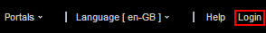
The Login link appears only to users who are not logged in. That is, if a user is logged in this link is hidden.
This section lists and describes the Display Options associated with the Login component. Additionally, it provides the tag that invokes this component on a .jspx page and the XML code that defines this component in a resource catalog.
This section includes the following subsections:
B.21.1 Login Component Display Options
The Login component shares many of the same properties with the About Portal component. Table B-20 lists the properties that have defaults other than those specified in Table B-2, "About Portal Component Display Options".
See Also:
The Login component has Style properties you can use to change the component's look and feel. For more information, see Section 14.3.6, "Working with Style and Content Style Properties."Table B-20 Login Component Display Options
| Property | Description |
|---|---|
|
|
A field for entering tooltip text to display when users hover their mouse pointers over the component The default is |
|
|
Display text for the component The default is |
|
|
The component type The default is |
See Also:
Display Options properties in the Component Properties dialog provide access to an Expression Language (EL) editor for entering and testing EL values.If you need EL assistance, an application developer can provide an EL expression; see the "Expression Language Expressions" appendix in Developing Portals with Oracle WebCenter Portal and Oracle JDeveloper.
B.21.2 Login Component Tag and XML
The following tag is used to render the Login component on a .jspx page:
<wcdc:spacesAction id="#"
   xmlns:wcdc="http://xmlns.oracle.com/webcenter/spaces/taglib"
   type="login" displayType="link" inlineStyle="white-space:nowrap"
   text="#{uib_o_w_w_r_WebCenter.GLOBAL_LINK_LOGIN}"
   shortDesc="#{uib_o_w_w_r_WebCenter.GLOBAL_LINK_LOGIN}"/>
In the resource catalog, the Login component uses the same XML code as the About WebCenter component. For more information, see Section B.4.2, "About WebCenter Component Tag and XML."
B.22 Logout
The Logout component is a link for logging out of WebCenter Portal (Figure B-20).

The Logout link appears only to logged in users. That is, if a user is logged out, this link is hidden.
This section lists and describes the Display Options associated with the Logout component. Additionally, it provides the tag that invokes this component on a .jspx page and the XML code that defines this component in a resource catalog.
This section includes the following subsections:
B.22.1 Logout Component Display Options
The Logout component shares many of the same properties with the About Portal component. Table B-21 lists the properties that have defaults other than those specified in Table B-2, "About Portal Component Display Options".
See Also:
The Logout component has Style properties you can use to change the component's look and feel. For more information, see Section 14.3.6, "Working with Style and Content Style Properties."Table B-21 Logout Component Display Options
| Property | Description |
|---|---|
|
|
A field for entering tooltip text to display when users hover their mouse pointers over the component The default is |
|
|
Display text for the component The default is |
|
|
The component type The default is |
See Also:
Display Options properties in the Component Properties dialog provide access to an Expression Language (EL) editor for entering and testing EL values.If you need EL assistance, an application developer can provide an EL expression; see the "Expression Language Expressions" appendix in Developing Portals with Oracle WebCenter Portal and Oracle JDeveloper.
B.22.2 Logout Component Tag and XML
The following tag is used to render the Logout component on a .jspx page:
<wcdc:spacesAction id="#"
   xmlns:wcdc="http://xmlns.oracle.com/webcenter/spaces/taglib"    type="logout" displayType="link" inlineStyle="white-space:nowrap"
   text="#{uib_o_w_w_r_WebCenter.GLOBAL_LINK_LOGOUT}"
   shortDesc="#{uib_o_w_w_r_WebCenter.GLOBAL_LINK_LOGOUT_DESC}"/>
In the resource catalog, the Logout component uses the same XML code as the About WebCenter component. For more information, see Section B.4.2, "About WebCenter Component Tag and XML."
B.23 Mail Members
The Mail Members component is a link that opens a simple send-mail window (Figure B-21).
Such messages are sent to the in-boxes of all members of the current portal.
This section lists and describes the Display Options associated with the Mail Members component. Additionally, it provides the tag that invokes this component on a .jspx page and the XML code that defines this component in a resource catalog.
This section includes the following subsections:
B.23.1 Mail Members Component Display Options
The Mail Members component shares many of the same properties with the About Portal component. Table B-22 lists the properties that have defaults other than those specified in Table B-2, "About Portal Component Display Options".
Table B-22 Mail Members Component Display Options
| Property | Description |
|---|---|
|
|
The default is |
See Also:
Display Options properties in the Component Properties dialog provide access to an Expression Language (EL) editor for entering and testing EL values.If you need EL assistance, an application developer can provide an EL expression; see the "Expression Language Expressions" appendix in Developing Portals with Oracle WebCenter Portal and Oracle JDeveloper.
B.23.2 Mail Members Component Tag and XML
The following tag is used to render the Mail Members component on a .jspx page:
<wcdc:emailMembersLink id="#"
   xmlns:wcdc="http://xmlns.oracle.com/webcenter/spaces/taglib"    text="#{uib_o_w_w_r_WebCenter.LABEL_SEND_EMAIL_TO_MEMBERS}"/>
Example B-15 provides the XML code that represents the component in the resource catalog file (SiteTemplateCatalog.xml) in a Portal Framework application.
Example B-15 XML Code for the Mail Members Component
<tag>
   <name>emailMembersLink</name>
   <tag-class>oracle.webcenter.webcenterapp.internal.view.taglib.
      EmailMembersLinkTag</tag-class>
   <body-content>empty</body-content>
   <attribute>
      <name>id</name>
   </attribute>
   <attribute>
      <name>rendered</name>
      <deferred-value>
         <type>boolean</type>
      </deferred-value>
   </attribute>
   <attribute>
      <name>binding</name>
      <deferred-value/>
   </attribute>
   <attribute>
      <name>clientComponent</name>
      <deferred-value>
         <type>boolean</type>
      </deferred-value>
   </attribute>
   <attribute>
      <name>customizationId</name>
      <deferred-value/>
   </attribute>
   <attribute>
      <name>disabled</name>
      <required>false</required>
      <deferred-value/>
   </attribute>
   <attribute>
      <name>displayType</name>
      <required>false</required>
      <deferred-value/>
   </attribute>
   <attribute>
      <name>shortDesc</name>
      <required>false</required>
      <deferred-value/>
   </attribute>
   <attribute>
      <name>scopeName</name>
      <required>false</required>
      <deferred-value/>
   </attribute>
   <attribute>
      <name>text</name>
      <required>false</required>
      <deferred-value/>
   </attribute>
</tag>
B.24 Mail Portal Moderators
The Mail Portal Moderators component is a link that opens a simple send-mail window (Figure B-22).
Figure B-22 Mail Portal Moderators Component
Description of ''Figure B-22 Mail Portal Moderators Component''
Such messages are sent to the in-boxes of all users assigned the role Moderator for the current portal.
This section lists and describes the Display Options associated with the Mail Portal Moderators component. Additionally, it provides the tag that invokes this component on a .jspx page and the XML code that defines this component in a resource catalog.
This section includes the following subsections:
-
Section B.24.1, "Mail Portal Moderators Component Display Options"
-
Section B.24.2, "Mail Portal Moderators Component Tag and XML"
B.24.1 Mail Portal Moderators Component Display Options
The Mail Portal Moderators component shares many of the same properties with the About Portal component. Table B-23 lists the properties that have defaults other than those specified in Table B-2, "About Portal Component Display Options".
See Also:
The Mail Portal Moderators component has Style properties you can use to change the component's look and feel. For more information, see Section 14.3.6, "Working with Style and Content Style Properties."Table B-23 Mail Portal Moderators Component Display Options
| Property | Description |
|---|---|
|
|
The default is |
See Also:
Display Options properties in the Component Properties dialog provide access to an Expression Language (EL) editor for entering and testing EL values.If you need EL assistance, an application developer can provide an EL expression; see the "Expression Language Expressions" appendix in Developing Portals with Oracle WebCenter Portal and Oracle JDeveloper.
B.24.2 Mail Portal Moderators Component Tag and XML
The following tag is used to render the Mail Portal Moderators component on a .jspx page:
<wcdc:emailModeratorsLink id="#"
   xmlns:wcdc="http://xmlns.oracle.com/webcenter/spaces/taglib"
   text="#{uib_o_w_w_r_WebCenter.LABEL_SEND_EMAIL_TO_MODERATORS}"/>
Example B-16 provides the XML code that represents the component in the resource catalog file (SiteTemplateCatalog.xml) in a Portal Framework application.
Example B-16 XML Code for the Mail Portal Moderators Component
<tag>   <name>emailModeratorsLink</name>
   <tag-class>oracle.webcenter.webcenterapp.internal.view.taglib.
      EmailModeratorsLinkTag</tag-class>
   <body-content>empty</body-content>
   <attribute>
      <name>id</name>
   </attribute>
   <attribute>
      <name>rendered</name>
      <deferred-value>
         <type>boolean</type>
      </deferred-value>
   </attribute>
   <attribute>
      <name>binding</name>
      <deferred-value/>
   </attribute>
   <attribute>
      <name>clientComponent</name>
      <deferred-value>
         <type>boolean</type>
      </deferred-value>
   </attribute>
   <attribute>
      <name>customizationId</name>
      <deferred-value/>
   </attribute>
   <attribute>
      <name>disabled</name>
      <required>false</required>
      <deferred-value/>
   </attribute>
   <attribute>
      <name>displayType</name>
      <required>false</required>
      <deferred-value/>
   </attribute>
   <attribute>
      <name>shortDesc</name>
      <required>false</required>
      <deferred-value/>
   </attribute>
   <attribute>
      <name>scopeName</name>
      <required>false</required>
      <deferred-value/>
   </attribute>
   <attribute>
      <name>text</name>
      <required>false</required>
      <deferred-value/>
   </attribute>
</tag>
B.25 Manage Pages
The Manage Pages component is a link that opens the Manage Pages dialog (Figure B-23).
The Manage Pages dialog lists all of the pages to which the current user has access. Manage Pages provides controls for creating more pages, setting page creation defaults (Home portal only), and performing actions on pages, such as editing, renaming, setting access, and the like. Additionally, users can click a listed page name to navigate to that page.
See Also:
For information about the types of actions users can perform through Manage Pages, see Chapter 12, "Creating and Editing a Portal Page" and the "Creating and Managing Personal Pages" chapter in Using Oracle WebCenter Portal.This section lists and describes the Display Options associated with the Manage Pages component. Additionally, it provides the tag that invokes this component on a .jspx page and the XML code that defines this component in a resource catalog.
This section includes the following subsections:
B.25.1 Manage Pages Component Display Options
The Manage Pages component shares many of the same properties with the About Portal component. Table B-24 lists the properties that have defaults other than those specified in Table B-2, "About Portal Component Display Options".
See Also:
The Manage Pages component has Style properties you can use to change the component's look and feel. For more information, see Section 14.3.6, "Working with Style and Content Style Properties."Table B-24 Manage Pages Component Display Options
| Property | Description |
|---|---|
|
|
A field for entering tooltip text to display when users hover their mouse pointers over the component The default is |
|
|
The component's unique identifier, for example |
|
|
Display text for the component The default is |
See Also:
Display Options properties in the Component Properties dialog provide access to an Expression Language (EL) editor for entering and testing EL values.If you need EL assistance, an application developer can provide an EL expression; see the "Expression Language Expressions" appendix in Developing Portals with Oracle WebCenter Portal and Oracle JDeveloper.
B.25.2 Manage Pages Component Tag and XML
The following tag is used to render the Manage Pages component on a .jspx page:
<wcdc:managePages id="#" __taskFlowId="#"
   xmlns:wcdc="http://xmlns.oracle.com/webcenter/spaces/taglib"
   displayType="link" inlineStyle="white-space:nowrap;"
   text="#{uib_o_w_w_r_WebCenter.TITLE_MANAGE_PAGES}"
   shortDesc="#{uib_o_w_w_r_WebCenter.TITLE_MANAGE_PAGES}"/>
Example B-17 provides the XML code that represents the component in the resource catalog file (SiteTemplateCatalog.xml) in a Portal Framework application.
Example B-17 XML Code for the Manage Pages Component
<tag>
   <name>managePages</name>
   <tag-class>oracle.webcenter.webcenterapp.internal.view.taglib.
      ManagePagesTag</tag-class>
   <body-content>empty</body-content>
   <attribute>
      <name>id</name>
   </attribute>
   <attribute>
      <name>rendered</name>
      <deferred-value>
         <type>boolean</type>
      </deferred-value>
   </attribute>
   <attribute>
      <name>binding</name>
      <deferred-value/>
   </attribute>
   <attribute>
      <name>clientComponent</name>
      <deferred-value>
         <type>boolean</type>
      </deferred-value>
   </attribute>
   <attribute>
      <name>customizationId</name>
      <deferred-value/>
   </attribute>
   <attribute>
      <name>depressedIcon</name>
      <required>false</required>
      <deferred-value/>
   </attribute>
   <attribute>
      <name>disabled</name>
      <required>false</required>
      <deferred-value/>
   </attribute>
   <attribute>
      <name>disabledIcon</name>
      <required>false</required>
      <deferred-value/>   </attribute>
   <attribute>
      <name>displayType</name>
      <required>false</required>
      <deferred-value/>
   </attribute>
   <attribute>
      <name>hoverIcon</name>
      <required>false</required>
      <deferred-value/>
   </attribute>
   <attribute>
      <name>icon</name>
      <required>false</required>
      <deferred-value/>
   </attribute>
   <attribute>
      <name>iconPosition</name>
      <required>false</required>
      <deferred-value/>
   </attribute>
   <attribute>
      <name>inlineStyle</name>
      <required>false</required>
      <deferred-value/>
   </attribute>
   <attribute>
      <name>shortDesc</name>
      <required>false</required>
      <deferred-value/>
   </attribute>
   <attribute>
      <name>styleClass</name>
      <required>false</required>
      <deferred-value/>
   </attribute>
   <attribute>
      <name>__taskFlowId</name>
      <required>false</required>
      <deferred-value/>
   </attribute>
   <attribute>
      <name>text</name>
      <required>false</required>
      <deferred-value/>
   </attribute>
</tag>
B.26 Page Links
The Page Links component is an icon and link that opens the Links dialog (Figure B-24).
The Links dialog enables users to add personal links to related content to the current page and to navigate to those link targets.
This section lists and describes the Display Options associated with the Page Links component. Additionally, it provides the tag that invokes this component on a .jspx page and the XML code that defines this component in a resource catalog.
This section includes the following subsections:
B.26.1 Page Links Component Display Options
Table B-25 lists and describes the Display Options properties associated with the Page Links component.
Table B-25 Page Links Component Display Options
| Property | Description |
|---|---|
|
|
A unique identifier for the component instance Caution: Never change this property's default value |
|
|
Display text for the component By default, the Page Links component is labeled |
|
|
An option for hiding or showing the component on the page
Once you hide a component in this way, any child components are also hidden. You can show the component again through Composer Structure view (see Section 12.4.1.3, "About Structure View in Composer"). Right-click the hidden component, and select Show Component from the resulting context menu. |
See Also:
Display Options properties in the Component Properties dialog provide access to an Expression Language (EL) editor for entering and testing EL values.If you need EL assistance, an application developer can provide an EL expression; see the "Expression Language Expressions" appendix in Developing Portals with Oracle WebCenter Portal and Oracle JDeveloper.
B.26.2 Page Links Component Tag and XML
The following tag is used to render the Page Links component on a .jspx page:
<wcdc:pageLinks id="#" __taskFlowId="#"
   xmlns:wcdc="http://xmlns.oracle.com/webcenter/spaces/taglib"/>
Example B-18 provides the XML code that represents the component in the resource catalog file (SiteTemplateCatalog.xml) in a Portal Framework application.
Example B-18 XML Code for the Page Links Component
<tag>
   <name>pageLinks</name>
   <tag-class>oracle.webcenter.webcenterapp.internal.view.taglib.
      PageLinksTag</tag-class>
   <body-content>empty</body-content>
   <attribute>
      <name>id</name>
   </attribute>
   <attribute>
      <name>rendered</name>
      <deferred-value>
         <type>boolean</type>
      </deferred-value>
   </attribute>
   <attribute>
      <name>binding</name>
      <deferred-value/>
   </attribute>
   <attribute>
      <name>clientComponent</name>
      <deferred-value>
         <type>boolean</type>
      </deferred-value>
   </attribute>
   <attribute>
      <name>customizationId</name>
      <deferred-value/>
   </attribute>
   <attribute>
      <name>showLabel</name>
      <required>false</required>
      <deferred-value/>
   </attribute>
   <attribute>
      <name>__taskFlowId</name>
      <required>false</required>
      <deferred-value/>
   </attribute>
</tag>
B.27 Parent Portal
The Parent Portal component is a link that navigates to the top portal in a portal hierarchy (Figure B-25).
See Also:
For information about portal hierarchies, see Chapter 5, "Working with Subportals."This section lists and describes the Display Options associated with the Parent Portal component. Additionally, it provides the tag that invokes this component on a .jspx page and the XML code that defines this component in a resource catalog.
This section includes the following subsections:
B.27.1 Parent Portal Component Display Options
The Parent Portal component shares many of the same properties with the About Portal component. Table B-26 lists the properties that have defaults other than those specified in Table B-2, "About Portal Component Display Options".
See Also:
The Parent Portal component has Style properties you can use to change the component's look and feel. For more information, see Section 14.3.6, "Working with Style and Content Style Properties."Table B-26 Parent Portal Component Display Options
| Property | Description |
|---|---|
|
|
A field for entering tooltip text to display when users hover their mouse pointers over the component The default is |
|
|
Display text for the component The default is |
See Also:
Display Options properties in the Component Properties dialog provide access to an Expression Language (EL) editor for entering and testing EL values.If you need EL assistance, an application developer can provide an EL expression; see the "Expression Language Expressions" appendix in Developing Portals with Oracle WebCenter Portal and Oracle JDeveloper.
B.27.2 Parent Portal Component Tag and XML
The following tag is used to render the Parent Portal component on a .jspx page:
<wcdc:parentSpace id="#"
   xmlns:wcdc="http://xmlns.oracle.com/webcenter/spaces/taglib"
   displayType="link" inlineStyle="white-space:nowrap;"
   text="#{uib_o_w_w_r_WebCenter.LABEL_NAVIGATE_TO_PARENT_SPACE}"
   shortDesc="#{uib_o_w_w_r_WebCenter.LABEL_NAVIGATE_TO_PARENT_SPACE}"/>
Example B-19 provides the XML code that represents the component in the resource catalog file (SiteTemplateCatalog.xml) in a Portal Framework application.
Example B-19 XML Code for the Parent Portal Component
<tag>
   <name>parentSpace</name>
   <tag-class>oracle.webcenter.webcenterapp.internal.view.taglib.
      ParentSpaceTag</tag-class>
   <body-content>empty</body-content>
   <attribute>
      <name>id</name>
   </attribute>
   <attribute>
      <name>rendered</name>
      <deferred-value>
         <type>boolean</type>
      </deferred-value>
   </attribute>
   <attribute>
      <name>binding</name>
      <deferred-value/>
   </attribute>
   <attribute>
      <name>clientComponent</name>
      <deferred-value>
         <type>boolean</type>
      </deferred-value>
   </attribute>
   <attribute>
      <name>customizationId</name>
      <deferred-value/>
   </attribute>
   <attribute>
      <name>depressedIcon</name>
      <required>false</required>
      <deferred-value/>
   </attribute>
   <attribute>
      <name>disabled</name>
      <required>false</required>
      <deferred-value/>
   </attribute>
   <attribute>
      <name>disabledIcon</name>
      <required>false</required>
      <deferred-value/>
   </attribute>
   <attribute>
      <name>displayType</name>
      <required>false</required>
      <deferred-value/>
   </attribute>
   <attribute>
      <name>hoverIcon</name>
      <required>false</required>
      <deferred-value/>
   </attribute>
   <attribute>
      <name>icon</name>
      <required>false</required>
      <deferred-value/>
   </attribute>
   <attribute>
      <name>iconPosition</name>
      <required>false</required>
      <deferred-value/>
   </attribute>
   <attribute>
      <name>inlineStyle</name>
      <required>false</required>
      <deferred-value/>
   </attribute>
   <attribute>
      <name>shortDesc</name>
      <required>false</required>
      <deferred-value/>
   </attribute>
   <attribute>
      <name>scopeName</name>
      <required>false</required>
      <deferred-value/>
   </attribute>
   <attribute>
      <name>styleClass</name>
      <required>false</required>
      <deferred-value/>
   </attribute>
   <attribute>
      <name>text</name>
      <required>false</required>
      <deferred-value/>
   </attribute>
</tag>
B.28 Portal Switcher
The Portal Switcher component is a menu where users can select a portal to which to navigate (Figure B-26).

This section lists and describes the Display Options associated with the Portal Switcher component. Additionally, it provides the tag that invokes this component on a .jspx page and the XML code that defines this component in a resource catalog.
This section includes the following subsections:
B.28.1 Portal Switcher Component Display Options
The Portal Switcher component shares many of the same properties with the About Portal component. Table B-27 lists the properties that have defaults other than those specified in Table B-2, "About Portal Component Display Options".
Table B-27 Portal Switcher Component Display Options
| Property | Description |
|---|---|
|
|
A field for entering tooltip text to display when users hover their mouse pointers over the component The default is |
|
|
Display text for the component The default is |
See Also:
Display Options properties in the Component Properties dialog provide access to an Expression Language (EL) editor for entering and testing EL values.If you need EL assistance, an application developer can provide an EL expression; see the "Expression Language Expressions" appendix in Developing Portals with Oracle WebCenter Portal and Oracle JDeveloper.
B.28.2 Portal Switcher Component Tag and XML
The following tag is used to render the Portal Switcher component on a .jspx page:
<wcdc:spacesSwitcher id="#" __taskFlowId="#"
   xmlns:wcdc="http://xmlns.oracle.com/webcenter/spaces/taglib"
   inlineStyle="white-space:nowrap;" styleClass="WCLinkMenu"
   text="#{uib_o_w_s_r_Spaces.LABEL_COMMUNITIES}"
   shortDesc="#{uib_o_w_s_r_Spaces.LABEL_COMMUNITIES_DESC}"/>
Example B-20 provides the XML code that represents the component in the resource catalog file (SiteTemplateCatalog.xml) in a Portal Framework application.
Example B-20 XML Code for the Portal Switcher Component
<tag>
   <name>portalsSwitcher</name>
   <tag-class>oracle.webcenter.webcenterapp.internal.view.taglib.
      portalsSwitcherTag</tag-class>
   <body-content>empty</body-content>
   <attribute>
      <name>id</name>
   </attribute>
   <attribute>
      <name>rendered</name>
      <deferred-value>
         <type>boolean</type>
      </deferred-value>
   </attribute>
   <attribute>
      <name>binding</name>
      <deferred-value/>
   </attribute>
   <attribute>
      <name>clientComponent</name>
      <deferred-value>
         <type>boolean</type>
      </deferred-value>
   </attribute>
   <attribute>
      <name>customizationId</name>
      <deferred-value/>
   </attribute>
   <attribute>
      <name>depressedIcon</name>
      <required>false</required>
      <deferred-value/>
   </attribute>
   <attribute>
      <name>disabled</name>
      <required>false</required>
      <deferred-value/>
   </attribute>
   <attribute>
      <name>disabledIcon</name>
      <required>false</required>
      <deferred-value/>
   </attribute>
   <attribute>
      <name>displayType</name>
      <required>false</required>
      <deferred-value/>
   </attribute>
   <attribute>
      <name>hoverIcon</name>
      <required>false</required>
      <deferred-value/>
   </attribute>
   <attribute>
      <name>icon</name>
      <required>false</required>
      <deferred-value/>
   </attribute>
   <attribute>
      <name>iconPosition</name>
      <required>false</required>
      <deferred-value/>
   </attribute>
   <attribute>
      <name>inlineStyle</name>
      <required>false</required>
      <deferred-value/>
   </attribute>
   <attribute>
      <name>shortDesc</name>
      <required>false</required>
      <deferred-value/>
   </attribute>
   <attribute>
      <name>styleClass</name>
      <required>false</required>
      <deferred-value/>
   </attribute>
   <attribute>
      <name>__taskFlowId</name>
      <required>false</required>
      <deferred-value/>
   </attribute>
   <attribute>
      <name>text</name>
      <required>false</required>
      <deferred-value/>
   </attribute>
</tag>
B.29 Print Preview
The Print Preview component is a link that open a print preview of the current page in the browser (Figure B-27).
This section lists and describes the Display Options associated with the Print Preview component. Additionally, it provides the tag that invokes this component on a .jspx page and the XML code that defines this component in a resource catalog.
This section includes the following subsections:
B.29.1 Print Preview Component Display Options
The Print Preview component shares many of the same properties with the About Portal component. Table B-28 lists the properties that have defaults other than those specified in Table B-2, "About Portal Component Display Options".
See Also:
The Print Preview component has Style properties you can use to change the component's look and feel. For more information, see Section 14.3.6, "Working with Style and Content Style Properties."Table B-28 Print Preview Component Display Options
| Property | Description |
|---|---|
|
|
A field for entering tooltip text to display when users hover their mouse pointers over the component The default is |
|
|
Display text for the component The default is |
See Also:
Display Options properties in the Component Properties dialog provide access to an Expression Language (EL) editor for entering and testing EL values.If you need EL assistance, an application developer can provide an EL expression; see the "Expression Language Expressions" appendix in Developing Portals with Oracle WebCenter Portal and Oracle JDeveloper.
B.29.2 Print Preview Component Tag and XML
The following tag is used to render the Print Preview component on a .jspx page:
<wcdc:printPreview id="#"
   xmlns:wcdc="http://xmlns.oracle.com/webcenter/spaces/taglib"
   text="#{uib_o_w_w_r_WebCenter.LABEL_PAGE_PRINT_PREVIEW}"
   shortDesc="#{uib_o_w_w_r_WebCenter.LABEL_PAGE_PRINT_PREVIEW}"
   inlineStyle="white-space:nowrap;"/>
Example B-21 provides the XML code that represents the component in the resource catalog file (SiteTemplateCatalog.xml) in a Portal Framework application.
Example B-21 XML Code for the Print Preview Component
<tag>
   <name>printPreview</name>
   <tag-class>oracle.webcenter.webcenterapp.internal.view.taglib.
      PrintPreviewTag</tag-class>
   <body-content>empty</body-content>
   <attribute>
      <name>id</name>
   </attribute>
   <attribute>
      <name>rendered</name>
      <deferred-value>
         <type>boolean</type>
      </deferred-value>
   </attribute>
   <attribute>
      <name>binding</name>
      <deferred-value/>
   </attribute>
   <attribute>
      <name>clientComponent</name>
      <deferred-value>
         <type>boolean</type>
      </deferred-value>
   </attribute>
   <attribute>
      <name>customizationId</name>
      <deferred-value/>
   </attribute>
   <attribute>
      <name>depressedIcon</name>
      <required>false</required>
      <deferred-value/>
   </attribute>
   <attribute>
      <name>disabled</name>
      <required>false</required>
      <deferred-value/>
   </attribute>
   <attribute>
      <name>disabledIcon</name>
      <required>false</required>
      <deferred-value/>
   </attribute>
   <attribute>
      <name>displayType</name>
      <required>false</required>
      <deferred-value/>
   </attribute>
   <attribute>
      <name>hoverIcon</name>
      <required>false</required>
      <deferred-value/>
   </attribute>
   <attribute>
      <name>icon</name>
      <required>false</required>
      <deferred-value/>
   </attribute>
   <attribute>
      <name>iconPosition</name>
      <required>false</required>
      <deferred-value/>
   </attribute>
   <attribute>
      <name>inlineStyle</name>
      <required>false</required>
      <deferred-value/>
   </attribute>
   <attribute>
      <name>shortDesc</name>
      <required>false</required>
      <deferred-value/>
   </attribute>
   <attribute>
      <name>styleClass</name>
      <required>false</required>
      <deferred-value/>
   </attribute>
   <attribute>
      <name>text</name>
      <required>false</required>
      <deferred-value/>
   </attribute>
</tag>
B.30 Privacy URL
The Privacy URL component is a link that displays the application privacy statement (Figure B-28).
This section lists and describes the Display Options associated with the Privacy URL component. Additionally, it provides the tag that invokes this component on a .jspx page and the XML code that defines this component in a resource catalog.
This section includes the following subsections:
B.30.1 Privacy URL Component Display Options
The Privacy URL component shares many of the same properties with the About Portal component. Table B-29 lists the properties that have defaults other than those specified in Table B-2, "About Portal Component Display Options".
See Also:
The Privacy URL component has Style properties you can use to change the component's look and feel. For more information, see Section 14.3.6, "Working with Style and Content Style Properties."Table B-29 Privacy URL Component Display Options
| Property | Description |
|---|---|
|
|
A field for entering tooltip text to display when users hover their mouse pointers over the component The default is |
|
|
Display text for the component The default is |
|
|
The component type The default is |
See Also:
Display Options properties in the Component Properties dialog provide access to an Expression Language (EL) editor for entering and testing EL values.If you need EL assistance, an application developer can provide an EL expression; see the "Expression Language Expressions" appendix in Developing Portals with Oracle WebCenter Portal and Oracle JDeveloper.
B.30.2 Privacy URL Component Tag and XML
The following tag is used to render the Privacy URL component on a .jspx page:
<wcdc:spacesAction id="#"
   xmlns:wcdc="http://xmlns.oracle.com/webcenter/spaces/taglib"
   type="privacyURL" displayType="link" inlineStyle="white-space:nowrap;"
   text="#{uib_o_w_w_r_WebCenter.PRIVACY_STMT}"
   shortDesc="#{uib_o_w_w_r_WebCenter.PRIVACY_STMT_DESC}"/>
In the resource catalog, the Privacy URL component uses the same XML code as the About WebCenter component. For more information, see Section B.4.2, "About WebCenter Component Tag and XML."
B.31 RSS
The RSS component is a link that opens the RSS Manager (Figure B-29).
The RSS Manager enables users to subscribe to news feeds from WebCenter Portal tools and services. For more information, see Chapter 54, "Adding RSS Feeds to a Portal."
This section lists and describes the Display Options associated with the RSS component. Additionally, it provides the tag that invokes this component on a .jspx page and the XML code that defines this component in a resource catalog.
This section includes the following subsections:
B.31.1 RSS Component Display Options
The RSS component shares many of the same properties with the About Portal component. Table B-30 lists the properties that have defaults other than those specified in Table B-2, "About Portal Component Display Options".
See Also:
The RSS component has Style properties you can use to change the component's look and feel. For more information, see Section 14.3.6, "Working with Style and Content Style Properties."Table B-30 RSS Component Display Options
| Property | Description |
|---|---|
|
|
A field for entering tooltip text to display when users hover their mouse pointers over the component The default is |
|
|
Display text for the component The default is |
|
|
The component type The default is |
See Also:
Display Options properties in the Component Properties dialog provide access to an Expression Language (EL) editor for entering and testing EL values.If you need EL assistance, an application developer can provide an EL expression; see the "Expression Language Expressions" appendix in Developing Portals with Oracle WebCenter Portal and Oracle JDeveloper.
B.31.2 RSS Component Tag and XML
The following tag is used to render the RSS component on a .jspx page:
<wcdc:spacesAction id="#"
   xmlns:wcdc="http://xmlns.oracle.com/webcenter/spaces/taglib"
   type="rss" displayType="link" text="#{uib_o_w_w_r_WebCenter.GLOBAL_LINK_RSS}"
   inlineStyle="white-space:nowrap;"/>
In the resource catalog, the RSS component uses the same XML code as the About WebCenter component. For more information, see Section B.4.2, "About WebCenter Component Tag and XML."
B.32 Search
See Also:
Chapter 55, "Adding Search to a Portal"The Search component provides a means entering search terms against the application or the current portal, depending on how its parameters are configured (Figure B-30).
Note:
The tip text and operation of the Search box is dependent on the version of SES configured. For example, SES 11.2.2.2 displays tip text Search Everything in the Search box as shown in Figure B-30. SES 11.1.2.2 does not display any tip text. For more information, see Chapter 55, "Adding Search to a Portal" and the "Searching for Documents" section in Using Oracle WebCenter Portal.
Note:
The Search component is a task flow and has no associated XML definition. This component is the same as the Search - Toolbar task flow available in the resource registry, along with other Search task flows (see Section 55.1.2, "Understanding Search with Oracle SES").See Also:
The Search component has Style properties you can use to change the component's look and feel. For more information, see Section 14.3.6, "Working with Style and Content Style Properties."B.33 Self-Registration
The Self-Registration component is a link that opens the Self-Registration page (Figure B-31).
The Self-Registration page is a system page that enables users to create their own application login credentials. For more information, see Section 7.10, "Administering System Pages in a Portal," and the "Registering Yourself with WebCenter Portal" section in Using Oracle WebCenter Portal.
This section lists and describes the Display Options associated with the Self-Registration component. Additionally, it provides the tag that invokes this component on a .jspx page and the XML code that defines this component in a resource catalog.
This section includes the following subsections:
B.33.1 Self-Registration Component Display Options
The Self-Registration component shares many of the same properties with the About Portal component. Table B-31 lists the properties that have defaults other than those specified in Table B-2, "About Portal Component Display Options".
See Also:
The Self-Registration component has Style properties you can use to change the component's look and feel. For more information, see Section 14.3.6, "Working with Style and Content Style Properties."Table B-31 Self-Registration Component Display Options
| Property | Description |
|---|---|
|
|
A field for entering tooltip text to display when users hover their mouse pointers over the component The default is |
|
|
Display text for the component The default is |
|
|
The component type The default is |
See Also:
Display Options properties in the Component Properties dialog provide access to an Expression Language (EL) editor for entering and testing EL values.If you need EL assistance, an application developer can provide an EL expression; see the "Expression Language Expressions" appendix in Developing Portals with Oracle WebCenter Portal and Oracle JDeveloper.
B.33.2 Self-Registration Component Tag and XML
The following tag is used to render the Self-Registration component on a .jspx page:
<wcdc:spacesAction id="#"
   xmlns:wcdc="http://xmlns.oracle.com/webcenter/spaces/taglib"
   type="selfRegistration" displayType="link"
   text="#{uib_o_w_w_r_WebCenter.GLOBAL_LINK_SELFREG}"
   shortDesc="#{uib_o_w_w_r_WebCenter.GLOBAL_LINK_SELFREG_DESC}"
   inlineStyle="white-space:nowrap"/>
In the resource catalog, the Self-Registration component uses the same XML code as the About WebCenter component. For more information, see Section B.4.2, "About WebCenter Component Tag and XML."
B.34 Share Resource
The Share Resource component renders as Share Link. Users click this link to open a popup version of the Publisher task flow for publishing messages, links, and documents (Figure B-32).
Messages, links, and documents are published on the user's own Message Board or a portal Message Board, depending on the selected recipient. In turn, if activities on the user's Message Board are shared with the user's connections via Activity Stream, then the published message, document, or link is shared with all of the user's connections through their Activity Streams. Messages published to a portal are shared with all members of that portal through their Activity Streams.
See Also:
For information about the Publisher task flow, see the "Sharing Messages, Files, and URLs" section in Using Oracle WebCenter Portal.This section lists and describes the Display Options associated with the Share Resource component. Additionally, it provides the tag that invokes this component on a .jspx page and the XML code that defines this component in a resource catalog.
This section includes the following subsections:
B.34.1 Share Resource Display Options
The Share Resource component shares many of the same properties with the About Portal component. Table B-32 lists the properties that have defaults other than those specified in Table B-2, "About Portal Component Display Options".
See Also:
The Share Resource component has Style properties you can use to change the component's look and feel. For more information, see Section 14.3.6, "Working with Style and Content Style Properties."Table B-32 Share Resource Component Display Options
| Property | Description |
|---|---|
|
|
A field for entering tooltip text to display when users hover their mouse pointers over the component The default is |
|
|
Display text for the component The default is |
See Also:
Display Options properties in the Component Properties dialog provide access to an Expression Language (EL) editor for entering and testing EL values.If you need EL assistance, an application developer can provide an EL expression; see the "Expression Language Expressions" appendix in Developing Portals with Oracle WebCenter Portal and Oracle JDeveloper.
B.34.2 Share Resource Component Tag and XML
The following tag is used to render the Share Resource component on a .jspx page:
<wcdc:shareResource id="#" __taskFlowId="#"
   xmlns:wcdc="http://xmlns.oracle.com/webcenter/spaces/taglib"
   displayType="link" inlineStyle="white-space:nowrap;"
   text="#{uib_o_w_w_r_WebCenter['NAV_TOOLS_ACTIONS_FOLDER_SHARE.TITLE']}"
   shortDesc="#{uib_o_w_w_r_WebCenter
      ['NAV_TOOLS_ACTIONS_FOLDER_SHARE.TITLE']}"/>
Example B-22 provides the XML code that represents the component in the resource catalog file (SiteTemplateCatalog.xml) in a Portal Framework application.
Example B-22 XML Code for the Share Resource Component
<tag>
   <name>shareResource</name>
   <tag-class>oracle.webcenter.webcenterapp.internal.view.taglib.
      ShareResourceTag</tag-class>
   <body-content>empty</body-content>
   <attribute>
      <name>id</name>
   </attribute>
   <attribute>
      <name>rendered</name>
      <deferred-value>
         <type>boolean</type>
      </deferred-value>
   </attribute>
   <attribute>
      <name>binding</name>
      <deferred-value/>
   </attribute>
   <attribute>
      <name>clientComponent</name>
      <deferred-value>
         <type>boolean</type>
      </deferred-value>
   </attribute>
   <attribute>
      <name>customizationId</name>
      <deferred-value/>
   </attribute>
   <attribute>
      <name>depressedIcon</name>
      <required>false</required>
      <deferred-value/>
   </attribute>
   <attribute>
      <name>disabled</name>
      <required>false</required>
      <deferred-value/>
   </attribute>
   <attribute>
      <name>disabledIcon</name>
      <required>false</required>
      <deferred-value/>
   </attribute>
   <attribute>
      <name>displayType</name>
      <required>false</required>
      <deferred-value/>
   </attribute>
   <attribute>
      <name>hoverIcon</name>
      <required>false</required>
      <deferred-value/>
   </attribute>
   <attribute>
      <name>icon</name>
      <required>false</required>
      <deferred-value/>
   </attribute>
   <attribute>
      <name>iconPosition</name>
      <required>false</required>
      <deferred-value/>
   </attribute>
   <attribute>
      <name>inlineStyle</name>
      <required>false</required>
      <deferred-value/>
   </attribute>
   <attribute>
      <name>shortDesc</name>
      <required>false</required>
      <deferred-value/>
   </attribute>
   <attribute>
      <name>scopeName</name>
      <required>false</required>
      <deferred-value/>
   </attribute>
   <attribute>
      <name>styleClass</name>
      <required>false</required>
      <deferred-value/>
   </attribute>
   <attribute>
      <name>__taskFlowId</name>
      <required>false</required>
      <deferred-value/>
   </attribute>
   <attribute>
      <name>text</name>
      <required>false</required>
      <deferred-value/>
   </attribute>
</tag>
B.35 Status Indicator
The Status Indicator component is an animated icon that spins when WebCenter Portal is processing information (Figure B-33).
This section lists and describes the Display Options associated with the Status Indicator component. Additionally, it provides the tag that invokes this component on a .jspx page and the XML code that defines this component in a resource catalog.
This section includes the following subsections:
B.35.1 Status Indicator Component Display Options
The Status Indicator component shares many of the same properties with the About Portal component. Table B-33 lists the properties that have defaults other than those specified in Table B-2, "About Portal Component Display Options".
See Also:
The Status Indicator component has Style properties you can use to change the component's look and feel. For more information, see Section 14.3.6, "Working with Style and Content Style Properties."Table B-33 Status Indicator Component Display Options
| Property | Description |
|---|---|
|
|
The component type The default is |
See Also:
Display Options properties in the Component Properties dialog provide access to an Expression Language (EL) editor for entering and testing EL values.If you need EL assistance, an application developer can provide an EL expression; see the "Expression Language Expressions" appendix in Developing Portals with Oracle WebCenter Portal and Oracle JDeveloper.
B.35.2 Status Indicator Component Tag and XML
The following tag is used to render the Status Indicator component on a .jspx page:
<wcdc:spacesAction id="#"
   xmlns:wcdc="http://xmlns.oracle.com/webcenter/spaces/taglib"
   type="statusIndicator" displayType="link" />
In the resource catalog, the Status Indicator component uses the same XML code as the About WebCenter component. For more information, see Section B.4.2, "About WebCenter Component Tag and XML."
B.36 Subscription Preferences
The Subscription Preferences component is a link users can click to subscribe to notifications about specific types of activities that occur in the context of the portal (Figure B-34).
Figure B-34 Subscription Preferences Component
Description of ''Figure B-34 Subscription Preferences Component''
This section lists and describes the Display Options associated with the Subscription Preferences component. Additionally, it provides the tag that invokes this component on a .jspx page and the XML code that defines this component in a resource catalog.
This section includes the following subsections:
-
Section B.36.1, "Subscription Preferences Component Display Options"
-
Section B.36.2, "Subscription Preferences Component Tag and XML"
B.36.1 Subscription Preferences Component Display Options
The Subscription Preferences component shares many of the same properties with the About Portal component. Table B-34 lists the properties that have defaults other than those specified in Table B-2, "About Portal Component Display Options".
See Also:
The Subscription Preferences component has Style properties you can use to change the component's look and feel. For more information, see Section 14.3.6, "Working with Style and Content Style Properties."Table B-34 Subscription Preferences Component Display Options
| Property | Description |
|---|---|
|
|
A field for entering tooltip text to display when users hover their mouse pointers over the component The default is |
|
|
Display text for the component The default is |
See Also:
Display Options properties in the Component Properties dialog provide access to an Expression Language (EL) editor for entering and testing EL values.If you need EL assistance, an application developer can provide an EL expression; see the "Expression Language Expressions" appendix in Developing Portals with Oracle WebCenter Portal and Oracle JDeveloper.
B.36.2 Subscription Preferences Component Tag and XML
The following tag is used to render the Subscription Preferences component on a .jspx page:
<wcdc:notificationSubscriptionsLink id="#" __taskFlowId="#"
   xmlns:wcdc="http://xmlns.oracle.com/webcenter/spaces/taglib"
   text="#{uib_o_w_w_r_WebCenter.LABEL_SUBSCRIBE_TO_GET_NOTIFICATION}"
   shortDesc="#{uib_o_w_w_r_WebCenter.LABEL_SUBSCRIBE_TO_GET_NOTIFICATION}" />
Example B-23 provides the XML code that represents the component in the resource catalog file (SiteTemplateCatalog.xml) in a Portal Framework application.
Example B-23 XML Code for the Subscription Preferences Component
<tag>
   <name>notificationSubscriptionsLink</name>
   <tag-class>oracle.webcenter.webcenterapp.internal.view.
      taglib.NotificationSubscriptionsLinkTag</tag-class>
   <body-content>empty</body-content>
   <attribute>
      <name>id</name>
   </attribute>
   <attribute>
      <name>rendered</name>
      <deferred-value>
         <type>boolean</type>
      </deferred-value>
   </attribute>
   <attribute>
      <name>binding</name>
      <deferred-value/>
   </attribute>
   <attribute>
      <name>clientComponent</name>
      <deferred-value>
         <type>boolean</type>
      </deferred-value>
   </attribute>
   <attribute>
      <name>customizationId</name>
      <deferred-value/>
   </attribute>
   <attribute>
      <name>depressedIcon</name>
      <required>false</required>
      <deferred-value/>
   </attribute>
   <attribute>
      <name>disabled</name>
      <required>false</required>
      <deferred-value/>
   </attribute>
   <attribute>
      <name>disabledIcon</name>
      <required>false</required>
      <deferred-value/>
   </attribute>
   <attribute>
      <name>displayType</name>
      <required>false</required>
      <deferred-value/>
   </attribute>
   <attribute>
      <name>hoverIcon</name>
      <required>false</required>
      <deferred-value/>
   </attribute>
   <attribute>
      <name>icon</name>
      <required>false</required>
      <deferred-value/>
   </attribute>
   <attribute>
      <name>iconPosition</name>
      <required>false</required>
      <deferred-value/>
   </attribute>
   <attribute>
      <name>inlineStyle</name>
      <required>false</required>
      <deferred-value/>
   </attribute>
   <attribute>
      <name>shortDesc</name>
      <required>false</required>
      <deferred-value/>
   </attribute>
   <attribute>
      <name>scopeName</name>
      <required>false</required>
      <deferred-value/>
   </attribute>
   <attribute>
      <name>styleClass</name>
      <required>false</required>
      <deferred-value/>
   </attribute>
   <attribute>
      <name>text</name>
      <required>false</required>
      <deferred-value/>
   </attribute>
   <attribute>
      <name>__taskFlowId</name>
      <required>false</required>
      <deferred-value/>
   </attribute>
</tag>
B.37 Tags
The Tags component is an icon that users click to open the Add Tags dialog (Figure B-35).
Add tags to associate personally meaningful search terms to a page or a portal item. For more information, see Chapter 56, "Adding Tagging to a Portal."
This section lists and describes the Display Options associated with the Tags component. Additionally, it provides the tag that invokes this component on a .jspx page and the XML code that defines this component in a resource catalog.
This section includes the following subsections:
B.37.1 Tags Component Display Options
Table B-35 lists and describes the Display Options associated with the Tags component.
See Also:
The Tags component has Style properties you can use to change the component's look and feel. For more information, see Section 14.3.6, "Working with Style and Content Style Properties."Table B-35 Tags Component Display Options
| Property | Description |
|---|---|
|
|
An option for hiding or showing the component on the page
Once you hide a component in this way, any child components are also hidden. You can show the component again through Composer Structure view (see Section 12.4.1.3, "About Structure View in Composer"). Right-click the hidden component, and select Show Component from the resulting context menu. |
|
|
Display text for the component By default, no display text is associated with the Tag icon. |
|
|
The component's unique identifier, for example |
See Also:
Display Options properties in the Component Properties dialog provide access to an Expression Language (EL) editor for entering and testing EL values.If you need EL assistance, an application developer can provide an EL expression; see the "Expression Language Expressions" appendix in Developing Portals with Oracle WebCenter Portal and Oracle JDeveloper.
B.37.2 Tags Component Tag and XML
The following tag is used to render the Tags component on a .jspx page:
<wcdc:pageTags id="#" __taskFlowId="#"
   xmlns:wcdc="http://xmlns.oracle.com/webcenter/spaces/taglib"/>
Example B-24 provides the XML code that represents the component in the resource catalog file (SiteTemplateCatalog.xml) in a Portal Framework application.
Example B-24 XML Code for the Tags Component
<tag>
   <name>pageTags</name>
   <tag-class>oracle.webcenter.webcenterapp.internal.view.taglib.
      PageTagsTag</tag-class>
   <body-content>empty</body-content>
   <attribute>
      <name>id</name>
   </attribute>
   <attribute>
      <name>rendered</name>
      <deferred-value>
         <type>boolean</type>
      </deferred-value>
   </attribute>
   <attribute>
      <name>binding</name>
      <deferred-value/>
   </attribute>
   <attribute>
      <name>clientComponent</name>
      <deferred-value>
         <type>boolean</type>
      </deferred-value>
   </attribute>
   <attribute>
      <name>customizationId</name>
      <deferred-value/>
   </attribute>
   <attribute>
      <name>showLabel</name>
      <required>false</required>
      <deferred-value/>
   </attribute>
   <attribute>
      <name>__taskFlowId</name>
      <required>false</required>
      <deferred-value/>
   </attribute>
</tag>
B.38 User Preferences
The User Preferences component is a link that opens the Preferences dialog (Figure B-36).

User preferences enable users to configure their views of the application to suit their working styles. For more information, see the "Setting Your Personal Preferences" chapter in Using Oracle WebCenter Portal.
This section lists and describes the Display Options associated with the User Preferences component. Additionally, it provides the tag that invokes this component on a .jspx page and the XML code that defines this component in a resource catalog.
This section includes the following subsections:
B.38.1 User Preferences Component Display Options
The User Preferences component shares many of the same properties with the About Portal component. Table B-36 lists the properties that have defaults other than those specified in Table B-2, "About Portal Component Display Options".
See Also:
The User Preferences component has Style properties you can use to change the component's look and feel. For more information, see Section 14.3.6, "Working with Style and Content Style Properties."Table B-36 User Preferences Component Display Options
| Property | Description |
|---|---|
|
|
A field for entering tooltip text to display when users hover their mouse pointers over the component The default is |
|
|
Display text for the component The default is |
See Also:
Display Options properties in the Component Properties dialog provide access to an Expression Language (EL) editor for entering and testing EL values.If you need EL assistance, an application developer can provide an EL expression; see the "Expression Language Expressions" appendix in Developing Portals with Oracle WebCenter Portal and Oracle JDeveloper.
B.38.2 User Preferences Component Tag and XML
The following tag is used to render the User Preferences component on a .jspx page:
<wcdc:userPreferences id="#" __taskFlowId="#"
   xmlns:wcdc="http://xmlns.oracle.com/webcenter/spaces/taglib"
   displayType="link" inlineStyle="white-space:nowrap;"
   text="#{uib_o_w_w_r_WebCenter.GLOBAL_LINK_PREFERENCES}"
   shortDesc="#{uib_o_w_w_r_WebCenter.GLOBAL_LINK_PREFERENCES_DESC}"/>
Example B-25 provides the XML code that represents the component in the resource catalog file (SiteTemplateCatalog.xml) in a Portal Framework application.
Example B-25 XML Code for the User Preferences Component
<tag>
   <name>userPreferences</name>
   <tag-class>oracle.webcenter.webcenterapp.internal.view.taglib.
      UserPreferencesTag</tag-class>
   <body-content>empty</body-content>
   <attribute>
      <name>id</name>
   </attribute>
   <attribute>
      <name>rendered</name>
      <deferred-value>
         <type>boolean</type>
      </deferred-value>
   </attribute>
   <attribute>
      <name>binding</name>
      <deferred-value/>
   </attribute>
   <attribute>
      <name>clientComponent</name>
      <deferred-value>
         <type>boolean</type>
      </deferred-value>
   </attribute>
   <attribute>
      <name>customizationId</name>
      <deferred-value/>
   </attribute>
   <attribute>
      <name>depressedIcon</name>
      <required>false</required>
      <deferred-value/>
   </attribute>
   <attribute>
      <name>disabled</name>
      <required>false</required>
      <deferred-value/>
   </attribute>
   <attribute>
      <name>disabledIcon</name>
      <required>false</required>
      <deferred-value/>
   </attribute>
   <attribute>
      <name>displayType</name>
      <required>false</required>
      <deferred-value/>
   </attribute>
   <attribute>
      <name>hoverIcon</name>
      <required>false</required>
      <deferred-value/>
   </attribute>
   <attribute>
      <name>icon</name>
      <required>false</required>
      <deferred-value/>
   </attribute>
   <attribute>
      <name>iconPosition</name>
      <required>false</required>
      <deferred-value/>
   </attribute>
   <attribute>
      <name>inlineStyle</name>
      <required>false</required>
      <deferred-value/>
   </attribute>
   <attribute>
      <name>shortDesc</name>
      <required>false</required>
      <deferred-value/>
   </attribute>
   <attribute>
      <name>styleClass</name>
      <required>false</required>
      <deferred-value/>
   </attribute>
   <attribute>
      <name>__taskFlowId</name>
      <required>false</required>
      <deferred-value/>
   </attribute>
   <attribute>
      <name>text</name>
      <required>false</required>
      <deferred-value/>
   </attribute>
  </tag>