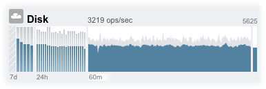
Disk Activity Dashboard
The activity area of the Dashboard shows graphs of eight performance statistics by default. The example in this section shows Disk operations/sec. The statistical average is plotted in blue and the maximum appears in light grey.
Figure 15 Disk Activity Dashboard

To go to the Analytics worksheet for an activity, click one of the four graphs (day, hour, minute, second) for the statistic you want to evaluate.
To view the average for each graph, mouse-over a graph and the average appears in the tooltip. The weather icon in the upper-left provides a report of activity according to thresholds you can customize for each statistic on the Status Settings screen.
| ||||||||||
The average for the selected plot is shown numerically above the graph. To change the average that appears, select the average you want, either 7d, 24h, or 60m.
The vertical scale of all graphs is printed on the top right, and all graphs are scaled to this same height. The height is calculated from the selected graph (plus a margin). The height will rescale based on activity in the selected graph, with the exception of utilization graphs which have a fixed height of 100 percent.
Since the height can rescale, 60 minutes of idle activity may look similar to 60 minutes of busy activity. Always check the height of the graphs before trying to interpret what they mean.
Understanding some statistics may not be obvious - you might wonder, for a particular appliance in your environment, whether 1000 NFSv3 ops/sec is considered busy or idle. This is where the 24-hour and 7-day plots can help, to provide historic data next to the current activity for comparison.
The plot height is calculated from the selected plot. By default, the 60-minute plot is selected. So, the height is the maximum activity during that 60-minute interval (plus a margin). To rescale all plots to span the highest activity during the previous 7 days, select 7d. This makes it easy to see how current activity compares to the last day or week.
The weather icon is intended to grab your attention when something is unusually busy or idle. To go to the weather threshold configuration page, click the weather icon. There is no good or bad threshold, rather the BUI provides a gradient of levels for each activity statistic. The statistics on which weather icons are based provide an approximate understanding for appliance performance that you should customize to your workload, as follows:
-
Different environments have different acceptable levels for performance (latency), and so there is no one-size-fits-all threshold.
-
The statistics on the Dashboard are based on operations/sec and bytes/sec, so you should use Analytics worksheets for an accurate understanding of system performance.