User Interface Redesign
-
Performance data is now shown in data views that you access through a navigation bar on the left. This replaces the horizontal tab navigation that was used previously. See Performance Analyzer Navigation for more information.
-
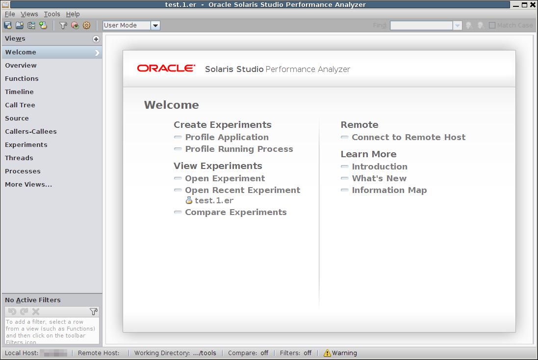
A new Welcome screen displays when you start Performance Analyzer without specifying an experiment name. See Welcome Screen of Performance Analyzer for more information.
-
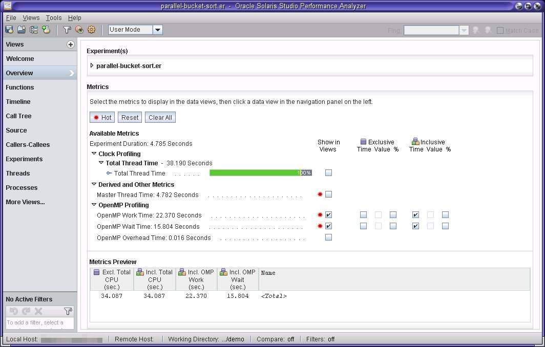
A new Overview screen displays as the first view of the data when you open an experiment. See Overview Screen of Performance Analyzer for more information.
Performance Analyzer user interface features improved data presentation and navigation. Some highlights of the UI changes include:
Performance Analyzer Navigation
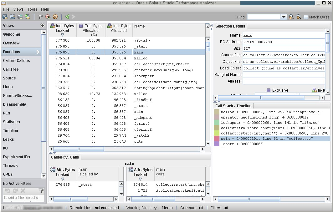
Performance Analyzer is now organized around data views that you access from a navigation bar on the left side of the Performance Analyzer window. Each view shows a different perspective of the performance metrics for your profiled application. As before, the Functions view serves as a focal point; when you select a function the other data views are updated to also focus on that selected function.
Figure 3-1 Vertical Navigation Area with Functions View Selected

The data views available in the navigation bar are determined by the data available in the experiments you open. You can easily add and remove data views using the Views menu or the "+" button above the navigation bar. Details about items you select in the data view are shown on the right side, as you can see in the preceding figure.
Below the navigation bar, the Active Filters area shows the names of data filters that are currently applied and enables you to remove and reapply filters or remove all filters. You can apply filters by right-clicking an item in a data view and selecting a filter from the popup list or by clicking the filter icon in the toolbar.
Welcome Screen of Performance Analyzer
Performance Analyzer displays a new Welcome screen when you do not specify the name of an experiment when you start the tool. The Welcome screen provides links to make it easier to profile your application, view recent experiments, browse experiments, and view documentation.
Figure 3-2 Welcome Screen of Performance Analyzer

The Welcome screen is always available from the navigation bar so you can use it as a home page for using the Performance Analyzer, where you can click a link to perform an activity or open the Performance Analyzer Help viewer to read documentation.
Overview Screen of Performance Analyzer
The Overview shows performance metrics for the loaded experiments. Use the Overview to select the metrics you want to explore in other data views.
For each metric a value is displayed that represents the total for all loaded experiments. Colored bars are displayed to show relative values of related metrics. A highlight marker for high activity metrics indicates a metric that showed significant activity when compared to CPU time. These metrics can help identify problem areas in your program.
Figure 3-3 Performance Analyzer Overview and New Navigation

See the Help in the Performance Analyzer for more information about the Overview screen.